Nature Photographers Network
This is the preserved archive of the original Nature Photographers Network. The community continues at naturephotographers.network.
Violet Nemesis + Repost
‹ PreviousFlora GalleryNext ›

Violet Nemesis + Repost

by Bill Fach

Gallery: FloraPosted January 12, 2013160 views14 comments
Sony A77
Minolta 200mm macro (No CPL - too windy)
ISO 400, 1/60 @ f10

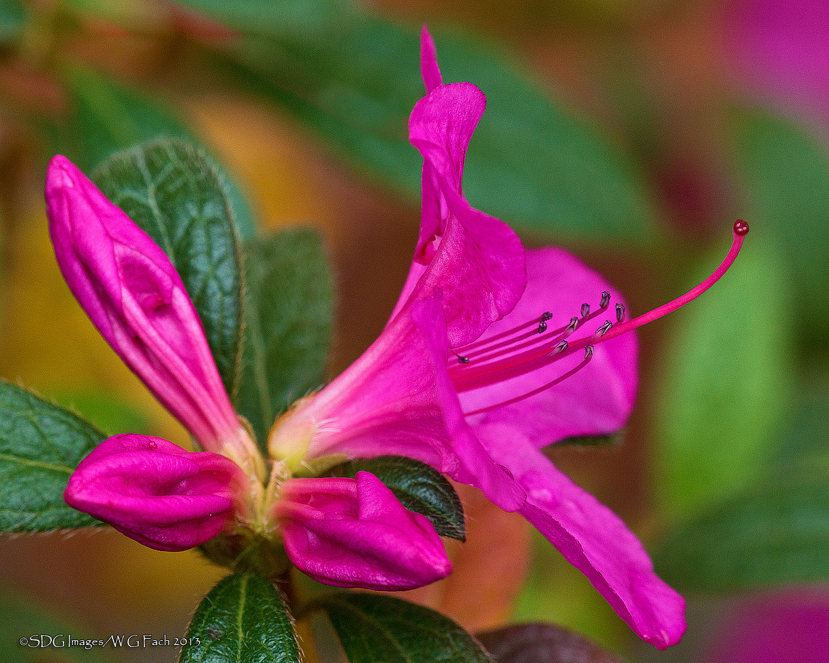
We have a number of Encore Azaleas in our garden and most of them are blooming now. This one is uniquely colored and I have struggled for a couple of years to shoot it to my satisfaction. While roaming the property today I spotted this bunch of buds with an open flower and gave it a whirl. All comments welcome. >=))>

Comments

14 comments
Comment posted by Michael Cothran on January 12, 2013 at 2:17 PM
Wow, that is one intense color. I like the composition here - the three buds counter balance the open blossom perfectly, while the greenery in the background provides a nice contrast to the vivid magenta.
As a suggestion - when there is subject matter like this that is easily defined (as opposed to some broad open landscapes), I'd darken the corners a little more, to help keep the eye more focused on the star performer.
As I sit here in Nashville today, with temps in the mid-70's, I wouldn't be surprised if we didn't have some early blooms soon ourselves. Only to be foiled by more frost later on.
Registered on December 5, 2012, 31 Posts, 730 Comments
Comment posted by Bill Fach on January 12, 2013 at 3:06 PM
Michael: Great suggestion on the corners; it had not occurred to me. Thanks. >=))>
Registered on November 1, 2003, 1805 Posts, 26981 Comments
Comment posted by Eirini Pajak on January 12, 2013 at 4:15 PM
I think I actually like the first post the best! Some how in the second post you lost some of the zing in the detail...maybe because some of it lies within the darkened area?
Registered on December 13, 2011, 216 Posts, 1671 Comments
Comment posted by William Gillis on January 12, 2013 at 7:20 PM
Bill,

I actually like both versions for different reasons. The intense color is remarkable. I would not have thought of darkening the corners either but it does empasize the center of the image. Very well done. No flowers here for awhile since it is 11 degrees.

William Gillis
Registered on November 28, 2011, 17 Posts, 204 Comments
Comment posted by Mark Seaver on January 12, 2013 at 8:09 PM
Looks great, Bill. Good dof on the cluster of buds and the inner parts of the open bloom. The comp. speaks of trumpeting to the world. There are halos around the pistil and the upper and lower petals and the stamen also seem a touch stark...maybe too much sharpening???. What ever it is it should be an easy fix on a fabulous view. I prefer the original post for the overall clarity on the entire flower.
Registered on January 23, 2011, 1103 Posts, 17270 Comments
Comment posted by Barb Pflaum on January 12, 2013 at 8:40 PM
Beautiful colors and excellent detail, Bill! I prefer the orginal post, it just looks more beautiful to me.
Registered on January 14, 2009, 316 Posts, 2724 Comments
Comment posted by scott lanz on January 12, 2013 at 8:53 PM
I'll join in the accolades for this one Bill. Very beautiful. I really like the comp and bg. Michael's suggestion is a good one, and one to keep in mind, but the bg is so colorful and nice, I prefer the better view in the first. Maybe something in between would be perfect.
Registered on November 14, 2003, 840 Posts, 12902 Comments
Comment posted by Pat Sampson on January 12, 2013 at 10:22 PM
Talk about electric color. Great clarity as well.

I prefer the second version Bill. It is more subdued but I think this animal needs a bit of that. (smile)

Beautiful image - should be on a hospital wall somewhere because of the mood and energy it conveys.

pat
Registered on May 19, 2007, 953 Posts, 15989 Comments
Comment posted by Ken Smith on January 12, 2013 at 11:03 PM
Good angle and comp... tough to decide where to crop...and this looks spot-on perfect. Glad you darkened corners...it helps. This color is tough to share on monitors...well done!
Registered on September 5, 2008, 449 Posts, 2444 Comments
Comment posted by Gary Yeoh on January 13, 2013 at 8:56 AM
Bill:
Really intense color :jump: I like the vignette in the repost but perhaps not so strong - somewhere between the first and second.
Registered on September 1, 2009, 588 Posts, 8184 Comments
Comment posted by Morris McClung on January 13, 2013 at 10:39 AM
I do like the repost better and I liked it fine before. :biggrin: Such fantastic color, Bill! :toast:
Registered on May 7, 2007, 670 Posts, 19650 Comments
Comment posted by Albert Darmo on January 13, 2013 at 11:26 AM
Hi Bill :wavey: Love the stunning color on both images!!! both versions have their merits :cool: but i agree with the majority. on choosing the second version. because of a softer BG. :wink:
Albert Darmo
Registered on November 25, 2008, 1386 Posts, 11978 Comments
Comment posted by Giuseppe Guadagno on January 13, 2013 at 4:03 PM
Both beautiful for me Bill, with different suggestions. Excellent Michael's advice.
Cheers.
Registered on February 3, 2007, 827 Posts, 5052 Comments
Comment posted by Ian Wolfenden on January 14, 2013 at 3:21 PM
A wonderfully crisp rendering, Bill ! Am in two minds over the repost - the fg dark to bg pale colours of the original work very well - in fact I do think the anthers and the stigma shine out more strongly in that version.
Registered on May 18, 2007, 1108 Posts, 7647 Comments