Nature Photographers Network
This is the preserved archive of the original Nature Photographers Network. The community continues at naturephotographers.network.
Spirit Light
‹ PreviousLandscape GalleryNext ›

Spirit Light

by Peter Coskun

Gallery: LandscapePosted January 22, 2013447 views24 comments
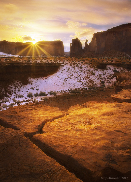
This is a shot I took from monument valley a few weekends ago. I wasn't really wowed with any of the stuff I took, but liked this one for obvious reasons. There are things I wish I would have done compositionally (lower angle), but wasn't sure of the mid ground. While the snow adds a nice dynamic (I think) it was a muddy looking snow that seeped into the red soil. Anyways, I would appreciate some thoughts on this one. It is a blend of two exposures for dynamic range. I'm probably going to reprocess this one anyways, so any suggestions would be greatly appreciated.

Canon 7d
Canon 17-40mm @17mm
f22
ISO 100
1/8th sec + 1/80 sec
CPL
Tripod.

Comments

24 comments
Comment posted by Vincent Piotrowski on January 22, 2013 at 7:00 PM
This image has a lot of strong points like the lighting in the foreground, the crack, the snow, the rocks in the background, the sun flare, and the sky. It's a lot to take in but it's all enjoyable. If I were to reprocess it I'd adjust the levels to turn down the yellow a bit. It's minor but on my monitor the image has a pronounced yellow hue.
Registered on January 20, 2012, 6 Posts, 48 Comments
Comment posted by Todd Liotine on January 22, 2013 at 7:34 PM
I think you did really well, that glow on the rock is awesome. I would however tone down the yellow.
Registered on July 1, 2008, 131 Posts, 671 Comments
Comment posted by Peter Coskun on January 22, 2013 at 7:45 PM
Here is a quick rework adjust the yellows. They seemed more on the orange side so I lightened up the color a bit, may still be on the yellow side but should not be as vivid with the yellow/orange.
Registered on October 31, 2011, 170 Posts, 1240 Comments
Comment posted by Eirini Pajak on January 22, 2013 at 7:58 PM
Hmmm....I think I actually like the first one best! The yellow looks a bit too hot in the second, where as in the first it is a more natural warm glow. Beautiful!
Registered on December 13, 2011, 216 Posts, 1671 Comments
Comment posted by Peter Coskun on January 22, 2013 at 8:02 PM
Thanks Eirini. The yellows were quite strong to begin with in the RAW files, so the first one is actually more natural in terms of what the camera picked up. I wonder if a dark border would change perspective on the repost to emphasize the change.
Registered on October 31, 2011, 170 Posts, 1240 Comments
Comment posted by Kah Kit Yoong on January 22, 2013 at 8:03 PM
I like this a lot, not the usual scene from MV. The light is glorious and you have great elements from top to bottom. I don't think you've got the most out of it in terms of processing. I would like to see more definition in the sky between clouds and blue sky, seems kind of glarey at the moment.
Registered on September 27, 2006, 636 Posts, 10682 Comments
Comment posted by Peter Coskun on January 22, 2013 at 8:11 PM
Kah Kit Yoong, that was my issue, I only did so much processing until I felt "comfortable" with it, but knew I would need to reprocess it a few times. I'm going to take another stab at it and hopefully bring out more of that sky.
Registered on October 31, 2011, 170 Posts, 1240 Comments
Comment posted by Matt Anderson on January 22, 2013 at 9:32 PM
If it was my baby I'd:

Crop a bit off the top.
Darken cool down the shot, from top down. (basically taming the yellows a bit)
Slightly remove the soft glow on the foreground face of the rock,
and kill the pink cast a bit on the snow.

My recommendations, you've got a great eye, and I should comment more

Forgive me, I usually bite my lip and say "Nice Shot" but in your / this case, IMHO this image could be stronger with some tweaks that would suit this viewer, so, take it with a grain of salt.
Registered on September 6, 2007, 346 Posts, 2696 Comments
Comment posted by Tony Kuyper on January 22, 2013 at 10:27 PM
Very unique perspective on MV. Wonderfully handled light too.
Registered on November 1, 2003, 364 Posts, 22328 Comments
Comment posted by Abdulla Bin Touq on January 22, 2013 at 11:01 PM
I just loved how you composed the image in directing the viewers eye through the image. I am with first one as it gives a nice warm feeling. I would recover a little bit of detail in the clouds.Well Done.
Registered on January 2, 2011, 10 Posts, 68 Comments
Comment posted by Vance Gese on January 22, 2013 at 11:59 PM
Love your composition and that warm glow throughout, especially on the foreground rocks, is really nice. The textures on those foreground rocks are outstanding as well. The snow adds an interesting element to the red rock.
Registered on November 13, 2008, 298 Posts, 6629 Comments
Comment posted by Peter Coskun on January 23, 2013 at 12:14 AM
Ok, here is another reprocessed version, my biggest concern is the sky.
Registered on October 31, 2011, 170 Posts, 1240 Comments
Comment posted by Stan Rose on January 23, 2013 at 1:09 AM
I like the comp, and the sunstar. The last post looks pretty good for the sky, but i still think there should be more red in the sun rays/sky--you want people to think 'golden' and this looks more like yellow--and not the kind of yellow that is particularly enjoyable unless you relieve it :wink: :wink: Just use selective color and add red--done!
Registered on September 15, 2005, 836 Posts, 17099 Comments
Comment posted by Peter Coskun on January 23, 2013 at 1:19 AM
Thanks Stan, the thing with this sunset is that it never really blew up into anything insanely dramatic. I don't recall a lot of reds in the sky here as the sun just kinda got muted after it dipped below the horizon. I guess I'll have to sit on it and wait another day to work with it.
Registered on October 31, 2011, 170 Posts, 1240 Comments
Comment posted by Jenaya Launstein on January 23, 2013 at 1:27 AM
Wow, this is breathtaking, Peter! Gorgeous view! No nits from me!
Registered on February 8, 2011, 254 Posts, 1302 Comments
Comment posted by Kurt Budliger on January 23, 2013 at 9:51 AM
Great comp, the reworked version is looking much stronger. It's funny I couldn't put my finger on it until Stan mentioned the yellow in the sun, might be worth playing with. It has a very "otherworldly" (I know that word is becoming cliche) look and feel, perhaps too glowy, soft focus or orton....
Registered on June 11, 2006, 113 Posts, 2116 Comments
Comment posted by Navin Sarma on January 23, 2013 at 9:57 AM
Cool shot, I like the last repost best as you recovered much of the texture that I think is most interesting in the FG.
Registered on July 17, 2011, 233 Posts, 1373 Comments
Comment posted by Bill Chambers on January 23, 2013 at 10:53 AM
Beautiful Peter. The light on the FG is so attractive, as is the sky. I might consider brightening the midground just a wee bit.
Registered on April 10, 2005, 753 Posts, 21216 Comments
Comment posted by Paul Marcellini on January 23, 2013 at 11:14 AM
Last shot is the winner for me. Nice unique view, to me at least.
Registered on November 27, 2007, 250 Posts, 2468 Comments
Comment posted by Peter Coskun on January 23, 2013 at 11:53 AM
Thanks everyone.

Kurt, I added an Orton layer at 30% opacity over the entire image and then masked over the landscape area with a 50% brush to minimize the effect on the rocks. I'll try to see about adding some more yellow/red in the sun area.
Registered on October 31, 2011, 170 Posts, 1240 Comments
Comment posted by Zack Clothier on January 23, 2013 at 10:58 PM
Peter, I like the sky in the first post the best out of the three. It seems you lost some highlight detail in the reposts. It definitely feels too magenta and yellow to me, though. There is also a bit of haloing going on over the mountains on the right. The glow is nice, but I feel it is a little strong, particularly on the fg rocks. Matt had some great suggestions for improving this. I think with the right processing you'll have a very strong shot. :wavey:
Registered on January 28, 2010, 343 Posts, 2257 Comments
Comment posted by Aaron Feinberg on January 23, 2013 at 11:02 PM
Light is sick...something feels slightly unbalanced in the comp though....very left heavy. Great processing with this one.

aF
Registered on October 26, 2009, 399 Posts, 2789 Comments
Comment posted by Peter Coskun on January 23, 2013 at 11:11 PM
Thanks Zack and Aaron. I haven't perfected this one yet, but hopefully in time I can get it right. As for the unbalanced thing, this wasn't the actual comp I had in mind (wanted to get lower) but it seemed to work at the time. I think the lines in the foreground and sunstar make it appear unbalanced.
Registered on October 31, 2011, 170 Posts, 1240 Comments
Comment posted by Morris McClung on January 25, 2013 at 6:00 PM
I like the last version best as well. I like the comp as is, and the moment captured.
Registered on May 7, 2007, 670 Posts, 19650 Comments