Nature Photographers Network
This is the preserved archive of the original Nature Photographers Network. The community continues at naturephotographers.network.
Sand Mitten
‹ PreviousLandscape GalleryNext ›

Sand Mitten

by Peter Coskun

Gallery: LandscapePosted January 26, 2013371 views13 comments
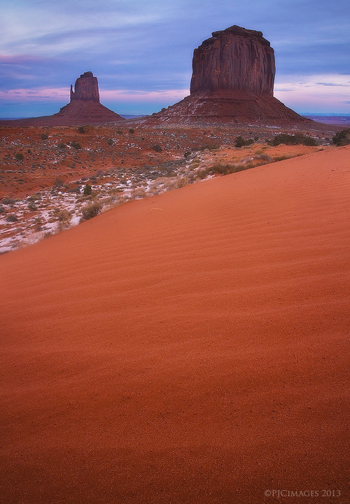
A simple shot I just had to get from Monument Valley a few weeks back. I wanted a shot from the mittens, just because they are so iconic. Everyone always seems to try and get the two mittens and merrick in a horizontal frame, but with some light constraints, I made the most of the location I was at. I chose to get as close to the sand as possible to capture the detail in the small dunes. There was still just a tiny bit of color left in the sky, which complimented the scene. As always, comments and critiques appreciated.

Canon 7d
Canon 17-40mm @17mm
f11
.6 sec
ISO 100
CPL
Tripod.

Comments

13 comments
Comment posted by Chet Dowell on January 26, 2013 at 7:51 PM
This is something different in a really great way. Love the color and detailed texture and ridges in the dune and then the old friendly mittens in the bg. Great job!!!!!!!! Chet
Registered on December 3, 2012, 237 Posts, 1171 Comments
Comment posted by Ed Cordes on January 26, 2013 at 9:27 PM
Very interesting perspective. I like the colors and vertical comp. To my eye a little less sand in the FG would be better.
Registered on November 1, 2003, 451 Posts, 3366 Comments
Comment posted by Tony Kuyper on January 27, 2013 at 12:19 AM
Unique comp and very nice light.
Registered on November 1, 2003, 364 Posts, 22328 Comments
Comment posted by Jack Maloney on January 27, 2013 at 1:15 AM
I have to agree with Ed on this one. A very cool perspective and great warm colors. But I'd like to see a little less sand in the FG. Still a great shot!
Registered on November 5, 2004, 5 Posts, 20 Comments
Comment posted by Zack Clothier on January 27, 2013 at 1:56 AM
I think a 4x5 crop, removing some of the sand, would really help this image. I really like the contrasting warm and cool tones.
Registered on January 28, 2010, 343 Posts, 2257 Comments
Comment posted by Eirini Pajak on January 27, 2013 at 6:46 AM
Nice! I especially like all the untouched sand in the foreground...lots of detail here!
Registered on December 13, 2011, 216 Posts, 1671 Comments
Comment posted by Nick Bristol on January 27, 2013 at 2:12 PM
This is really nice Peter. I love the light and colors you captured and the wonderful detail! I actually like this comp with all the foreground sand with the nice rich color and detail, but it does work well with about half of it cropped off. There is something about the feel of this as you have it that I quite enjoy... :smile: A beautiful scene!

Nick Bristol
Lone Rock, WI
Registered on February 1, 2004, 752 Posts, 14140 Comments
Comment posted by Brian Schrayer on January 27, 2013 at 2:28 PM
It's refreshing to see a different take on this scene. I like the contrast between the warm vibrant reds in the foreground sand and in the mittens and the soft pastel blues and pinks. I would love to see this larger to appreciate all of the detail in the sand and the repeated lines in the sand ripples that lead my eyes throughout the scene.

I often associate bold color and light with your style of photography but you have shown some images recently with more subtle light that really stand out.

EDIT: I just read others' comments about suggesting a crop. When I first saw this last night I had the same thought. However, I wanted to revisit it with fresh eyes before commenting. For me at least I think the question of whether or not to crop would come down to how well the detail in the sand and the texture of the ripples comes across at a larger size. The detail is kind of lost at this size and therefore the foreground loses it's impact and seems to carry too much visual weight. I think if I could see this in a larger format I would appreciate the foreground details much more. Perhaps increasing local contrast in the foreground sand would bring out the details a little better. Sorry to ramble on; hopefully this is helpful.
Registered on May 28, 2004, 114 Posts, 2890 Comments
Comment posted by Eva McDermott on January 27, 2013 at 8:16 PM
A different take on an icon spot Peter. The color looks great! I do agree a crop from the bottom to a 4X5 version might enhance your image.
Registered on January 4, 2009, 1015 Posts, 13229 Comments
Comment posted by Peter Coskun on January 27, 2013 at 11:04 PM
Thanks for the suggestions everyone. As for the crop, I thought about it, but posted the un-cropped version to see your thoughts. In the larger version (for print) the details in the sand are very fine, which doesn't translate well in a small web version. However, even a cropped version will have plenty of fine detail in the sand as well.
Registered on October 31, 2011, 170 Posts, 1240 Comments
Comment posted by Morris McClung on January 28, 2013 at 5:40 PM
With this much mass of sand at this size it pulls so strongly it's hard to even lift my eyes to the mittens. That's due, in part, to the brightness of the sand as well as the mass, I think. The color is pretty strong, but that's all about the artist imo. I like the comp and the light is sweet.
Registered on May 7, 2007, 670 Posts, 19650 Comments
Comment posted by Ben Horne on January 28, 2013 at 6:24 PM
You've wonderfully captured the texture and color of the foreground sand Peter. I get the feeling that I want to run my hands through it. I also like the subtle color you've captured in the sky in the background -- it's very naturally presented which is nice. I do find a disconnect between the brightness of the foreground and of the background though. I would expect the foreground sand to be similar in tone to the rocks/sand at the base of the mittens. Darkening the foreground would certainly lose much of that wonderful color and texture --- but brightening the background would make it appear unnatural --- so I sense that this is something you were also considering. Perhaps a compromise of darkening the foreground just a bit might help unify them, but it would be difficult to completely correct it.
Registered on August 27, 2009, 51 Posts, 959 Comments
Comment posted by Peter Coskun on January 28, 2013 at 8:47 PM
Thank you Morris and Ben. The sand is actually a lighter color than that of the base of the mittens. It's not as red nor clay like in color so that is why it appears brighter. I did darken the foreground down a bit, but might have to do a little more darkening.
Registered on October 31, 2011, 170 Posts, 1240 Comments