Gallery: LandscapePosted January 27, 2013100 views6 comments
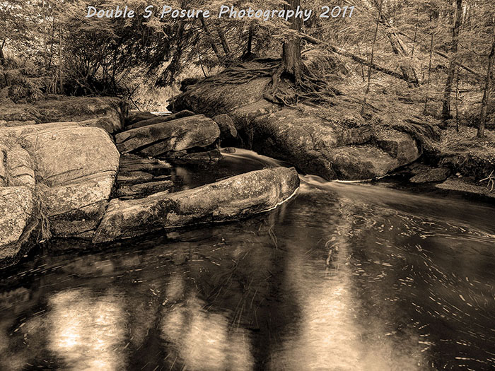
In August, with water levels low, a small stream murmurs through the rocks on its way to the river below.
(Four shot hdr converted to b&w and given a sepia treatment)
Comments
6 comments
Comment posted by Eva McDermott on January 27, 2013 at 7:19 PM
I like this a lot Stan especially your B&W treatment and sepia toning. HDR done well since it doesn't look HDR-ish. Curious, what HDR software do you use?
Registered on January 4, 2009, 1015 Posts, 13229 Comments
Comment posted by Stan Wojtaszek on January 27, 2013 at 7:32 PM
Thank you very much, Eva !!
I took five exposure, one stop apart. Was never satisfied with the result.
(I used to do my hdr the old fashioned way - Photo Shop and masks)
A few months ago I bought Photomatix and gave it a go this past week.
The result - not so good. The top right side still looked very muddy.
A brain stom: try it in b&w.
Better but too many blacks.
The last go-around, I left out the -2 exposure; this is the result.
Much more satified with it.
Registered on August 6, 2012, 21 Posts, 86 Comments
Comment posted by Stan Rose on January 27, 2013 at 11:02 PM
I'm not usually big on sepia, but this has a subtle metallic look and i kind of like it. The scene is very complex--hard to appreciate at this small size but im betting it looks great big!
Registered on September 15, 2005, 836 Posts, 17099 Comments
Comment posted by Lon Overacker on January 28, 2013 at 4:48 PM
Stan,
I really like this scene - there is a great deal of interest that can keep a viewer engaged. I really like the reflection and texture in the water, as well as the rocks and also the very interesting roots of the tree.
I'm really curious though how the color version works. IMHO, the sepia toning is fine, but I'm not sure the monochrome treatment is getting the best out of this scene. The reason is that there is a lot of mid tones and all the interest above the water seem to have little tonal separation allowing me to investigate all the nice details the scene is providing. Perhaps tweaking the individual color channels may help with that.
I do like this quite a bit, just not sure the b&w is working for me; although as Stan commented, viewing images at this size sometimes do them a disservice. I'm guessing a large print would show well.
Lon
Registered on November 24, 2006, 521 Posts, 19147 Comments
Comment posted by Stan Wojtaszek on January 28, 2013 at 8:02 PM
Stan/Lon:
Thanks for dropping by and commenting.
Always enjoy hearing from you.
Always appreciate it. :)
I may have to re-visit the colour version, based on what I learned with the b&w version.
In colour, I found the top right hand quadrant was very muddy and lifeless - the roots and rocks did not separate well.
I was never pleased with any of my results.
As a matter of fact, there's no good reason I still had the file - other than being too lazy to delete it. lol.
Well, actually, I had just deleted it when I got the brain storm to see how it would look in b&w.
Luckily, it was still in my recycle bin.
With the b&w conversion - I'm no expert here; on the other end of the spectrum. If I learn one thing then I've doubled my knowledge.
At any rate, your comments give me more to work with.
Thank ya.
Registered on August 6, 2012, 21 Posts, 86 Comments
Comment posted by Stan Rose on January 28, 2013 at 9:05 PM
Stan, here's what I would suggest based on your response. With color conversions, it's best to start with the color version usually. The reason is that you want to translate the colors into tones based on what feeling you want to elicit from the monochrome. I can't answer that, but as I said this is a complex shot; I think one goal should be to make the subjects clearly identifiable--make the trees stand out from the dirt etc. The way to do that is look at the colors--the vegetation is generally cool colored while ground/rocks are often warm; so you convert accordingly so that those warm/cool transitions are maximized in the tones--it amounts to increasing contrast but in a controlled way.
Registered on September 15, 2005, 836 Posts, 17099 Comments

Comments
6 commentsI took five exposure, one stop apart. Was never satisfied with the result.
(I used to do my hdr the old fashioned way - Photo Shop and masks)
A few months ago I bought Photomatix and gave it a go this past week.
The result - not so good. The top right side still looked very muddy.
A brain stom: try it in b&w.
Better but too many blacks.
The last go-around, I left out the -2 exposure; this is the result.
Much more satified with it.
I really like this scene - there is a great deal of interest that can keep a viewer engaged. I really like the reflection and texture in the water, as well as the rocks and also the very interesting roots of the tree.
I'm really curious though how the color version works. IMHO, the sepia toning is fine, but I'm not sure the monochrome treatment is getting the best out of this scene. The reason is that there is a lot of mid tones and all the interest above the water seem to have little tonal separation allowing me to investigate all the nice details the scene is providing. Perhaps tweaking the individual color channels may help with that.
I do like this quite a bit, just not sure the b&w is working for me; although as Stan commented, viewing images at this size sometimes do them a disservice. I'm guessing a large print would show well.
Lon
Thanks for dropping by and commenting.
Always enjoy hearing from you.
Always appreciate it. :)
I may have to re-visit the colour version, based on what I learned with the b&w version.
In colour, I found the top right hand quadrant was very muddy and lifeless - the roots and rocks did not separate well.
I was never pleased with any of my results.
As a matter of fact, there's no good reason I still had the file - other than being too lazy to delete it. lol.
Well, actually, I had just deleted it when I got the brain storm to see how it would look in b&w.
Luckily, it was still in my recycle bin.
With the b&w conversion - I'm no expert here; on the other end of the spectrum. If I learn one thing then I've doubled my knowledge.
At any rate, your comments give me more to work with.
Thank ya.