Nature Photographers Network
This is the preserved archive of the original Nature Photographers Network. The community continues at naturephotographers.network.
Rodeo sunset
‹ PreviousLandscape GalleryNext ›

Rodeo sunset

by Kathy Barnhart

Gallery: LandscapePosted January 29, 2013379 views16 comments
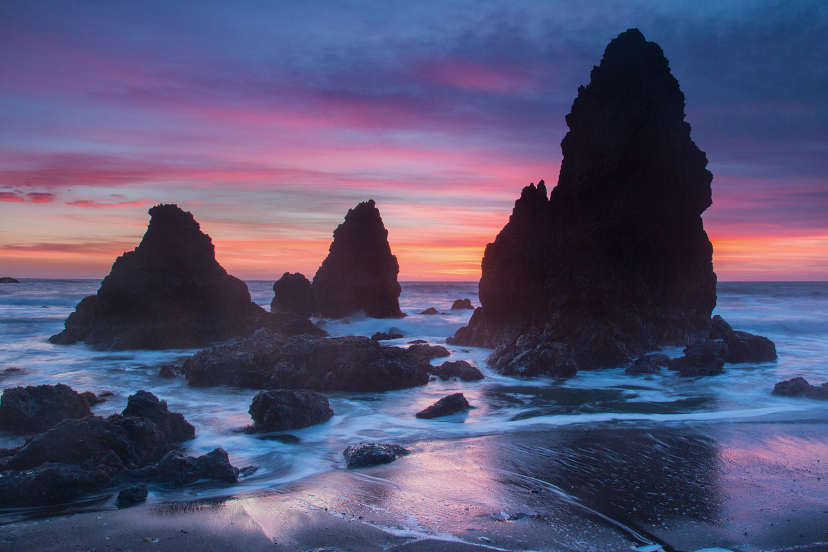
This is an overworked photography site north of San Francisco, but I had never gotten a shot I liked of it until yesterday. I would be interested to know if people think it is too saturated. The natural colors were so strong that I even desaturated a little, but I don't like photos that look "fake."

Canon 5d,M3, ISO 100, 24mm, f/11, 1 sec., ND reverse filter.

Comments and critiques welcome.

Comments

16 comments
Comment posted by Natalie Mikaels on January 29, 2013 at 12:22 PM
Great composition and great colors. Does not look "fake" at all. Nice work.
Registered on November 3, 2011, 45 Posts, 181 Comments
Comment posted by Richard Teller on January 29, 2013 at 1:06 PM
The composition, light and reflection is very nice. the only nit is it would be nice to have more detail in the rocks. It looks like you could bring some detail out by doing some dodging on the rocks.
Registered on August 23, 2010, 1162 Posts, 6692 Comments
Comment posted by Ronald Murphy on January 29, 2013 at 1:06 PM
Looks perfect on my monitor. Could bring out a little more detail in the dark rocks, perhaps.
Registered on March 13, 2012, 279 Posts, 975 Comments
Comment posted by Vincent Piotrowski on January 29, 2013 at 1:16 PM
I like a lot about this image especially the colour in the sky. You've framed it well but I think this scene would be amazing in the rocks in the lower left weren't there (not much you can do about that). Other than that I'd darken the shadows in the lower half of the picture slightly and brighten them in the top. I can see the graduation quite clearly especially on the big rock to the right.
Registered on January 20, 2012, 6 Posts, 48 Comments
Comment posted by Phil Pogledich on January 29, 2013 at 2:23 PM
Beautiful shot, Kathy. This is pretty much the sunset that I saw in my area last night, and I was wondering how it looked over on the coast. Excellent job keeping this natural.

As Vincent and others mentioned, there is a gradient that is evident in the image due to the reverse ND grad. I personally don't mind the rocks being dark...they are quite dark at this location. But I think an effort to balance the gradient a bit from top to bottom would serve to improve the image.
Registered on August 24, 2009, 123 Posts, 3099 Comments
Comment posted by Harry Lichtman on January 29, 2013 at 2:49 PM
Kathy - I think your colors are very natural. In addition to the grad filter issue and uneven light balance in the top portion of the rocks, there is some obvious fringing on the edges of the rocks. Easily corrected in PS during RAW conversion or under the Filters, Lens Correction if not aware. If you haven't tried it before, hand holding and moving the filter gently against the front of the lens will make the transition more natural and maybe not require any fixing post processing. Several second exposures are easier for this technique I have found, as you're not caught lifting or lowering the filter inbetween exposures. A longer exposure allows you to move the filter a couple of times during exposure. A little practice and you'll get the hang of it., But, no coffee prior :biggrin: to keep the hands steady :wink:
Registered on September 17, 2010, 304 Posts, 3507 Comments
Comment posted by Kory Lidstrom on January 29, 2013 at 3:21 PM
I like the comp and color, and especially the reflection in the foreground. I do thing the frothy white parts of the waves are too blue. That's very easily fixed in PS though.
Registered on November 19, 2008, 49 Posts, 1035 Comments
Comment posted by Skip Layman on January 29, 2013 at 3:28 PM
I certainly agree with you about fake and/or oversaturated photos. This looks very natural and pleasing. As for more details in the rocks, I don't see any problem with the picture as is. The rocks could be pure sillouette and it would still be a very nice picture.
Registered on November 1, 2003, 558 Posts, 1704 Comments
Comment posted by Dennis Chamberlain on January 29, 2013 at 5:05 PM
Using an ND grad filter in this case has captured the colors of the sky, but caused underexposure of the rocks. It's a tough situation. The option of taking several exposures to get the dynamic range when there is the motion of the water may not work either. The color seems to be ok except that the water just seems a bit too blue to me. Also, there seems to be a haze in the lower part of the image. Looks like a nice location to shot.
Registered on January 6, 2013, 12 Posts, 44 Comments
Comment posted by Aaron Feinberg on January 29, 2013 at 5:08 PM
Pretty sweet colors indeed! Look about right for the scene. Might have tried to get some water rushing toward or away from the camera for a bit more dynamic nature but that's completely personal preference. Nice take.

aF
Registered on October 26, 2009, 399 Posts, 2789 Comments
Comment posted by Eirini Pajak on January 29, 2013 at 5:44 PM
Pretty scene, I love the sky! The rocks seem to be a bit too dark but otherwise I like it!
Registered on December 13, 2011, 216 Posts, 1671 Comments
Comment posted by Brian Schrayer on January 29, 2013 at 10:06 PM
I like this a lot, Kathy. To my eye the color looks believably natural. I especially like the reflected light in the foreground. This has a wonderful mood!!
Registered on May 28, 2004, 114 Posts, 2890 Comments
Comment posted by Chris Chamberlain on January 29, 2013 at 10:55 PM
The colors look natural and believable to me. Nice comp too! The issue is with the grad. I have 3 reverse too, and never use it. the line of gradation is always too strong. I use a 3 soft and never have a grad line. I pull my filter pretty far down over the horizon. That leads to some dark sea stacks sometimes. But that's better then the grad line IMO. I use manual mode and push the exposure until the histogram is as far right as I can get it without blowing highlites.

Chris
Registered on March 13, 2007, 500 Posts, 8365 Comments
Comment posted by Harley Goldman on January 30, 2013 at 12:17 PM
Beautiful reflections. I love the colors. It does not look fake to me. I am not one for super-saturation and I don't find it over-saturated. Excellent capture.
Registered on November 19, 2003, 586 Posts, 11271 Comments
Comment posted by Kathy Barnhart on January 30, 2013 at 9:19 PM
Thanks everyone for your comments and critiques. I will work on this again, without the reverse ND filter. And I can take care of the fringing easy enough. It seems that people feel OK about the colors not being too unnatural and I appreciate the feedback. This is such a great place to learn.
Registered on November 11, 2011, 404 Posts, 1639 Comments
Comment posted by Morris McClung on January 31, 2013 at 10:37 AM
Beautiful color and light and a fine comp. As mentioned a touch more balance in tone, but not too much. Excellent work.
Registered on May 7, 2007, 670 Posts, 19650 Comments