Nature Photographers Network
This is the preserved archive of the original Nature Photographers Network. The community continues at naturephotographers.network.
Porcupine B&W
‹ PreviousWildlife GalleryNext ›

Porcupine B&W

by Jenaya Launstein

Gallery: WildlifePosted February 2, 2013364 views10 comments
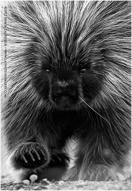
Hey everyone! I really appreciate your comments on my colour version of this image I posted earlier this week.

Every time my dad and I looked at it on our phones and zoomed in for full vertical size, we loved the more aggressive crop. We also balanced the sharpening on the face and front paw...I think it looks better now. I took Gary's suggestion to crop even more off the bottom (amazing how such a minor adjustment can have such a big impact, especially with losing some of the lighter band of quills on the sides!). I did decide to leave his crazy white quill in because it is part of him and I think it adds character!

As we worked on it we kept thinking this could look really cool in B&W. We tried a few different conversion "recipes" in Nik Silver Efex Pro 2 but in the end went with all custom settings to try and keep it accurate to the original while creating a dramatic monochrome. I hope you like it! :biggrin:

Thanks for looking! :wavey:

Nikon D7000
Nikkor AF-S 200-400 f/4 IF-ED @ 400mm
ISO 500
1/500sec @ f/5
Exposure compensation set to -0.3 to control highlights on quills
handheld lying down in brush
Nik Color Efex Pro 4
Nik Viveza 2
Nik Silver Evex Pro 2

Comments

10 comments
Comment posted by Carol Nichols on February 2, 2013 at 8:36 AM
Jenaya, I really like the improvements in this image over your prior post. Both the closer crop and the B&W emphasize all of the good stuff here - the raised paw, the eyes, all the quills covering his body, the patch of white on his snout and that crazy stray quill. I would only suggest removing the white dot below his left eye. This image is clearly a winner! :toast:
Registered on November 7, 2007, 161 Posts, 1420 Comments
Comment posted by Scott Fricke on February 2, 2013 at 10:57 AM
I like the improvements you made, except the B&W conversion, just my personal preference but to me the wonderful color in the original really drew me to the image. Another option for a crop might be to crop up from the bottom to the underside of its belly so all the light areas between its legs are gone. I think it creates an emphasis on the quills, probably more so in the color version. A great image any way you look at it.
Registered on January 19, 2007, 133 Posts, 1448 Comments
Comment posted by Gary Gulash on February 2, 2013 at 10:59 AM
Hi Jenaya. I prefer this version to the original post, the incorporated changes really help (even my suggestion for removing some of the bottom area ! ) I like the way his quill covered body dominates the frame now. Honestly, the wild quill on his snout was something I initially didn't really consciously notice. After someone pointed it out I couldn't stop looking at it and it really bugs me. It's great that you put the time in to rework the photo as per the advise given and your own feelings about it. :toast:
Registered on January 28, 2005, 879 Posts, 12098 Comments
Comment posted by Max Waugh on February 2, 2013 at 2:43 PM
The closer crop and sharper eyes are a big improvement. Gotta admit I prefer the color version as well. I like the subtle yellow tones in the quills and fur.

Max
Registered on September 26, 2008, 428 Posts, 2329 Comments
Comment posted by Brad Hill on February 3, 2013 at 9:12 AM
Hey Jenaya,

I like the tighter crop for sure. I have no issue with your B&W conversion but prefer the colour version...just like the warm browns and yellows of it. Still wishing that the left paw (right side of the frame) was "defogged" (even easier to adjust now in B&W). I personally still wish the "crazy quill" wasn't there (to me detracts more than it adds character) but I'm not suggesting you clone it out...so I guess that one is really a "in a perfect world" comment.

Cheers...

Brad
Registered on May 29, 2007, 431 Posts, 6061 Comments
Comment posted by Lon Sharp on February 3, 2013 at 10:49 AM
The great view point make both versions keepers. Interesting to me, I think the lone wild quill is much less of an eye distraction in the colored version. Hmmmm.
Registered on December 9, 2007, 258 Posts, 9892 Comments
Comment posted by Don Westbrook on February 3, 2013 at 5:10 PM
Ditto Lon's comments. My eye keeps going to that one quill in the B&W that blended better in the color version
Registered on January 4, 2013, 11 Posts, 332 Comments
Comment posted by David E Lester on February 4, 2013 at 12:45 PM
Love the in-your-face B&W..just super!! :toast:
Registered on March 24, 2010, 155 Posts, 793 Comments
Comment posted by John Launstein on February 4, 2013 at 10:48 PM
Hey, Jaye! Well, it's a no brainer for me on which crop/comp I like better...this one has WAY more impact IMO. I personally prefer the stronger contrast and power of the B&W, but also love the warm tones of the full-colour version...frankly I think they both work, and work very well. Great timing and execution to get this one, and I love the low angle and intense look (something I think is also more emphasized in the B&W).

Just love this image. :biggrin:
Registered on April 5, 2011, 223 Posts, 1193 Comments
Comment posted by Morkel Erasmus on February 6, 2013 at 3:09 PM
This rocks Jenaya! For me at least, this has leaped in front of the previous version by a coutry mile...
:toast:
Registered on March 22, 2011, 385 Posts, 2068 Comments