Nature Photographers Network
This is the preserved archive of the original Nature Photographers Network. The community continues at naturephotographers.network.
Falls & Ferns
‹ PreviousLandscape GalleryNext ›

Falls & Ferns

by Neale Dyster

Gallery: LandscapePosted February 11, 2013625 views6 comments
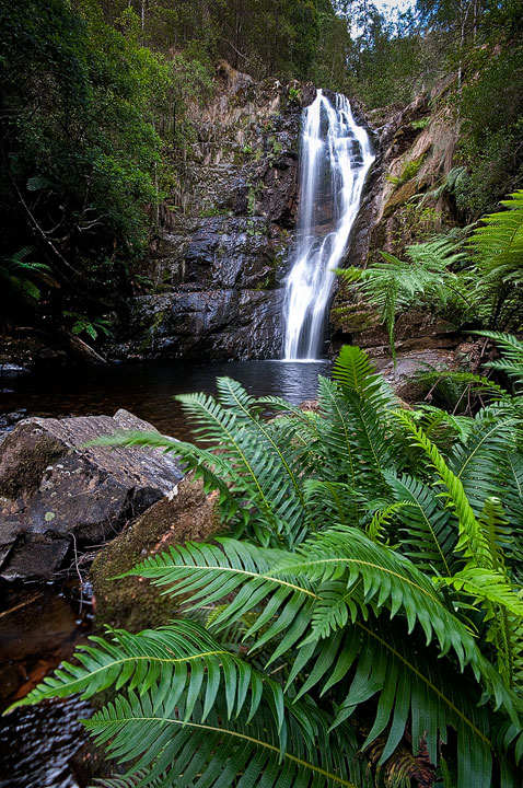
Ok, I have reservations about this one, but after all I'm here to learn so I've posted it!
I like my f/g here but I'm thinking the lens choice has diminished the falls too much. I've tried a couple of different crops, from top right to eliminate the sky, which throws the falls more to the right. Also a crop which brings the falls to the centre but chops off the bottom and left fern tips. I keep returning to this original frame. Middle to top left of frame a bit too uninteresting? (Of course returning when water flow is higher may help too.)
Any thoughts/tips appreciated.
D300, Sigma 10-20 @ 10mm, 1/5th @ f/11

Comments

6 comments
Comment posted by Marc Adamus on February 11, 2013 at 5:35 PM
I personally like the sky cropped out and maybe some off the bottom too. Eliminating the sky would better emphasize the falls. The foreground adds nice depth, but I could see a little less of it too. Nice work overall though.
Registered on September 17, 2005, 780 Posts, 8091 Comments
Comment posted by Neale Dyster on February 11, 2013 at 5:45 PM
thanks Marc, well here's a crop I tried which may work better?
Registered on February 19, 2008, 94 Posts, 738 Comments
Comment posted by Dennis Harding on February 12, 2013 at 1:34 AM
No question!....the crop gives this image a lot more impact.
Registered on January 19, 2011, 33 Posts, 408 Comments
Comment posted by Skip Layman on February 12, 2013 at 12:41 PM
The middle and left don't bother me, they are a part of the natural feel of this shot to me. I would crop out the sky, however. I really like the almost primevil feeling of the shot.
Registered on November 1, 2003, 558 Posts, 1704 Comments
Comment posted by Gary Reed on February 12, 2013 at 5:15 PM
The new crop is much better. You had it critiqued pretty spot on. The crop fixes most of the issues you mentioned. :toast:
Registered on September 19, 2009, 198 Posts, 1074 Comments
Comment posted by Vlad Sadovsky on February 13, 2013 at 12:40 PM
Tighter crop works wonders, starting to look like a columbia gorge :). Nice job with the composition. My only nit left is water seems too bright in two spots, tone it down little ?
Registered on November 12, 2010, 48 Posts, 358 Comments