Comment posted by John Mumaw on March 25, 2013 at 11:09 PM
Wow...are you OK?!
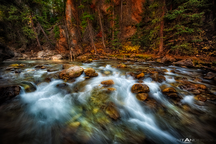
Quite a nice image, but the vignette is a bit too obvious for me and the processing is a bit too heavy handed. I think that if you back off a bit and make this much less obviously 'optimized', than you'll have a real natural beauty on your hands. Sorta like how marc does it.
Registered on September 9, 2005, 62 Posts, 2289 Comments
Comment posted by Matt Anderson on March 25, 2013 at 11:15 PM
John, thanks for your comment. I know my tastes in heavy processing, a dark vignette isn't for everyone. I recall images, locations, people, and experiences as if it were a dream. And so, whatever it is from within that drives our decision making process, it's that characteristic that comes shining through. Another aspect of my processing is that my target in career is high end printing. That said, I spend thousands of hours a year aiming for target that is less perfect in detail, density, acuity, color palette, hue, you name it. So overcompensating for the print world clearly carries over into my images as well.
Registered on September 6, 2007, 346 Posts, 2696 Comments
Comment posted by Peter Coskun on March 25, 2013 at 11:49 PM
I love it. I actually like the dark vignette. It helps focus on the great flow of the water and rich vegetation against the shore in the background. Everyone has their preferences though, so it won't be to everyones taste. Would love to sit down and discuss post processing techniques with you guys some day haha.
Registered on October 31, 2011, 170 Posts, 1240 Comments
Comment posted by Kane Engelbert on March 26, 2013 at 12:28 AM
Wow, I almost feel like I shouldn't respond after that incredibly strange rant.. I just had to lose interest in your weird story about half way down until I saw the "Marc Adamus" name in the last paragraph and had to keep reading. The last paragraph just seemed like more of the same.
I hope I'm not stepping on your name, I just haven't heard of you and this is my first read and view of your image.
Now lets get on to your nice image. Nice comp. Looks like a nice forest, and river scene. The color is perfect. Nice use of luminosity masks and excellent hand blending.
I agree with the keen eye of John M; there seems to be too much vignetting for my taste. Its almost like I'm looking through a telescope. But hey, if heavy vignetting is your thing, and that's the way choose to remember the scene, that's your call!
Registered on June 14, 2009, 63 Posts, 291 Comments
Comment posted by Daniel Rappaport on March 26, 2013 at 12:50 AM
Wonderful flow and glow. Well done, except a little more vignette than to my taste.
Registered on September 9, 2009, 294 Posts, 2006 Comments
Comment posted by Dennis Harding on March 26, 2013 at 4:12 AM
Yes, it's also a bit heavy on the vignette for me but it's a very beautiful photograph indeed.
Registered on January 19, 2011, 33 Posts, 408 Comments
Comment posted by Matt Anderson on March 26, 2013 at 7:00 AM
Thanks for your feedback guys on the vignette. I'll lighten for the final version.
Registered on September 6, 2007, 346 Posts, 2696 Comments
Comment posted by Gary Gosewisch on March 26, 2013 at 9:06 AM
Matt,
I have to agree with John. It appears to me that the contrast is to intense. It is bordering on HDR like quality. I really like the image though.
Oh, I hope the scotch was at least a 12 yr old single malt.
Registered on June 3, 2012, 17 Posts, 59 Comments
Comment posted by Nick Bristol on March 26, 2013 at 3:17 PM
Matt, First off, I quite enjoyed reading your thoughts on this image and the processing. I think this is a beautiful scene and really enjoy the light and color. The long exposure also worked well here imo. The vignette is a little heavy for my personal taste but it is also the reason this has that storybook look and feel I think. Kind of dreamy like which sounds like what you were after in the first place. Pretty cool...
Nick Bristol
Lone Rock, WI
Registered on February 1, 2004, 752 Posts, 14140 Comments
Comment posted by Mae on March 26, 2013 at 3:32 PM
Oh my...quite a wild and elemental cornucopia of emotional color and detail. I like the way you processed this image exactly as it is...purely because this image strikes me as far more about how you feel than the scene itself. An emotionally invested image.
But, that's just my two cents...
P.S. How sweet that you give your friend, Marc, so much credit as well.
Registered on March 22, 2013, 13 Posts, 58 Comments
Comment posted by Morris McClung on March 26, 2013 at 11:17 PM
I love everything about this but the red rocks, Matt. A little too much like HDR for my tastes, but then again, I have been accused of only having taste in my mouth. The water and the trees are making me very envious of your pp skills!
Registered on May 7, 2007, 670 Posts, 19650 Comments


Comments
11 commentsQuite a nice image, but the vignette is a bit too obvious for me and the processing is a bit too heavy handed. I think that if you back off a bit and make this much less obviously 'optimized', than you'll have a real natural beauty on your hands. Sorta like how marc does it.
I hope I'm not stepping on your name, I just haven't heard of you and this is my first read and view of your image.
Now lets get on to your nice image. Nice comp. Looks like a nice forest, and river scene. The color is perfect. Nice use of luminosity masks and excellent hand blending.
I agree with the keen eye of John M; there seems to be too much vignetting for my taste. Its almost like I'm looking through a telescope. But hey, if heavy vignetting is your thing, and that's the way choose to remember the scene, that's your call!
I have to agree with John. It appears to me that the contrast is to intense. It is bordering on HDR like quality. I really like the image though.
Oh, I hope the scotch was at least a 12 yr old single malt.
Nick Bristol
Lone Rock, WI
But, that's just my two cents...
P.S. How sweet that you give your friend, Marc, so much credit as well.