Nature Photographers Network
This is the preserved archive of the original Nature Photographers Network. The community continues at naturephotographers.network.
Please critique
‹ PreviousAvian GalleryNext ›

Please critique

by Joel Thomas

Gallery: AvianPosted April 8, 201398 views3 comments
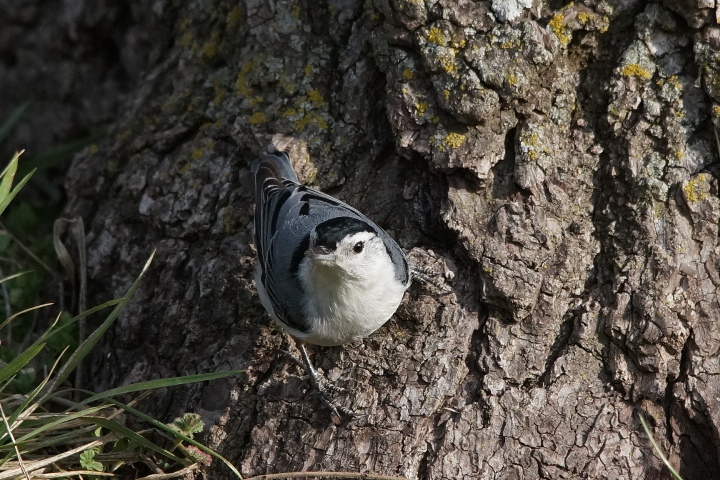
The common white breasted nuthatch.

Thirsty to learn what I can do to make the images better. I feel very humble posting these here as I look at all of the outstanding images on this forum. I am looking for any and all advice.

No editing at all, so a blank canvas for your critiques.

Sony a99
Sony G 70-400mm
focal length 400mm
aperture priority f/8
1/2000
ISO 400
Hand held

Comments

3 comments
Comment posted by Nate Chappell on April 8, 2013 at 1:43 PM
Hi Joel,
Sharpness and detail look good at this size. You can also post an optional larger version of up to 1200 pixels but you have to do it when you first upload the image. The box for that is below the regular upload box.
I like the eye contact here. The bird is right in the middle of the frame which generally would mean that it's too centered, you could take a bit off the right to compensate for that. This also might work well as a vertical.
Although you handled the contrasty light well, it looks like bright light, try to get out earlier in the morning or late in the afternoon to get sweeter, less contrasty light. :toast:
Registered on February 1, 2006, 1158 Posts, 19528 Comments
Comment posted by John Sherman on April 8, 2013 at 2:24 PM
Good exposure for this light, but I agree with Nate's advice on earlier/later light and centered composition. Also a shift in camera position to the right would expose more of the sunlit parts of the bird and positioned the bird against the shadowed background to let it pop (though you need to be careful as the dark cap on this bird could get lost against a dark BG - so rule of thumb light bird against dark BG, dark bird against light BG, black and white bird - you're screwed.) Learn the rules, then break them!
Registered on March 10, 2013, 31 Posts, 142 Comments
Comment posted by Gary Gulash on April 14, 2013 at 1:43 AM
I agree with the previous comments Joel, they cover the key points. You have an all natural setting here with some nice elements to work with. Composition is so important, but so are all the decisions you make technically and esthetically before you squeeze the shutter button. I think that the greenery in the lower left corner could be used to a greater extent, including more of it to fill the lower left quadrant of a vertical composition would be stunning. I would increase the shadows a little bit in your photo editor software in post-processing, the white areas look great - so you exposure choice was very good. Keep viewing the work of others, ask questions, comment on the work of others and you WILL improve. This is a solid photo in itself in my opinion.
Registered on January 28, 2005, 879 Posts, 12098 Comments