Gallery: Man & NaturePosted May 10, 2013261 views4 comments
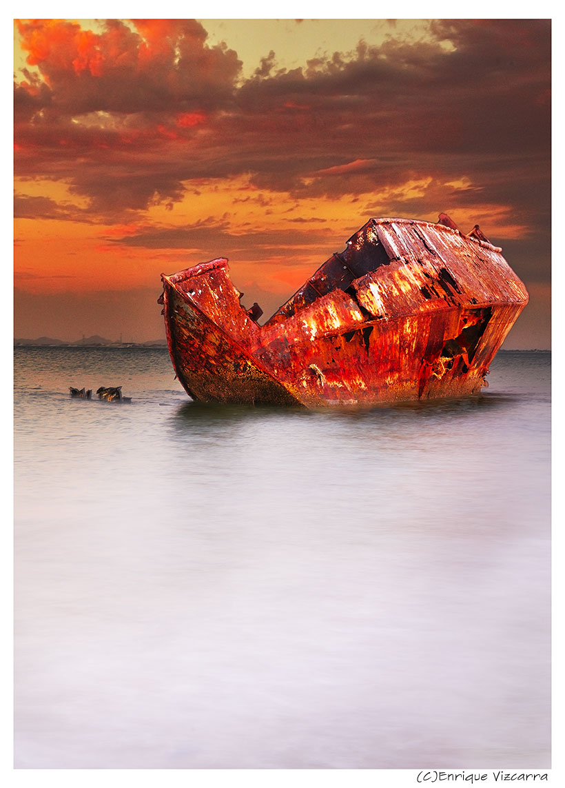
this boat is in San Nicolas de Kino, Soora, Mexico
fusion of 3 pictures
NIKON D300
Lens 16-85mm
CC Welcomes
Enrique Vizcarra
Comments
4 comments
Comment posted by John Clulow on May 10, 2013 at 5:10 PM
This is very colorful and the bright red hue gives it an "other-worldly" feeling, I guess one could say "sureal" insofar as the bright red color is associated with a hull which we would expect to see corroded with rust.
I think that there is too much negative space in the lower, water part of the image; a certain amount of which isn't really doing anything for the image. There is some subtle reflection of the boat into the water that I think would be retained by a 4 X 5 aspect ratio crop versus the 2 X 3 aspect ratio I believe you have used, and also possibly one where the long side is horizontal.. That would then put the boat at roughly the lower third horizontal in the image. I think that would improve it because the boat is the subject, not the water.
Yet another thing to consider is how it would look desaturated, Black-and-White. It definitely has a more realistic feeling, I think, and looks especially good after a levels adjustment where the right, highlight slider is moved a little to the left so that it is at the right side of the histogram. The B&W seems to convey more of a sense of loss and decay whereas the bright red, again, seems more incongruous with the present condition of the boat
Registered on November 1, 2012, 155 Posts, 1079 Comments
Comment posted by Richard Teller on May 10, 2013 at 6:27 PM
Great color and composition. This is a very artistic image.
Registered on August 23, 2010, 1162 Posts, 6692 Comments
Comment posted by Grant Collier on May 28, 2013 at 1:06 AM
I'm late to the game, but this is a superb image. Don't change a thing. IMO the negative space is very helpful to the image, as are the dramatic rusted colors on the ship.
Registered on July 29, 2005, 73 Posts, 430 Comments
Comment posted by Enrique Vizcarra on May 30, 2013 at 9:50 PM
John Clulow
Thank you very much for yours comments
Richard Teller
Thank you very much for yours comments
Grant Collier
Thank you very much for yours comments
Registered on September 10, 2009, 223 Posts, 393 Comments

Comments
4 commentsI think that there is too much negative space in the lower, water part of the image; a certain amount of which isn't really doing anything for the image. There is some subtle reflection of the boat into the water that I think would be retained by a 4 X 5 aspect ratio crop versus the 2 X 3 aspect ratio I believe you have used, and also possibly one where the long side is horizontal.. That would then put the boat at roughly the lower third horizontal in the image. I think that would improve it because the boat is the subject, not the water.
Yet another thing to consider is how it would look desaturated, Black-and-White. It definitely has a more realistic feeling, I think, and looks especially good after a levels adjustment where the right, highlight slider is moved a little to the left so that it is at the right side of the histogram. The B&W seems to convey more of a sense of loss and decay whereas the bright red, again, seems more incongruous with the present condition of the boat
Thank you very much for yours comments
Richard Teller
Thank you very much for yours comments
Grant Collier
Thank you very much for yours comments