Nature Photographers Network
This is the preserved archive of the original Nature Photographers Network. The community continues at naturephotographers.network.
Regal Tulip WC #584
‹ PreviousWeekly Challenge GalleryNext ›

Regal Tulip WC #584

by Jim Lockhart

Gallery: Weekly ChallengePosted May 16, 2013273 views6 comments
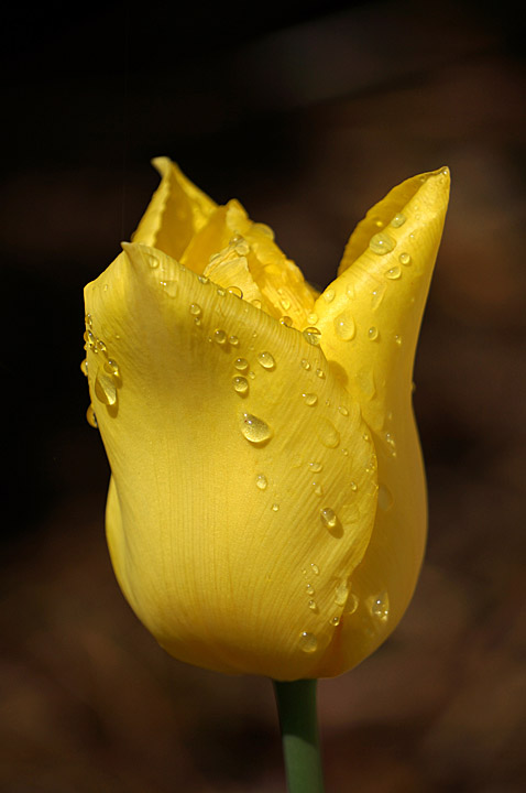
Another flower shot taken after a recent sprinkle. Wishing I had stopped down more to increase the DOF. Sony Nex 6, ISO 100, f/6.3, 1/1250, 55-300mm lens at 300mm, handheld. Sharpened in PSE. Comments and suggestions always welcome and thanks for viewing.

Comments

6 comments
Comment posted by Wayne Bartz on May 17, 2013 at 1:03 PM
I like the DOF on this shot, I think it helps the water drops to stand out.
Registered on May 12, 2007, 56 Posts, 92 Comments
Comment posted by Carolyn Derstine on May 17, 2013 at 9:09 PM
What a lovely beauty! The lighting helps highlight the lovely shade of yellow and the many raindrops. I guess more DOF is often nice but I think this looks fine as is too. The front is sharply focused, allowing us to see the fine texture in this tulip. I'm not a fan of the dirt-like background. Could darken it or change the color in postprocessing if you wished. Or when shooting, throwing some black velvet behind the flower would allow for lots of DOF and really show off this flower on a black background. Just my thoughts. . . :smile:
Registered on February 16, 2011, 610 Posts, 3684 Comments
Comment posted by John Clulow on May 18, 2013 at 9:37 AM
Lovely!
Registered on November 1, 2012, 155 Posts, 1079 Comments
Comment posted by Mark Seaver on May 18, 2013 at 11:24 AM
Wow, how bright was it shooting at 1/1250 and iso 100? This is a lovely view with lots of details and great collection of raindrops. From a dof point of view, this works very well as presented, but I could also see getting the flower tip pointed this way sharp as a subtle, but nice improvement.
Registered on January 23, 2011, 1103 Posts, 17270 Comments
Comment posted by Jim Greenwood on May 18, 2013 at 1:51 PM
Yeah, I agree with you ... a little more DOF, just enough so that the entire flower had been in sharp focus, would have been ideal I think. In response to Carolyn's comment, I don't mind the brownish background. I think it complements the yellow flower nicely, and reflects the outdoor setting. In fact, I'm wishing that this had filled the upper left background too.
Registered on November 9, 2003, 229 Posts, 1523 Comments
Comment posted by Dennis Plank on May 18, 2013 at 11:51 PM
Beautiful, Jim. the dof looks adequate to me. Only the furthest petals are soft and I kind of like them that way.

:toast:
Registered on January 28, 2008, 1767 Posts, 23192 Comments