Flowing Texture
by Lon Overacker
Thanks for your comments on my previous image, much appreciated.
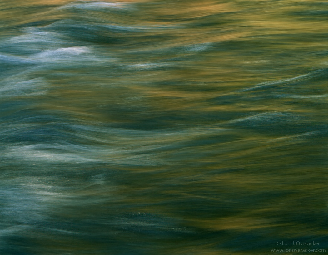
I expect the response on this one to be a hit or a miss. The transparency was a bit underexposed and so I had to do some rescuing with the processing including some noise reduction.
This is the Merced river in the late afternoon while the warm light reflects off the granite walls, just up river from Valley View.
Would love your thoughts, reactions to this image. Oh, and I'm really struggling with a title. Feel free to offer yours!
4x5, Nikkor 300mm, Provia 100F, f/22 @ 1/2s
Lot's of Tony Kuyper's masks and actions!
Thanks!
Lon

Comments
16 commentsSorry I cannot help with the image naming. I've had to call upon my wife to deal with my own these days.....
Title is tough. Golden Reflections?
When I have a hard time with a title, I often just go for the one word that I feel sums up the photo.
If you are interested in trying a few changes, I'd suggest looking at first a horizontal flip. That puts the highest luminance on the right side and gives it a more left-to-right flow.
Secondly, you might look at a levels adjustment to bring the highlight slider in a bit towards the left. This definitely changes the mood of the image, but it also brings out more of the color and lines of flow.
My two cents. But it is very nice as is.
John - great observations and suggestions. I believe, like you do, in the importance of direction, the western Left>right, up>down orientation and flow to compositions. I routinely even offer suggestions like yours like rotating an in image, or cropping to create better balance, etc. I also know you pay attention to things like the Rule of Thirds, etc. So I understand and appreciate your observations, not only on my image, but others you critique as well. SO, I like and agree with the thought of flipping this horizontally because as presented, the brighter parts of the image on the left in a sense "block" the eye from flowing left to right. I'm with ya. I did flip and agree it "feels" better to my eye. Here's the BUT. for the same reason flipping the image looks good to the eye, is the same reason now that the "flow" isn't right. While it's more subtle in this orientation, the actual water flow is now right to left, which works against what we're trying to accomplish by flipping the image to start with. In the end, I left it as captured and presented, but most certainly thought about this.
Also, your Levels/highlights suggestion is a good one. Unfortunately for me, the image falls apart with noise as I get brighter. I would like it, but the base image just isn't of good enough quality. This won't ever see print. It's much easier to hide defects here on the web.
Thanks again,
Lon
And sorry I can't help you finding a title. I'm always struggling to find title for my images.
Nick Bristol
Lone Rock, WI
Ed
Its a soothing image. I like how it feels just as is with regards to both light level and direction of flow. It looks to me, due to the shutter speed and how it caught the flowing water, like it was painted with brush strokes. So as for a title, while flowing texture is ok, I thought brushed light might suit this well.
I can see that boosting the whites would add noise for a large print, but may be OK for a small print.
--P