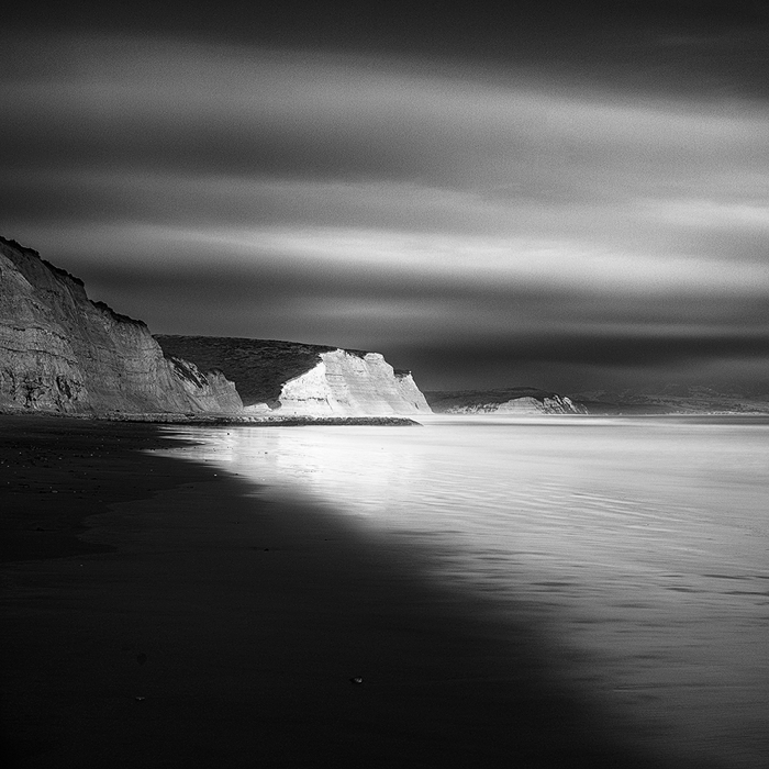
I was going through Ansel Adam's "Making of 40 Photographs" and I was wonderstruck with how much attention Ansel gave to developing the negative.The Zone System is such an amazing tool to have while developing, and it holds just as good in this digital era. Inspired by the imagery, and the creative process behind them, I attempted a black and white conversion of one of my seascapes that I had been wanting to process for quite some time. The digital darkroom truly gives us so much to choose from, if only we let ourselves be open to the choices. While I'm well and truly miles away from creating timeless work like Ansel, I'm grateful for being able to be inspired by his work.
Basic RAW processing, simple dodge and burn and some adjustment layers.
Tech : f/11 ISO 100 36s with a 10 stop ND filter.
Your comments and suggestions are welcome as always!


Comments
14 commentsEd
And in the honor of Adams, you've done this beautiful justice. In fact I could envision your processing here just as if it might have been something that came out of his darkroom. Excellent work here.
Along the lines of Mark's comments, but hard to tell at this size, is that the clouds seem a little noisy - or is that grainy? And if there is any detail at all that shows up in print, I'd say this looks great. Really like the contrast and tonal range.
You didn't mention, but is this Drakes beach/bay out at Point Reyes? Sure looks like it.
Lon
Nick Bristol
Lone Rock, WI
David, it's kind of weird because on my laptop at home ( a macbook), I can see detail in the sand pretty well. The same image when viewed on my work computer, a PC shows a darker image. I need to find a way to account for this brightness difference!
Thanks Ed, I guess a few people have mentioned lack of detail in the sand. Guess I need to look into it.
Thanks Bill, I guess there is some discrepancy across displays. Any idea of how to account for it?
Thanks Mark. I intentionally added a bit of grain to the image for aesthetics, but I guess the compression produced some artifacts and it looks a bit noisy. I'll fix that in a repost.
Thanks very much Phil, I'm glad you like it!
Thanks Paul, like I said above, the added grain and the compression I had to do to post it here has rather made it less like grain and more like noise. Will fix it
Lon, those are some very kind words! Thank you. Yes, this is Drake's beach at Point Reyes. It was a cloudy evening with occasional moments where the sun shone through and spotlit these rocks. As for the noise, I guess added grain + compression = nasty noise
Thanks Barry, glad you like it. I checked the histogram after processing, and there was no clipping on the highlights. I intentionally dodged the highlights there to draw the eye. Also if you see the larger version ( I will post one soon), you'll be able to see detail there, although rather faintly, since the original RAW didn't have too much to start with
Thanks very much Nick!
The beach looks dark on my monitor, too. I can see some detail, but I think the image wouldn't suffer if it were a little lighter.
There generally is no way to account for differences among other peoples' monitors. They are all different.
A problem does arise when you make a print. Prints tend to be darker than what we see on our monitor. This can be especially detrimental to black and white. I don't print my own; I have them professionally printed - my printer's monitor is calibrated to his printer and paper, so it is WYSIWYG. I plan to have some large black and white prints made soon and I will review them on his monitor, and have him make suitable adjustments before printing. Because prints tend to be darker, I think it's probably a good practice to err on the side of making shadows a little lighter.
By the way, I have Adams book too. I greatly admire his work.
I love the book!