Nature Photographers Network
This is the preserved archive of the original Nature Photographers Network. The community continues at naturephotographers.network.
Vale and Swell + REPOSTS
‹ PreviousLandscape GalleryNext ›

Vale and Swell + REPOSTS

by Catherine Reilly

Gallery: LandscapePosted June 11, 2013179 views16 comments
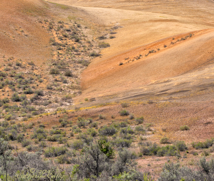
The Painted Hills series continues with this image of an intimate area of varied landscape features and colors.

GH3, tripod, cpl; Lumix 100-300 G Vario @ 100; f 22, 1/25, ISO 250.

Thanks again for viewing and offering your thoughts.

Comments

16 comments
Comment posted by Stan Rose on June 11, 2013 at 11:19 AM
Some nice subtle colors and textures here, Catherine. It looks a tad soft on my monitor, don't know if thats intentional or not, im sure the original is crisp. :smile:
Registered on September 15, 2005, 836 Posts, 17099 Comments
Comment posted by Nick Bristol on June 11, 2013 at 1:10 PM
Catherine, There are some very nice textures and colors in this landscape. It does look a little soft on my monitor as well. I think a bit of sharpening would help the appearance of this, at least for me. :smile:

Nick Bristol
Lone Rock, WI
Registered on February 1, 2004, 752 Posts, 14140 Comments
Comment posted by Mark Seaver on June 11, 2013 at 2:01 PM
I like the colors and the "flow" in the hills. I think this would benefit by cropping from the bottom to get rid of the tall shrubs. They feel pretty busy and cluttered, while everything else is open and airy. I agree that it does look a bit soft.
Registered on January 23, 2011, 1103 Posts, 17270 Comments
Comment posted by Nancy Lea Sandy on June 11, 2013 at 3:53 PM
You've captured the flow of this landscape so very nicely. Fg vegetation and the lovely warm colors are definite pluses.
Registered on January 24, 2011, 576 Posts, 6942 Comments
Comment posted by Paul Breitkreuz on June 11, 2013 at 4:58 PM
Nice all around color here, Catherine. I think the main composition is in the upper 2/3 rd area. So I can see the small crop at the bottom as well as the web sharpening item for image enhancements. Maybe even a bit of contrast too. The main comp is there it just needs some slight tweaking. :cool:
Registered on February 25, 2006, 525 Posts, 8448 Comments
Comment posted by Lon Overacker on June 11, 2013 at 5:13 PM
Catherine,

Have to jump on the bandwagon and agree with others about this appearing soft. Hard to tell at this size too whether or not it's just a web sharpening/compression thing, or if the original is sharp. I find the soft, OOF, brush in the immediate foreground to be mildly distraction. I think this might even be a stronger image if you cropped up from the bottom to just of the top of the brighter green, middle bottom.

I do think your title "Vale and Swell" is quite fitting! And I do really like the gentle lines and forms created by cutting this more intimate view out of the larger landscape. So I'd say good eye on this one.

Lon

Registered on November 24, 2006, 521 Posts, 19147 Comments
Comment posted by Catherine Reilly on June 11, 2013 at 6:38 PM
Thanks to all for pointing out the sharpening issue-- oopsie! :redface: Here's a repost; how does it look?
Registered on August 16, 2006, 603 Posts, 9192 Comments
Comment posted by Catherine Reilly on June 11, 2013 at 6:40 PM
And here is a vertical comp that deals with the suggestion of cropping the foreground...

I like the horizontal for what it shows of the lay of the land on the right, though...
Registered on August 16, 2006, 603 Posts, 9192 Comments
Comment posted by scott lanz on June 11, 2013 at 7:04 PM
The horizontal repost looks better/sharper, Catherine, and the vertical looks very sharp and good. I think I prefer the vertical comp as well.
Registered on November 14, 2003, 840 Posts, 12902 Comments
Comment posted by Ed Lowe on June 11, 2013 at 7:18 PM
I too like the horizontal image the best, Catherine and because of that I'd like to suggest an alternate crop to you. I think if you crop about 1/5th from the bottom to just above the bushes and make this more of a pano you would still retain the lay of the land that you suggested. Just another idea to muddy the waters. :smile:

Ed
Registered on February 7, 2004, 414 Posts, 7115 Comments
Comment posted by Lon Overacker on June 11, 2013 at 8:44 PM
Catherine, thanks for reposting. Clearly both new versions are sharper and an added benefit to that, they also appear to have better contrast and I even perceive the color to look better (prob cause of the contrast.)

I was also thinking of Ed's horizontal crop. but the vertical works too. Presentation much better, gives us a better impression!

Lon
Registered on November 24, 2006, 521 Posts, 19147 Comments
Comment posted by Eva McDermott on June 11, 2013 at 9:05 PM
Both reposts are much better but I prefer the vertical in this case (though I usually don't like verticals this one works well).

Thanks for the reposts.
Registered on January 4, 2009, 1015 Posts, 13229 Comments
Comment posted by Paul Breitkreuz on June 11, 2013 at 9:13 PM
I'm typically in favor of horizontal images, however, this vertical is a better image overall as a finished item IMO. The boost in contrast however obtained really brings these images to life. Good job with both reworks. :wink:
Registered on February 25, 2006, 525 Posts, 8448 Comments
Comment posted by Vance Gese on June 11, 2013 at 11:36 PM
Love the gentle curve of the land sweeping across the frame. Much prefer your second post with the improved sharpening and the slightly higher contrast.
Registered on November 13, 2008, 298 Posts, 6629 Comments
Comment posted by Joseph Campisi on June 12, 2013 at 3:05 PM
Number three = winner Catherine. The vertical comp is much stronger here IMO. I understand what you mean about the horizontal showing the lay of the land more, but the vertical as stronger visually, at least for me. Man, I gotta get out here this year!
Registered on November 24, 2008, 304 Posts, 3211 Comments
Comment posted by Nick Bristol on June 13, 2013 at 11:26 AM
Catherine, The repost look much better! I like the vert crop best now! :smile:

Nick Bristol
Lone Rock, WI
Registered on February 1, 2004, 752 Posts, 14140 Comments