Cotton Candy Stone w/repost
by Peter Coskun
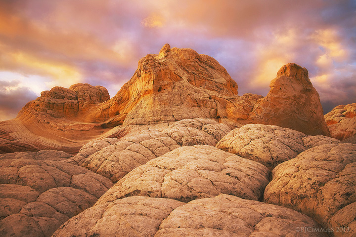
Took a break from looking at my white pocket stuff for a few days, then went back and processed this one, but not quite sure how I feel overall about it. I pushed the colors here quite a bit for a more artistic interpretation, but hopefully they still feel a somewhat natural. Double processed the RAW file for better control, and did some painting by hand to bring out some of the more vibrant colors in the sky. Comments and critique are greatly appreciated.
Canon 7d
Canon 17-40mm @17mm
ISO 100
f14
1/5 sec
CPL
Tripod

Comments
30 commentsEva, I surprisingly did not add much glow to this image except in the sky to bring out a bit more color and smoother textures, but noticed also that the landscape had a somewhat glowing appearance which I wasn't sure how to tone down.
That's not the area of concern, though. It's the top part of the landscape and the orange in the skies that need to be pulled back a bit to keep this more in the realm of believable. I do understand artistic interpretation, but there's a fine line between that and credibility. I hope you take this critique in the spirit for which it's intended. You've got a real fine image here!
John, I know exactly what you mean. I was playing around with different variations of the image and seeing what could be done with it. I have a much more natural shot from this spot with no orange in the sky that I might like a bit more (I think I posted in on 500px a while ago).
I mostly agree with John on this one. I like the comp and I think it has potential, but the overall orange color cast looks a tad artificial and creatively introduced. I would suggest you back off the orange in the sky a look to neutralize the color cast. Trust that the natural color, shape and texture of the formations will hold sufficient interest and intrigue.
Later, Shane
I think this is beautiful! I do prefer the repost, but the change is rather subtle. Not sure how you would process this differently without seeing the RAW or having been there. The sky/clouds especially have a dreamy look, but it sure seems to pair well with the fascinating rock formations. I really like what you have here.
Lon
Gary.
The highlights are a tad bright up top, but other than that, I can't spot anything else that may be off. IMO, this is a great use of artistic interpretation!
I had a look at the other one on your site. I think it looks great, still looks beautifully dramatic to me! Considering this is your first time to this location I think you came away with some great images.
Later,
Shane