Nature Photographers Network
This is the preserved archive of the original Nature Photographers Network. The community continues at naturephotographers.network.
Mountain Flow + Repost
‹ PreviousLandscape GalleryNext ›

Mountain Flow + Repost

by Peter Coskun

Gallery: LandscapePosted August 8, 2013360 views14 comments
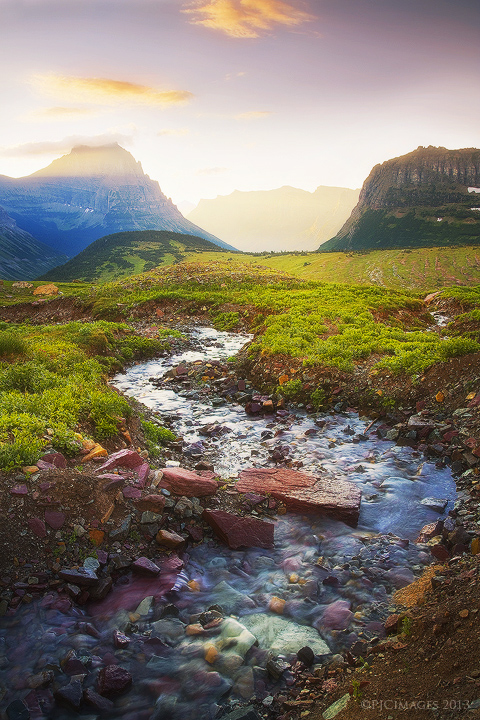
A small stream flows down from the base of clement's mountain into the morning sunrise. I was drawn to the way the stream weaved through the meadows and out into the sunlight. One of the many images I captured during my week long visit to Glacier National Park. Comments and critiques appreciated.

Canon 7d
Canon 17-40mm @17mm
f14
ISO 100
.6 sec
Tripod

Comments

14 comments
Comment posted by Joerg Bonner on August 8, 2013 at 5:30 PM
great use of the snaking stream! i find the blue cast in the left mountain's shadows to be a bit too intense..
Registered on September 5, 2011, 44 Posts, 221 Comments
Comment posted by Morris McClung on August 8, 2013 at 6:03 PM
Looks like Glacier did not disappoint you. :biggrin: The foreground is delicious! While the bright light does add to the depth, my preference would be for a little more contrast in that area. Particularly to bring out the strong ray of light across the peak. Beautiful shot! Should be lots to come from your trip.
Registered on May 7, 2007, 670 Posts, 19650 Comments
Comment posted by Peter Coskun on August 8, 2013 at 6:06 PM
Thank you Joerg and Morris.

Joerg- I didn't realize how strong that blue cast was. I will definitely tone that down and warm it up a bit.

Morris- The weather was less than ideal for much of the trip. No spectacular sunrises or sunsets. This was shot on the last morning where there was actually some nice light. It was rainy or foggy 50% of the time.
Registered on October 31, 2011, 170 Posts, 1240 Comments
Comment posted by Peter Coskun on August 8, 2013 at 6:36 PM
Here is a quick repost trying to rid of the blue cast
Registered on October 31, 2011, 170 Posts, 1240 Comments
Comment posted by Aaron Feinberg on August 8, 2013 at 6:46 PM
Crazy light and color. Would say the bg is a tad too bright for my taste...but more importantly the stream runs off the left side of the frame...and then so does my eye. Big pet pev for me. Those fg rock colors are NUTS here.

aF
Registered on October 26, 2009, 399 Posts, 2789 Comments
Comment posted by Peter Coskun on August 8, 2013 at 7:04 PM
Thanks Aaron. I too wish the stream didn't flow to the left, but I was quite limited on how to compose this scene. If I shot more to the left I would have boardwalk in the frame and the right mountain would be cut off too much for my tastes. Had to compromise a bit here. As for the brightness, I wanted to emphasize the light from the rising sun as it just crest over the mountains.
Registered on October 31, 2011, 170 Posts, 1240 Comments
Comment posted by Jeremy Kessler on August 8, 2013 at 8:48 PM
Beautiful Image Peter. I'd prefer a little less magenta in the upper portion but that's just a personal preference. Do what you like you best!

Looking forward to seeing more.
Registered on September 13, 2007, 36 Posts, 1283 Comments
Comment posted by Scott Smorra on August 9, 2013 at 12:54 AM
Really cool colors here Peter, especially in the foreground rocks. I like the classic "S" curve of the stream. The shadows are definitely improved in the repost. I like the sky color better in the original version (less magenta).
Registered on November 2, 2009, 161 Posts, 2143 Comments
Comment posted by Harry Lichtman on August 9, 2013 at 8:48 AM
Peter - In some ways, I prefer the original. The green grasses in the re-post seem too electric given that the light source is skimming across the peaks, not down at the grasses. Orig. looks more believeable. The blues/cyans in the mnt. still need some work IMO. I would first de-sat. them a little and see if that does the trick. If not, then s lectively adjust the blue and cyan colors a little. Lastly, the magenta sky seems out of place with the warm lighting - one or the other but both make it feel like it is a composite from different times of the day. I think there is some good potential that can easily be fixed, but you be the judge!
Registered on September 17, 2010, 304 Posts, 3507 Comments
Comment posted by Stan Rose on August 9, 2013 at 2:22 PM
eeek! Wayyyyyyy too saturated. Im shocked. dismayed. OK, not really, but i cant really get past the sat here. Nice light though
Registered on September 15, 2005, 836 Posts, 17099 Comments
Comment posted by Peter Coskun on August 9, 2013 at 3:46 PM
I must have gotten way too carried away with the processing here. Here is an updated version that is much closer to the actual scene that was before me.
Registered on October 31, 2011, 170 Posts, 1240 Comments
Comment posted by Jared Warren on August 9, 2013 at 8:28 PM
Latest repost looks great- the initial posts had a kind of fairyland feel to them, but it was unclear whether that was the intent. Very nice!
Registered on May 11, 2012, 84 Posts, 931 Comments
Comment posted by Stan Rose on August 9, 2013 at 11:33 PM
You lost alot of contrast in the repost--you could probably safely add some back. I actually liked the vibrant greens in the original--and the blue in the creek--it was the purple in the sky and rocks that kind of threw me. Keep at it, a few more tweaks and i bet you'll nail it. :wink:
Registered on September 15, 2005, 836 Posts, 17099 Comments
Comment posted by Peter Coskun on August 10, 2013 at 1:00 AM
Thanks Stan, I just wanted to show what the scene actually looked like compared to what I had done with it for processing. It's a shot I will probably keep working on, but I think I found a nice balance between the first version and the last repost to keep it more natural yet having it pop just a bit.
Registered on October 31, 2011, 170 Posts, 1240 Comments