Nature Photographers Network
This is the preserved archive of the original Nature Photographers Network. The community continues at naturephotographers.network.
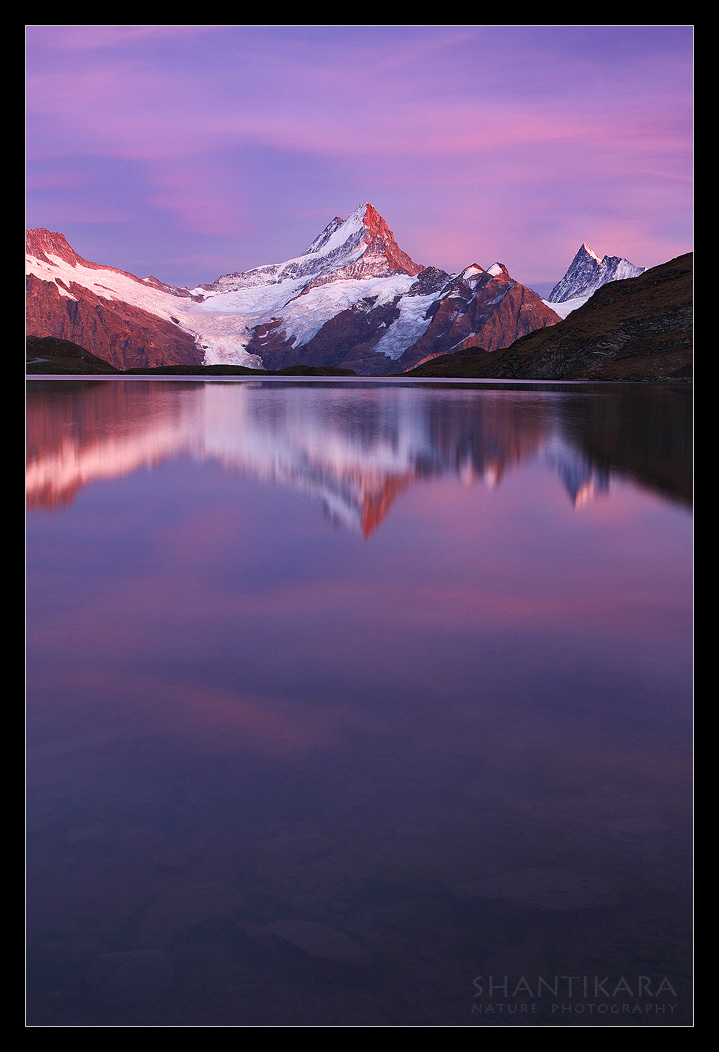
Bachsee Reflection
‹ PreviousLandscape GalleryNext ›

Bachsee Reflection

by Shantikara Valuska

Gallery: LandscapePosted August 17, 2013301 views8 comments
Bachsee Reflection, Switzerland

I had some difficulty to process this one, the light was soft and the original file was a bit flat, I am not sure how much can I push with the processing - tones, contrast and saturation-wise.

I'm interested in your thoughts.

Shantikara

Canon 40D + ef 17-40
1 exposure f/9.1 13 sec

Comments

8 comments
Comment posted by Bill Leggett on August 17, 2013 at 12:34 PM
Really like the light and colors in this, and the arrangement of the mountains. Processing looks really good on my monitor. I like the comp, but if mine I might consider the option of cropping just a bit off the bottom.
Registered on July 21, 2004, 706 Posts, 3233 Comments
Comment posted by Ron Pullen on August 17, 2013 at 1:45 PM
You may consider a square crop, just too much open space at the bottom for me. Overall color looks good to me. Ron
Registered on December 18, 2005, 74 Posts, 1413 Comments
Comment posted by Navin Sarma on August 17, 2013 at 2:32 PM
I love it Shantikara, I like how the comp stretches into the submerged rocks. Your colors look believable and dramatic.
Registered on July 17, 2011, 233 Posts, 1373 Comments
Comment posted by Preston Birdwell on August 17, 2013 at 8:03 PM
Shantikara,

The color and contrast look fine to me. I wouldn't push it any further. You might try pulling a little more detail out of the dark area on the right. The composition is nice, but I do agree regarding a crop from the bottom.

The mountains and sky are beautiful and the reflection works nicely: capitalize on that.

--P
Registered on November 1, 2003, 471 Posts, 5188 Comments
Comment posted by James Fougère on August 17, 2013 at 11:04 PM
I also like the square crop idea :biggrin: Nice reflection.
Registered on October 25, 2010, 41 Posts, 831 Comments
Comment posted by Chris Stenger on August 18, 2013 at 4:03 AM
Nice picture and well processed. I think the image would be stronger in landscape format or perhaps square format as already suggested by others.
Registered on May 9, 2013, 27 Posts, 163 Comments
Comment posted by Gary McGhee on August 18, 2013 at 1:57 PM
Lovely colour and a very tranquil feel to this Shantikara.

Gary.
Registered on April 15, 2010, 142 Posts, 2416 Comments
Comment posted by Ian Cameron on August 18, 2013 at 9:52 PM
Shantikara, that is a really lovely shot with excellent processing and I think the colours look just fine. Initially I agreed with another poster that a slight crop from the bottom might be in order but whilst I appreciate the squarer crop I think I would miss the delicate visibility of those submerged rocks in the immediate foreground.
Registered on August 6, 2004, 1125 Posts, 3318 Comments