Nature Photographers Network
This is the preserved archive of the original Nature Photographers Network. The community continues at naturephotographers.network.
Gloaming on 9
‹ PreviousLandscape GalleryNext ›

Gloaming on 9

by Morris McClung

Gallery: LandscapePosted December 9, 20132,415 views23 comments
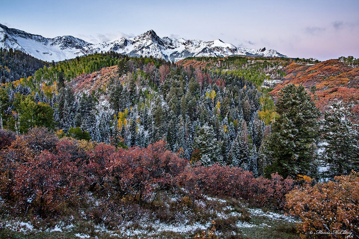
Taken on county road 9 near Ridgway, Colorado this fall. My impression of this fall was that the color palette was drastically different from other years. There was just not a lot of bold, bright color to be found. Much more somber and muted. This was especially true of this area and in twilight light.

C&C always welcome, and thanks for looking,

Large Version included,

Morris

TK's wizardry always.

Comments

23 comments
Comment posted by Peter Richter on December 9, 2013 at 1:30 PM
Amazing mixture of colors and elements for me, Morris. I can really feel the frosty atmosphere.

Peter
Registered on November 10, 2010, 218 Posts, 2723 Comments
Comment posted by Preston Birdwell on December 9, 2013 at 1:33 PM
Beautiful scene, Morris. I like the various layers of shapes and colors. The muted color goes well with the mountins and the sky. You did a nice job with this one.

--P
Registered on November 1, 2003, 471 Posts, 5188 Comments
Comment posted by Harley Goldman on December 9, 2013 at 1:46 PM
Beautiful mixture of layers and colors. This definitely needs to be viewed large. The smaller version does not really do justice to the detail.
Registered on November 19, 2003, 586 Posts, 11271 Comments
Comment posted by Bill Chambers on December 9, 2013 at 1:59 PM
A beautiful scene Morris, especially the larger version. The mountains are what really catches my eyes here - their rugges beauty is really something to behold. The color, although somewhat muted as you said, is still beautiful.
Registered on April 10, 2005, 753 Posts, 21216 Comments
Comment posted by Mark Metternich on December 9, 2013 at 3:37 PM
GREAT color variation and wonderful scene Morris!!!! :toast:
My only nit is the sharpening on the larger version. Not sure why but it seems to lack a fineness.
Registered on June 19, 2009, 276 Posts, 6240 Comments
Comment posted by Morris McClung on December 9, 2013 at 3:41 PM
Thanks, guys.

Mark, my thought was compression did not like the amount of detail. Crunched! :mad: The tiff looks sharp.
Registered on May 7, 2007, 670 Posts, 19650 Comments
Comment posted by Chris Stenger on December 9, 2013 at 3:48 PM
Great image with nice colours. I would like to see a bit more of the sky. In my opinion the image is more balanced witjh a slightly larger sky
Registered on May 9, 2013, 27 Posts, 163 Comments
Comment posted by Nick Bristol on December 9, 2013 at 5:04 PM
A beautiful scene Morris! Sometimes the muted autumn colors can really look wonderful, and you show that here!

Nick Bristol
Lone Rock, WI
Registered on February 1, 2004, 752 Posts, 14140 Comments
Comment posted by Tony Kuyper on December 9, 2013 at 7:15 PM
A surprisingly abstract image, Morris, at least at the two sizes presented here. The mountains look real, of course, but the snow-covered trees/shrubs are more about shape and texture, I think. The two columns of green along the right look like trees, but I'm thinking they probably aren't. So an engaging photo sure. If this were hanging on the wall I'd definitely move in close to see what's going on.
Registered on November 1, 2003, 364 Posts, 22328 Comments
Comment posted by scott lanz on December 9, 2013 at 7:19 PM
Exceptional range of colors, Morris, with a wonderful dusting of snow. :toast:
Registered on November 14, 2003, 840 Posts, 12902 Comments
Comment posted by John Williams on December 9, 2013 at 9:43 PM
Wonderful how the different sections have such different colors and textures. A whole lot going on here; you pulled it together nicely.
Registered on September 6, 2007, 221 Posts, 5985 Comments
Comment posted by jack jaeger jr on December 9, 2013 at 9:52 PM
Great color, comp and DOF !!!!
Registered on April 2, 2012, 26 Posts, 355 Comments
Comment posted by Stuart Williams on December 9, 2013 at 11:12 PM
i see the signature of TK's magic in those colours - but they are arresting and great. nice scene, well rendered.
Registered on December 7, 2007, 247 Posts, 4792 Comments
Comment posted by Dan Kearl on December 9, 2013 at 11:33 PM
I like the muted colors. It has a brooding tone to it.
Subtle and kind of ominous.
Registered on September 2, 2013, 209 Posts, 1514 Comments
Comment posted by John&Patty Benway on December 10, 2013 at 7:55 AM
Very nice indeed Morris, really like the layers of color and snow covered peaks. Beautiful work.
John
Registered on May 12, 2006, 626 Posts, 8700 Comments
Comment posted by Chet Dowell on December 10, 2013 at 8:21 AM
Very nice, Morris. I like the layers and the deeper colors leading to the mountain range. Gorgeous!! Chet
Registered on December 3, 2012, 237 Posts, 1171 Comments
Comment posted by Paul Gasior on December 10, 2013 at 9:14 AM
Nice picture .I like colors mix and textures :wavey:
Registered on March 7, 2010, 99 Posts, 502 Comments
Comment posted by David Chauvin on December 10, 2013 at 11:41 AM
The muted color and soft light give this a look that is very different from most fall shots. Very nice! :cool: :cool: Just looking at the coating of frost makes me shiver.
Registered on August 5, 2004, 1007 Posts, 5595 Comments
Comment posted by Bill Leggett on December 10, 2013 at 1:50 PM
Interesting to be able to see two seasons in one frame, Morris.
Registered on July 21, 2004, 706 Posts, 3233 Comments
Comment posted by Albert Darmo on December 11, 2013 at 11:27 AM
Hi Morris :wavey: layer after layer of magical color and detail :toast: :toast:
Albert Darmo
Canada
Registered on November 25, 2008, 1386 Posts, 11978 Comments
Comment posted by Doug Koepsel on December 11, 2013 at 11:43 AM
Nice scene with the soft light, oak framing and larger pines on the right. To me, it seems a little heavy with the blacks, especially in the peaks.
Registered on April 1, 2010, 196 Posts, 1592 Comments
Comment posted by Stan Rose on December 12, 2013 at 10:56 AM
hmmm...i may be biased since i know the view so well, but im not sure about this one Morris--i love the fg textures etc, but the bg almost seems wasted here, Sneffels seems minimized when the natural inclination is to maximize its grandeur. Of course, fighting that inclination might be good if it served a purpose--not sure it does here, especially since the sky is not really happening here. Just my take.
Registered on September 15, 2005, 836 Posts, 17099 Comments
Comment posted by Morris McClung on December 12, 2013 at 2:56 PM
Ha, Stan! Sneffels is minimized to the point of not being there. :jump: That isn't Sneffels, it's Mears Peak. :biggrin: My purpose here was to eliminate as much of the, and you are right, "not happening sky" as possible. Just no clouds and little color on this morning, so I was trying to bring the emphasis to the textures and colors leading up to the mountains. Now, I could have zoomed closer to really bring the emphasis to those elements, but I was enthralled by the fresh snow on the mountains and liked it as a contrast. Hope that gives a little insight to intent. :smile: Thanks, buddy! I know not all of my work is going to appeal to all here. When we going to shoot some winter scenes?
Registered on May 7, 2007, 670 Posts, 19650 Comments