Gallery: LandscapePosted December 10, 2013290 views13 comments
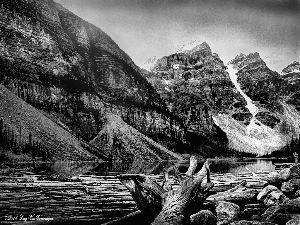
This is my second photo in which to attempt a good B&W landscape. Hope it works. I went with the grainier style again.
Comments
13 comments
Comment posted by Bill Chambers on December 10, 2013 at 3:59 PM
The composition is great and I like all the elements, but the processing looks a little over the top for my tastes. B&W is so subjective though, so don't take that as criticism. The next person may love the processing. My specific complaint is that it seems overly contrasty and I don't really love the graininess.
Registered on April 10, 2005, 753 Posts, 21216 Comments
Comment posted by Harley Goldman on December 10, 2013 at 6:14 PM
I like the image a lot. The processing is unique. It looks like an ink drawing rather than a photo. I would confess to being on the fence over the presentation style.
Registered on November 19, 2003, 586 Posts, 11271 Comments
Comment posted by Tony Kuyper on December 10, 2013 at 7:07 PM
The graininess certainly adds a new layer of interest to the scene. Sort of abstract in some regards. The fact that it's a commonly photographed location makes it a little hard to engage with the non-traditional treatment. I think the technique might lend itself better to a less traditional comp.
Registered on November 1, 2003, 364 Posts, 22328 Comments
Comment posted by Mark Seaver on December 11, 2013 at 3:12 AM
This is definitely dramatic and the grain adds to the drama. It's very attractive to look at, but because of the drama I'm not sure I'd come back to it again and again. That, however, is a very personal choice.
Registered on January 23, 2011, 1103 Posts, 17270 Comments
Comment posted by John&Patty Benway on December 11, 2013 at 6:17 AM
Lucy, definitely find this interesting, really like the comp and elements within the scene, kind of reminds me of old Ilford 50 B&W film, but I have to go along with the others, just a bit to grainy for me, otherwise, it works.
John
Registered on May 12, 2006, 626 Posts, 8700 Comments
Comment posted by Michael Cothran on December 11, 2013 at 9:17 AM
When I saw the thumbnail, I thought I'm going to really like this, but in all candor, I was very disappointed once I saw the full size image, and even more so with the larger image. My thoughts were that this is really gritty, over-cooked, over-sharpened, too grainy, and way too contrasty. Then I read your post, and noticed the word "grainier," so I then presumed it looked like this intentionally. And if this is how you see it, that is certainly your perogative. I just don't agree with your post processing. I "see" a much more grandeur image in my mind.
Registered on December 5, 2012, 31 Posts, 730 Comments
Comment posted by Preston Birdwell on December 11, 2013 at 1:04 PM
Lucy, I like the composition, but the contrast is way too high, and the graininess is not that appealing to me. You might consider processing this for less grain, and more separation in the mid tones.
--P
Registered on November 1, 2003, 471 Posts, 5188 Comments
Comment posted by David Chauvin on December 12, 2013 at 10:30 AM
The high contrast gives this a pen & ink graphic quality that is appealing. I might tone down the grain in the sky but once again that is objective. I would also be tempted to play with some border effects and toning to give this more of a glass plate look.
Registered on August 5, 2004, 1007 Posts, 5595 Comments
Comment posted by Lorna Taylor on December 12, 2013 at 1:27 PM
Beautiful work Lucy !
Registered on November 12, 2010, 254 Posts, 3083 Comments
Comment posted by Lucy VanSwearingen on December 13, 2013 at 1:29 PM
Here's a not grainy Lake Moraine
Registered on May 23, 2009, 800 Posts, 2042 Comments
Comment posted by Albert Darmo on December 14, 2013 at 11:48 AM
Hi Lucy agree with what david said the repost is even better
Albert Darmo
Canada
Registered on November 25, 2008, 1386 Posts, 11978 Comments
Comment posted by Mark Metternich on December 14, 2013 at 3:33 PM
I like the grainy post card like look to this. Nice job! I wouldn't mind less contrast on the foreground.
Registered on June 19, 2009, 276 Posts, 6240 Comments
Comment posted by Kah Kit Yoong on December 16, 2013 at 11:22 PM
I don't mind the grainy look but found the original post a bit too contrasty. Probably like the repost better though. Nice to see some good new renditions of this frequently shot location other than the rock pile.
Registered on September 27, 2006, 636 Posts, 10682 Comments

Comments
13 commentsJohn
--P
Albert Darmo
Canada