Gallery: POP PhotosPosted January 5, 2014112 views10 comments
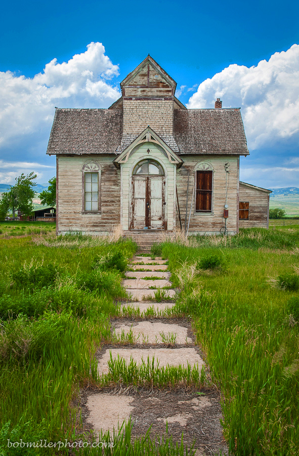
Old house or church - Ovid, Idaho.
Comments
10 comments
Comment posted by Lorna Taylor on January 5, 2014 at 1:49 PM
Fab find !
Registered on November 12, 2010, 254 Posts, 3083 Comments
Comment posted by Michael Cothran on January 5, 2014 at 3:20 PM
This is a fabulous old house, but I think your processing has worked against your intention of making it "spooky." The brightness, plus super saturated green grass and blue sky all imply a "happy" and a pleasantly inviting environment.
However, the house certainly does have the characteristics of a haunted house, and I think I would go there with the processing: Start over with the RAW file, get rid of all the saturated colors, in fact, desaturate it down to almost b&w, or even all the way to b&w, add a bunch of grit, darken it, pump up the contrast, then perhaps add a Dragonizing effect, and I think you would have the makings of a truly spooky house.
Registered on December 5, 2012, 31 Posts, 730 Comments
Comment posted by Bob Miller on January 5, 2014 at 3:35 PM
Michael- I guess I should have changed the title for the saturated version- here is the B&W version that I had in mind when I first composed the shot.
Registered on January 24, 2005, 152 Posts, 405 Comments
Comment posted by Michael Cothran on January 5, 2014 at 6:55 PM
Bob - You're on the right track, but it still does not evoke the feeling of a "spooky" or haunted house. I think part of the issue is still the sky. Even in b&w, it is too bright, and for want of a better term, a "happy" sky. Now, I'm only presuming that you want a scary house, simply by your choice of titles.
If so, I think you need to figure out a way to make that sky much more ominous and/or threatening. And the house, itself, needs to be more gritty. Maybe more contrast, more tonal separation, I just don't know. But I know that your image, the subject matter, and the fine composition is worth the effort to experiment as much as possible.
That said, it would also make a fine portrait of a very old, but interesting structure. Perhaps you could go down the road of making the image look more antiquated. Still needs some drama though, but I can see in the b&w version where this concept could be quite doable. You've got a fine shot here. As Tony Kuyper has said in the past - sometimes you've got to allow the image to lead you, rather than forcing something out of it. It's definitely got something to say, and hopefully, it will come out.
I might even suggest, if possible, to revisit the house under a more overcast, and possibly threatening sky. I see you're from AZ, and the house is in Idaho, so that may not be a possibility.
Registered on December 5, 2012, 31 Posts, 730 Comments
Comment posted by Philip Hodgkins on January 5, 2014 at 7:59 PM
Actually, I like the saturated version for spookiness. The juxtaposition of the decrepit house and the cheery colors is a subtler version of spookiness than the black and white, almost as if the horror will be revealed an instant after the cheery has worn off!
Registered on July 24, 2006, 2741 Posts, 12349 Comments
Comment posted by gary phillips on January 6, 2014 at 12:52 PM
I like the b/w version, the sky is still to bright and you've got numerous dust spots. Really cool old house.
Registered on October 24, 2013, 185 Posts, 4136 Comments
Comment posted by Bob Miller on January 6, 2014 at 1:44 PM
Thanks Michael & Gary,
I re-visited the b/w and did a selection of the sky and made it much darker- it made a big difference as to the mood. Thanks and I will do some more work on it as time permits.
Registered on January 24, 2005, 152 Posts, 405 Comments
Comment posted by Kent Staubus on January 6, 2014 at 2:34 PM
All in all, I like the b&w version best. It seems to bring out the clouds a bit more for one thing.
Kent in SD
Registered on November 11, 2003, 121 Posts, 2098 Comments
Comment posted by Karen Kane on January 11, 2014 at 4:04 PM
I really like the subject and the composition. Both versions have merits, but my personal preference is to see these old guys in B&W, so I appreciate the repost even more. Nice job Bob.
Registered on August 4, 2012, 66 Posts, 726 Comments
Comment posted by Nathan Buck on January 12, 2014 at 11:40 PM
I thought that building looked like the one in Ovid! I have been past it many, many times - photographed it a couple too. Nice photo Bob.
Nathan
Registered on November 1, 2003, 1101 Posts, 13589 Comments

Comments
10 commentsHowever, the house certainly does have the characteristics of a haunted house, and I think I would go there with the processing: Start over with the RAW file, get rid of all the saturated colors, in fact, desaturate it down to almost b&w, or even all the way to b&w, add a bunch of grit, darken it, pump up the contrast, then perhaps add a Dragonizing effect, and I think you would have the makings of a truly spooky house.
If so, I think you need to figure out a way to make that sky much more ominous and/or threatening. And the house, itself, needs to be more gritty. Maybe more contrast, more tonal separation, I just don't know. But I know that your image, the subject matter, and the fine composition is worth the effort to experiment as much as possible.
That said, it would also make a fine portrait of a very old, but interesting structure. Perhaps you could go down the road of making the image look more antiquated. Still needs some drama though, but I can see in the b&w version where this concept could be quite doable. You've got a fine shot here. As Tony Kuyper has said in the past - sometimes you've got to allow the image to lead you, rather than forcing something out of it. It's definitely got something to say, and hopefully, it will come out.
I might even suggest, if possible, to revisit the house under a more overcast, and possibly threatening sky. I see you're from AZ, and the house is in Idaho, so that may not be a possibility.
I re-visited the b/w and did a selection of the sky and made it much darker- it made a big difference as to the mood. Thanks and I will do some more work on it as time permits.
Kent in SD
Nathan