Nature Photographers Network
This is the preserved archive of the original Nature Photographers Network. The community continues at naturephotographers.network.
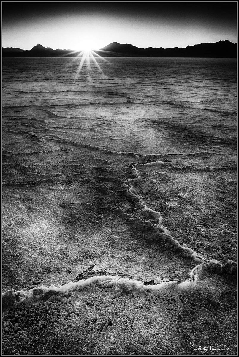
Bonneville Salt Flats
‹ PreviousLandscape GalleryNext ›

Bonneville Salt Flats

by Rick Turner

Gallery: LandscapePosted January 14, 2014230 views9 comments
I have been playing around with this image for some time in color and b&w.
This processing reminds me of my tri x 400 2 1/4 (120) days and push processing developing to ISO 800 or more.
I still do not feel right yet on this one but we all have images like that.
Sony a77
Minolta 20 mm f2.8 prime with cpl
ISO 200
f18 @ 1/13 second
tripod

:toast: C&C welcomed

Comments

9 comments
Comment posted by Jon Daining on January 14, 2014 at 8:45 PM
Rick, I understand the frustration of not getting an image quite how you want it in post! The flats look a bit to muddy/grungy and grey for my taste. I really enjoy the background with the strong mountain ridge and sunbeam. My eyes want to see an equally strong/contrasty foreground.
Registered on February 25, 2012, 25 Posts, 191 Comments
Comment posted by Joerg Bonner on January 15, 2014 at 5:06 AM
i agree with jon regarding the foreground - but to me it looks like it's definitely worth playing around. i'm sure you'll end up with the shot you wanted.
Registered on September 5, 2011, 44 Posts, 221 Comments
Comment posted by gary phillips on January 15, 2014 at 10:48 AM
Rick, I think this has great potential. My suggestion would be to highlight the crystalline ridges (as they are in the foreground) selectively, working your way back into the sun. Sorta of a squigley leading line . Perhaps cropping the black dome out of the sky, leaving just the sun. Just some thoughts. Great canvas to work with. Man I' m stuck on a bunch of stuff right now, but to me, that's have the fun. :biggrin: I didn't see the repost when I made my suggestions. I sorta think it's ( repost) lost some of it's drama. I liked the foreboding look of the original.
Registered on October 24, 2013, 185 Posts, 4136 Comments
Comment posted by John Williams on January 15, 2014 at 12:48 PM
Love the setup/comp here with the attractive foreground and ridge/sun background. I wonder if this would be worth taking the foreground in the opposite direction of your repost. Darkening all but the highlights would emphasize those lines and blotches. Looking at the large version, I'd also try some noise reduction.
Registered on September 6, 2007, 221 Posts, 5985 Comments
Comment posted by Nick Bristol on January 15, 2014 at 6:59 PM
Rick, I like the original post better. The repost seemed to loose the some of the drama as Gary mentioned. I like John's thoughts on this as well. Really a cool image and sure worth some fine tuning! :smile:

Nick Bristol
Lone Rock, WI
Registered on February 1, 2004, 752 Posts, 14140 Comments
Comment posted by scott lanz on January 16, 2014 at 12:15 AM
Excellent as is, IMO, Rick. I like the overall look. :toast:
Registered on November 14, 2003, 840 Posts, 12902 Comments
Comment posted by Morris McClung on January 16, 2014 at 10:27 AM
Makes for high drama, Rick. Nicely done.
Registered on May 7, 2007, 670 Posts, 19650 Comments
Comment posted by R.Bill Moser on January 16, 2014 at 3:29 PM
I love the comp with its foreground.....I agree the flats look a bit muddy and grey....but I like the idea and I think it's woth while working on it. I love the dramatic look of the image
Registered on January 29, 2010, 285 Posts, 4281 Comments
Comment posted by Rick Turner on January 16, 2014 at 4:30 PM
Thanks for suggestions :wavey:
Registered on February 18, 2012, 534 Posts, 2755 Comments