Nature Photographers Network
This is the preserved archive of the original Nature Photographers Network. The community continues at naturephotographers.network.
View from my window +repost
‹ PreviousLandscape GalleryNext ›

View from my window +repost

by Carolyn Derstine

Gallery: LandscapePosted February 3, 2014835 views12 comments
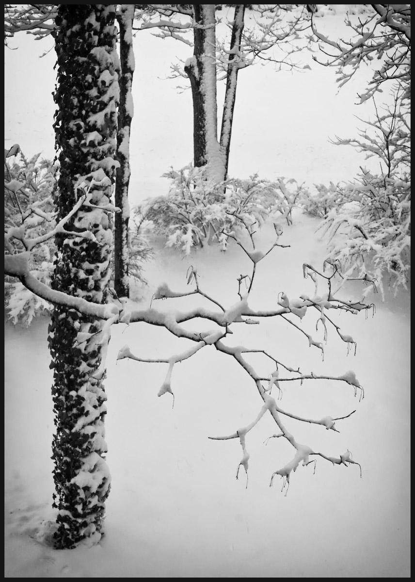
Another snowy day today. . .a very wet snow that clung to everything. This view was taken from my second story window. To me, these graphic elements made for an interesting compostion. B&W conversion done in Nik Silver Efex Pro. I also added some filters so if this makes it too "artsy", please feel free to move to Photo Art. :smile:

Canon 60D. 33mm at F/11 for 1/125 sec. ISO 250.

Comments

12 comments
Comment posted by Daniel Rappaport on February 3, 2014 at 5:50 PM
I like this. The increased brightness at the top sort of pulls me out of the scene though. Would you consider cropping the top 1/5?.
Registered on September 9, 2009, 294 Posts, 2006 Comments
Comment posted by Carolyn Derstine on February 3, 2014 at 6:13 PM
Thanks for your comment, Daniel. I tried out a cropped version and I think I like it. :smile: Curious to see what others think.
Registered on February 16, 2011, 610 Posts, 3684 Comments
Comment posted by Genny K. on February 3, 2014 at 7:39 PM
Ok I'm probably being picky, but I think you cropped too much. :smile: I'm guessing about 10%? Leave some of those branches in up there, to echo the branches in the bottom. Of course, that's just me; others may differ!
I do like this. Quiet, clean softness. Definitely a fleeting moment. I like the darkness around the edges.
Registered on June 5, 2006, 132 Posts, 2001 Comments
Comment posted by Wayne Jones on February 3, 2014 at 9:37 PM
Love the soft, gentle feeling of this. Cropping is a tough call. The branches on top do create a nice frame, but the bright area just below them is an eye magnet, as Daniel said. I like the crop because it fixes that, and makes the subject branches seem brighter because thy are not competing with that bright spot. If you like the comp of the original better, you might try reducing the brightness of that part (and perhaps making the main part a tiny bit brigher and more contrasty with a micro curves adjustment, being careful not to remove the soft feeling). Not sure if that would work, because making snow darker can create problems, especially in black and white. I guess that does not help much, but I do like the cropped version for the reason stated.
Registered on April 18, 2007, 953 Posts, 6435 Comments
Comment posted by gary phillips on February 4, 2014 at 11:42 AM
Carolyn, I like the cropped version better. I like the isolation of the spreading branch and the soft stillness you convey here
Registered on October 24, 2013, 185 Posts, 4136 Comments
Comment posted by Richard Castillo on February 4, 2014 at 12:10 PM
If your intent is to make the large branch in the foreground the main subject, which I believe it is, then I'd say the crop is better, for sure. In terms of the graphic elements I think it's more focused, with an improved visual flow. The large foreground branch, esp. in the second version, kind of reminds me of a stained glass window. Beautiful photo!
Registered on October 20, 2013, 9 Posts, 37 Comments
Comment posted by Ed Lowe on February 4, 2014 at 6:57 PM
While both are beautifully done I prefer the repost because it simplifies the scene just a bit for me, Carolyn. The quite peaceful mood here is just fantastic.

Ed
Registered on February 7, 2004, 414 Posts, 7115 Comments
Comment posted by Lorna Taylor on February 4, 2014 at 7:30 PM
You can keep it ! I am done with the cold no matter how beautiful this looks!! Stay warm !
Registered on November 12, 2010, 254 Posts, 3083 Comments
Comment posted by Bill Reid on February 5, 2014 at 12:27 PM
I prefer the cropped version Carolyn because it puts more focus on the branch and the nice soft light behind it. Very nicely done.
Registered on January 27, 2013, 65 Posts, 2460 Comments
Comment posted by David Chauvin on February 5, 2014 at 5:58 PM
I really like the original comp and would keep it as is. Sweet! :cool:
Registered on August 5, 2004, 1007 Posts, 5595 Comments
Comment posted by Mark Metternich on February 7, 2014 at 8:54 AM
Very nice composition. Love the mood.
Registered on June 19, 2009, 276 Posts, 6240 Comments
Comment posted by Navin Sarma on February 7, 2014 at 10:43 AM
nice mood and tough comp, Carolyn! I like the first version
Registered on July 17, 2011, 233 Posts, 1373 Comments