Nature Photographers Network
This is the preserved archive of the original Nature Photographers Network. The community continues at naturephotographers.network.
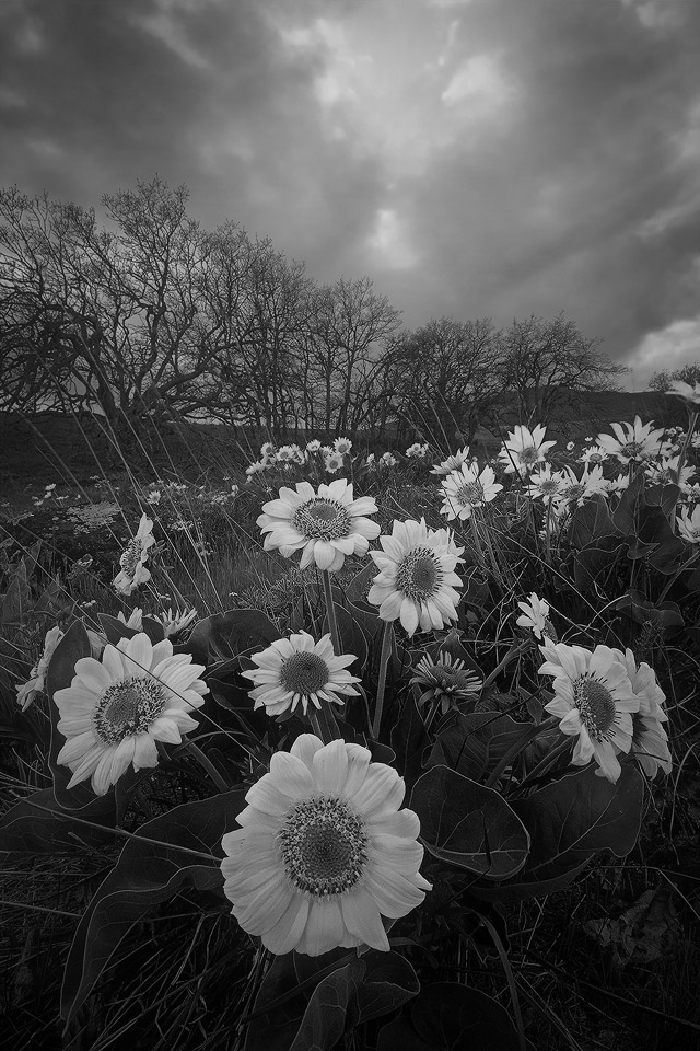
Spring Frenzy
‹ PreviousLandscape GalleryNext ›

Spring Frenzy

by John Williams

Gallery: LandscapePosted March 1, 20143,543 views23 comments
Here's another conversion of a prior image. Many of the black and white images I really admire are very simple, typically quite high-key or low-key (see the one Eva just posted). My color images are typically quite busy, and therefore maybe not the best for conversion, but they're still fun to play with.

The color version can be seen here.

Comments

23 comments
Comment posted by Chet Dowell on March 1, 2014 at 6:53 PM
I like both of these images but for me the bw is even more dramatic than the color version. I like this one a lot. Great work. Chet
Registered on December 3, 2012, 237 Posts, 1171 Comments
Comment posted by Nick Bristol on March 1, 2014 at 7:01 PM
John, This is wonderful! Your color version is a beautiful image but this b&w version works so nice for me. Really a wonderfully done conversion. Both version are excellent! :smile:

Nick Bristol
Lone Rock, WI
Registered on February 1, 2004, 752 Posts, 14140 Comments
Comment posted by Rebecka on March 1, 2014 at 8:18 PM
The monochrome version puts all the emphasis on the lovely lines and textures and comp. It's always different to see flowers in B&W. Nice! :toast:
Registered on February 5, 2009, 170 Posts, 924 Comments
Comment posted by Joseph Campisi on March 1, 2014 at 8:37 PM
Nice perspective John, and enough of a tonal range to make an effective B&W conversion. Great work as always!
Registered on November 24, 2008, 304 Posts, 3211 Comments
Comment posted by Tony Kuyper on March 1, 2014 at 8:59 PM
Color or B&W, this is an exceptional comp and very well developed image. I like this a lot.
Registered on November 1, 2003, 364 Posts, 22328 Comments
Comment posted by Ken Smith on March 1, 2014 at 9:12 PM
The comp is super… and your processing to B/W creates entirely a different photo appealing to the eye in a way that cannot be compared to the color version. It is like comparing an exquisite meal rich with spices and aromas to a chocolate dessert… I like them both ...for different reasons.
Registered on September 5, 2008, 449 Posts, 2444 Comments
Comment posted by gary phillips on March 1, 2014 at 9:16 PM
Both images are great, John. This version is hands down the winner for me. Love the DOF and and the crisp, clean comp. :toast:
Registered on October 24, 2013, 185 Posts, 4136 Comments
Comment posted by Andrew Waddington on March 1, 2014 at 9:19 PM
John my first reaction was '' I wonder what the color version looked like'' then I checked you created a link. I think I actually prefer the B+W which is unusual for me. I love the DOF, I notice you only used 5 files. I have found shots with this DOF benefit greatly from more shots otherwise I often get blurred areas in the finished image.
Registered on February 11, 2014, 44 Posts, 183 Comments
Comment posted by Neale Dyster on March 1, 2014 at 9:24 PM
I wouldn't have thought of a B&W conversion of a flower shot but it sure works here ! Wonderful composition and dof .
Registered on February 19, 2008, 94 Posts, 738 Comments
Comment posted by John Williams on March 1, 2014 at 9:36 PM
Thanks so much for the feedback everyone! It helps a lot when experimenting.

Andrew, I goofed when answering Marylynne's question. I was answering loosely, and didn't delineate between focus stacking and focus blending. It's actually not a true focus stack, rather a focus blended image. I used the technique I detailed in an NPN article awhile back. It's sharp from front to back.
Registered on September 6, 2007, 221 Posts, 5985 Comments
Comment posted by Daniel Finchum on March 1, 2014 at 10:24 PM
You would think this would look better in color but the b/w conversion works veryh well for this. I think the excellent clarity and focus makes this picture work so well.
Registered on September 8, 2013, 43 Posts, 222 Comments
Comment posted by Doug Roane on March 2, 2014 at 3:16 AM
I like both. I know you are going for a more low-key look here, but for me, the mono conversion looks just a little flat. I wonder how it would do with the contrast pumped up a bit?
:smile:
Registered on December 12, 2008, 213 Posts, 2226 Comments
Comment posted by Mario Moreno on March 2, 2014 at 5:17 AM
This is one fine composition John ! Really like the composition and conversion ..... Great amount of detail too :toast:
Registered on January 24, 2012, 163 Posts, 369 Comments
Comment posted by Morkel Erasmus on March 2, 2014 at 7:21 AM
This works well, I'd be hesitant to make a B&W of what must've been a vibrant scene.
Perhaps needs a touch more contrast or deeper blacks?
Registered on March 22, 2011, 385 Posts, 2068 Comments
Comment posted by Nancy Lea Sandy on March 2, 2014 at 9:23 AM
Stunning, this is an excellent conversion and, IMO, the B&W creates a nice mood.
Registered on January 24, 2011, 576 Posts, 6942 Comments
Comment posted by Mark Seaver on March 2, 2014 at 2:16 PM
I'd say your conversion worked great, John. There's a fine emphasis on the foreground flowers and enough detail and texture behind them to set the stage and keep the top half interesting.
Registered on January 23, 2011, 1103 Posts, 17270 Comments
Comment posted by Eva McDermott on March 2, 2014 at 3:02 PM
I think the B&W conversion adds more drama to the scene John. I love the comp too. I agree with Doug and Morkel on adding a touch more contrast which I think would make the flowers pop more. Beautiful image in color or B&W.
Registered on January 4, 2009, 1015 Posts, 13229 Comments
Comment posted by Brian Schrayer on March 2, 2014 at 6:13 PM
John, I have really enjoyed seeing the B&W images that you have posted recently. This has a nice tonal range and the brightness of the flowers makes them leap in front of the viewer. As much as I like this I think I do prefer the color version in this instance - I think that's because color is the probably the primary reason that most of us are drawn to wildflowers.
Registered on May 28, 2004, 114 Posts, 2890 Comments
Comment posted by Vance Gese on March 2, 2014 at 8:14 PM
Really like your b/w treatment of this image, John. The tonality gives the flowers and plants a nice delicate and even nostalgic feel to them in my opinion; quite different from the beautiful color image.
Registered on November 13, 2008, 298 Posts, 6629 Comments
Comment posted by Kane Engelbert on March 2, 2014 at 10:17 PM
This is stunning. You had some crazy light here. The comp is fantastic, and I love the B&W application.
Registered on June 14, 2009, 63 Posts, 291 Comments
Comment posted by Chris Chamberlain on March 3, 2014 at 10:07 PM
Very nice! I wouldn't think I'd prefer this over color, but I do.

Chris
Registered on March 13, 2007, 500 Posts, 8365 Comments
Comment posted by Bill Reid on March 4, 2014 at 11:12 AM
Both are just great John and I like them for different reasons. Maybe the color version by a touch. Very nice tones and detail in this version and a wonderful comp. Very well done.
Registered on January 27, 2013, 65 Posts, 2460 Comments
Comment posted by Mark Metternich on March 9, 2014 at 1:11 AM
Fabulous! :toast:
Registered on June 19, 2009, 276 Posts, 6240 Comments