Nature Photographers Network
This is the preserved archive of the original Nature Photographers Network. The community continues at naturephotographers.network.
Ponderosa Sandstone
‹ PreviousLandscape GalleryNext ›

Ponderosa Sandstone

by Thomas Haney

Gallery: LandscapePosted March 10, 2014484 views18 comments
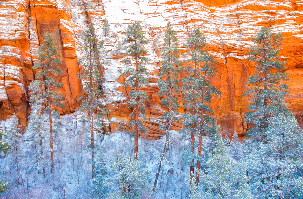
I was lucky enough to be in Zion this past November for a powerful winter storm that dumped over a foot of snow on the area - which, of course, presented it's own challenges to the photographer, but which also provided many opportunities. It was while following the tracks of some bighorn sheep that I saw this scene, and was immediately struck by the colors and placement of the Ponderosas. Please let me know what you think, if it works well for you or if there just isn't enough there.

Canon 5d Mark iii, 16-35mm lens, 1/50 sec at f/11, ISO 100

Comments

18 comments
Comment posted by Louis Pattis on March 10, 2014 at 8:35 PM
Wow this is electric, the colors are intense, I can't take my eyes of them, the snow in the upper half looks hot, I say this because it took me some time to qualify it as such, cut the highlights in the upper snow and I would reduce some cyan in the lower shady part, dial the saturation down and you have a winner.
Registered on March 30, 2012, 0 Posts, 164 Comments
Comment posted by Rick Turner on March 10, 2014 at 9:34 PM
To my eye this is simple and stunning.................. :toast:
Registered on February 18, 2012, 534 Posts, 2755 Comments
Comment posted by John Williams on March 11, 2014 at 12:26 AM
Love the way this one comes together Thomas.
Registered on September 6, 2007, 221 Posts, 5985 Comments
Comment posted by Thomas Haney on March 11, 2014 at 8:15 AM
Thanks Louis. I have had a hard time with the processing of this one, as the line between under and over saturated seems very thin. I'll try your suggestions. Thanks again.
Registered on April 7, 2013, 138 Posts, 537 Comments
Comment posted by Harry Lichtman on March 11, 2014 at 10:44 AM
Great mix of colors that you just don't have that often. The trunk colors ties in nicely with the walls. The sandstone does apear as though sun were hitting it, but it doesn't look like that was the case? Desat is one idea already presented, but perhaps adding a little cyan backinto the reds and yellows. Also, I would crop out the small evergreen branches poking into the frame on the LL. A fine shot, hope you found those sheep too.
Registered on September 17, 2010, 304 Posts, 3507 Comments
Comment posted by Roel Wijtmans on March 11, 2014 at 12:33 PM
A remarkable picture for sure! Because there is no depth in the picture it becomes very abstract, but it definitely works for me! The combination of colors is great. Maybe a bit extra contrast wouldn't hurt, but I'm not sure about that. I would crop out the branches in the left that are intruding your composition. Great pic!
Registered on September 30, 2012, 116 Posts, 2257 Comments
Comment posted by gary phillips on March 11, 2014 at 12:35 PM
I like this presentation a lot, Thomas. I agree with the desat issue. I don't think I've ever seen that much blue in the shadows,I often look at the ponderosa/ sandstone combos and have not come up with a comp I'm happy with. This has a lot of possibilities.
Registered on October 24, 2013, 185 Posts, 4136 Comments
Comment posted by Bill Chambers on March 11, 2014 at 2:44 PM
Gorgeous color contrast! Wish I was there to witness this first hand!
Registered on April 10, 2005, 753 Posts, 21216 Comments
Comment posted by David Chauvin on March 11, 2014 at 7:02 PM
The contrasting colors really pop,,,,the red trunks disappearing into the blue is a nice touch. The comp feels nicely balanced. The green branches on the left edge are the only minor nit I can come up with. :cool: :cool:
Registered on August 5, 2004, 1007 Posts, 5595 Comments
Comment posted by Mark Metternich on March 11, 2014 at 9:02 PM
Dreamy cool to warm contrast!!!! :toast:
Registered on June 19, 2009, 276 Posts, 6240 Comments
Comment posted by Dan Kearl on March 11, 2014 at 10:02 PM
I like this a lot. Terrific colors and contrast. Well seen and executed.
Registered on September 2, 2013, 209 Posts, 1514 Comments
Comment posted by Ben Horne on March 11, 2014 at 11:55 PM
Those are some beautiful conditions with the trees and rocks frosted in snow! I really like your composition here, and if this was mine, I would darken it down a bit to help control some of the orange tones, and also the white snow at the top. This is one of those scenes that has a lot of natural pop to it, so I would avoid cranking up the saturation. The composition is very elegant, and I think the enhanced saturation only takes away from the natural beauty of your subject.
Registered on August 27, 2009, 51 Posts, 959 Comments
Comment posted by Navin Sarma on March 12, 2014 at 1:47 AM
Awesome layered display. Love the contrasts of color here. An excellent shot, works very well for me Thomas
Registered on July 17, 2011, 233 Posts, 1373 Comments
Comment posted by Thomas Haney on March 12, 2014 at 10:52 AM
Thanks so much for all the comments. I don't consider myself a very talented post-processor in general, but certain photos give me more trouble than others and i've had a really hard time "seeing" this one, maybe because i've been staring at it too long. He's a repost with all your great feedback in mind, hopefully it's an improvement.
Registered on April 7, 2013, 138 Posts, 537 Comments
Comment posted by Ian Cameron on March 12, 2014 at 3:20 PM
Hi Thomas I wasn't really drawn to your original post because of the reason outlined by Ben but your repost is far superior maybe a tad bright with a hint too much cyan and blue but now far far stronger in its subtlety.
Registered on August 6, 2004, 1125 Posts, 3318 Comments
Comment posted by Doug Roane on March 12, 2014 at 4:34 PM
The subject and composition here is awesome - with the right processing, it could be absolutely stunning! I wonder if you are able to bring down the white in the snow a little to bring out some detail? I would also consider darkening the dark tones, especially on the lower third. Have you every used Tony Kuyper's luminosity and saturation masks? ... they would do wonders for this image.
Registered on December 12, 2008, 213 Posts, 2226 Comments
Comment posted by Bill Reid on March 13, 2014 at 11:21 AM
The repost looks much nicer to me Thomas. Very interesting comp and colors in this. Good eye to spot this.
Registered on January 27, 2013, 65 Posts, 2460 Comments
Comment posted by Jared Warren on March 13, 2014 at 1:41 PM
Thomas, this is a great image and the repost is an improvement. The snow still feels a little blue to me, and it's lost some of its "pop". This would really test my processing skills as well. I've been starting to learn more about luminosity masks and as was previously mentioned those could really do wonders for this kind of image. It's great as is but I bet it will really shine with continued refining in post. :toast:
Registered on May 11, 2012, 84 Posts, 931 Comments