Nature Photographers Network
This is the preserved archive of the original Nature Photographers Network. The community continues at naturephotographers.network.
Mount Fitz Roy
‹ PreviousLandscape GalleryNext ›

Mount Fitz Roy

by Andrew Waddington

Gallery: LandscapePosted March 20, 2014312 views16 comments
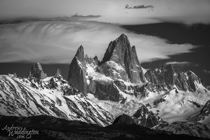
This shot was taken at around 11.00am and looked bland in color. I was all for deleting it from my hard drive until I tried a black and white conversion. I don't know what other people's views are but I feel it's kind of a cop out to convert a poor color image to black and white.
I suppose if it works it's ok ?

Any comments regarding my processing and personal views about black and white conversions would be appreciated.

Comments

16 comments
Comment posted by Preston Birdwell on March 20, 2014 at 8:19 PM
Cerro Fitzroy--one of my favorite mountains that I have not had the good fortune to visit. I do like what you've done here. The tones look fine, and I love the sky.

With regard to conversions of color to B&W: At least to me, if you like the results of the conversion, i.e. the image has a greater voice in B&W than in color and it makes you happy, then it's not a cop out at all. I have several color images, both digital and 4x5 that are much more expressive in B&W. In some instances, I have made the exposure with the express goal of converting to B&W.

--P
Registered on November 1, 2003, 471 Posts, 5188 Comments
Comment posted by gary phillips on March 20, 2014 at 11:58 PM
Andrew, if I ask myself that question, then my whole body of work would be a cop out. :frown: I look at every image I take with the idea of conversion. I actually feel some frustration at having an image that will not convert satisfactorily. :mad: I think this image works very well as a B&W. It has a beautiful range of tones and with a couple of adjustments I think you have a real winner. First, I would crop to just below the sketchy cloud TRM, and increase the detail in the foreground ridge. Keep in mind that if your end game is B&W, then plan accordingly and if you are in an exotic place, are the magic hours all that matter? Additionally, a large view would help in the critique.
Registered on October 24, 2013, 185 Posts, 4136 Comments
Comment posted by Chris Chamberlain on March 21, 2014 at 12:32 AM
It's an incredible view! Maybe a little more contrast. The sky mostly looks like it could be brought up some. Nice!

Chris
Registered on March 13, 2007, 500 Posts, 8365 Comments
Comment posted by Aaron Feinberg on March 21, 2014 at 4:59 AM
b/w love strong contrast. so good choice. really dig this

aF
Registered on October 26, 2009, 399 Posts, 2789 Comments
Comment posted by Andrew Waddington on March 21, 2014 at 5:30 AM
I agree that nasty bit of dark cloud at the top is irritating I think I'll do a crop. Thanks for the advice. I'll also try to get some more contrast in the cloud.
Registered on February 11, 2014, 44 Posts, 183 Comments
Comment posted by Harry Lichtman on March 21, 2014 at 8:02 AM
Andrew - I made a similar image with some interesting clouds from this perspective and liked the BW conversion much better. It brings out the textures and forms much better than color. Jagged peaks contrast nicely with big flowing clouds. Regarding processing, I might try to work on level adjustment of the clouds to bring out the detail there a bit more. Looks like there isplenty of latitude to do it if you want. :toast:
Registered on September 17, 2010, 304 Posts, 3507 Comments
Comment posted by Harley Goldman on March 21, 2014 at 10:44 AM
Beautiful view and a classic B&W look. A cop out? Not in the slightest. Some images work in B&W, some in color, some in both and some neither. Just the nature of it.
Registered on November 19, 2003, 586 Posts, 11271 Comments
Comment posted by Roel Wijtmans on March 21, 2014 at 11:21 AM
Nope, I don't think it's a cop out at all. Some images just work better B/W, and if you didn't anticipate the B/W conversion while taking the photo then that's one lesson learned for next time. And learning new lessons is the whole point of photography (for me at least). Next time you'll recognize the poor color scene as a great B/W scene. Just my 2 cents....

And it's a stunning image!
Registered on September 30, 2012, 116 Posts, 2257 Comments
Comment posted by Andrew Waddington on March 21, 2014 at 11:28 AM
Thanks and yes I have begun to realise what may work as a black and white whilst looking at an image in color. When I started shooting I used to waste 22 hours of the day as I waited patiently for the golden hours.
Registered on February 11, 2014, 44 Posts, 183 Comments
Comment posted by Kathy Barnhart on March 21, 2014 at 12:35 PM
I think it's OK and this one really works! Lovely tones and textures. I might consider cropping just a little off the top so your eye just goes right to the peak. But still a very nice job.
Registered on November 11, 2011, 404 Posts, 1639 Comments
Comment posted by Bill Reid on March 21, 2014 at 12:37 PM
Great shot Andrew and looks wonderful in B&W. A tinch off the top and print big. Well done.
Registered on January 27, 2013, 65 Posts, 2460 Comments
Comment posted by Scott Smorra on March 21, 2014 at 6:41 PM
Beautiful b/w conversion Andrew. I really like all of the different tones you captured here. I don't feel this is a cop out at all. B/w scenes tend to look best during the contrasty light during the middle of the day.
Registered on November 2, 2009, 161 Posts, 2143 Comments
Comment posted by Bill Chambers on March 21, 2014 at 11:36 PM
Why do you feel it's a cop-out to convert a bland color image? I've shot many bland subjects with the sole intention of converting to B&W. In this case it would be criminal to lose such a wonderful image simply because the color was bland. You simply made the most from an image - to me, that's what photography is all about.

This is simply beautiful IMHO.
Registered on April 10, 2005, 753 Posts, 21216 Comments
Comment posted by Chris Stenger on March 22, 2014 at 12:46 PM
Nice image and the B&W conversion works well here. You may consider increasing the overall brightness a bit (without loosing contrast!) and increasing the contrast in the clouds, but for the rest the image is fine!
Registered on May 9, 2013, 27 Posts, 163 Comments
Comment posted by Carey Closs on March 23, 2014 at 3:38 PM
Andrew, if you are deleting images that are this good then I want to pick through your garbage. This is a prime example of why everyone should take the whole "pre-visualization" concept of photography with a huge grain of salt ( and realize that its just a lot of photographer BS designed to make you think they are artistic geniuses). So many times I have taken images that didn't live up to what I was after, revisited them a few months later and had an OMG moment because I wasn't prejudiced by my original ideas of what the image should be. For that reason I seldom delete images right away.

I'd like to echo Chris's comments though; increase the overall brightness and you have a winner. There's some great detail in those clouds and whitening them and the snow up somewhat would really make this image pop.
Registered on April 15, 2012, 107 Posts, 326 Comments
Comment posted by Andrew Waddington on March 23, 2014 at 4:29 PM
I'll definitely re-process this one soon. My photo buddies think I'm mad for throwing away so many images and I must admit to kicking myself for throwing some excellent ones.
Registered on February 11, 2014, 44 Posts, 183 Comments