Nature Photographers Network
This is the preserved archive of the original Nature Photographers Network. The community continues at naturephotographers.network.
Winter's Warmth II
‹ PreviousLandscape GalleryNext ›

Winter's Warmth II

by Scott Smorra

Gallery: LandscapePosted March 21, 20141,012 views20 comments
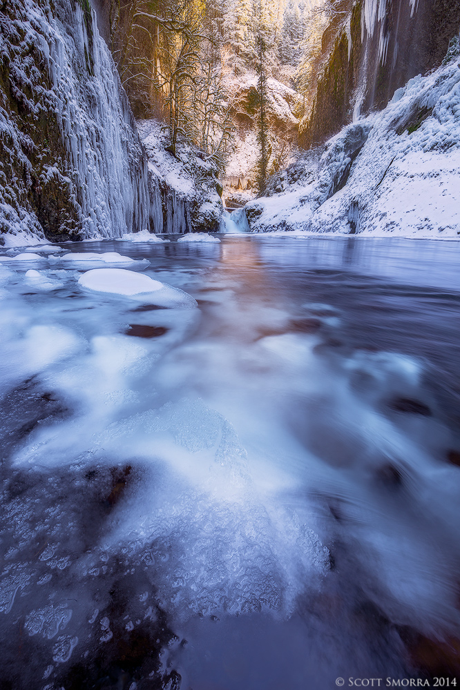
Snow, ice and golden light in the Columbia River Gorge of Oregon, February 2014.

This is another image from the Columbia River Gorge during the cold and snow in February 2013. I previously posted another image from this location, but there were several comments about the lack of detail in the foreground. This image includes an ice formation in the foreground. I'm interested to hear which image you like better. I will post the original in the comments below.

For those of you who are curious, the ice on the bottom of the creek is called frazil ice. This type of ice actually forms on the surface of of the creeks when the air temperature is extremely cold. When the air temp is below freezing, the surface of the water releases heat into the air and the water briefly becomes supercooled (less than 32 degrees). This supercooling allows ice crystals to rapidly form on the surface. Then the turbulence of the water column can push the frazil ice crystals to the bottom of the stream, where they can adhere to the upstream side of rocks, logs and other objects. Ice usually floats, but the small size of frazil ice crystals and the force of the current allows it to be carried to the bottom. The foreground frazil ice formations on the right hand side of this image are on the upstream side of a medium size rock that was just outside of the frame in the lower right hand corner. Pretty cool!

Nikon D800, Nikkor 16-35, polarizer
3 image blend for DOF
1 sec at f/16, ISO 100

Thanks for any comments or suggestions you have. Please check out the larger version.

Comments

20 comments
Comment posted by Scott Smorra on March 21, 2014 at 11:16 AM
Here is the alternate version for comparison. Any feedback on which one you like better is much appreciated!
Registered on November 2, 2009, 161 Posts, 2143 Comments
Comment posted by Navin Sarma on March 21, 2014 at 12:12 PM
Much prefer the new one, Scott. The foreground is much more interesting in this version. I might shave a hair off of the bottom Though.
Registered on July 17, 2011, 233 Posts, 1373 Comments
Comment posted by Bill Reid on March 21, 2014 at 12:19 PM
Much prefer the new version Scott. Really like the fore ground details and wonderful depth and tones in this. Great shot. :toast:
Registered on January 27, 2013, 65 Posts, 2460 Comments
Comment posted by Harley Goldman on March 21, 2014 at 12:36 PM
I definitely prefer the first one presented. Great ice patterns and excellent contrast of the warm and cool tones. Very well done.
Registered on November 19, 2003, 586 Posts, 11271 Comments
Comment posted by Ian Cameron on March 21, 2014 at 5:24 PM
Both excellent Scott but I lean toward the second for the simpler foreground.
Registered on August 6, 2004, 1125 Posts, 3318 Comments
Comment posted by John Williams on March 21, 2014 at 5:59 PM
This one! Cool info on the ice too; I had no idea. :toast:
Registered on September 6, 2007, 221 Posts, 5985 Comments
Comment posted by Andrew Waddington on March 21, 2014 at 6:00 PM
I remembered the old one before I saw your original below, I think this newer one definitely catches the eye better. The old one was a bit one sided at the lower part of the image. Thanks for the info' about frazil ice, I'd never heard of this.
Registered on February 11, 2014, 44 Posts, 183 Comments
Comment posted by Eva McDermott on March 21, 2014 at 6:45 PM
I definitely like the second post Scott. Lovely mix of gold and blue tones. The foregrounds work better for me in the second along with the slightly closer view.
Registered on January 4, 2009, 1015 Posts, 13229 Comments
Comment posted by Nick Bristol on March 21, 2014 at 7:02 PM
Scott, Both of these are really nice but I do prefer the new one. That foreground ice is so interesting and I like the detail better. I also like the looks of the bg a little better in the new one. It seems just a bit darker and I like that. Excellent work on both! Cool ice info too! :toast:

Nick Bristol
Lone Rock, WI
Registered on February 1, 2004, 752 Posts, 14140 Comments
Comment posted by Michael Martin on March 21, 2014 at 7:28 PM
This is my first time seeing either, and I'm leaning toward the second one. I really like that warm and cool tones, and the larger background in the second balances it out for me. Thanks for sharing this with me !
Registered on February 1, 2014, 5 Posts, 20 Comments
Comment posted by Brian Schrayer on March 21, 2014 at 8:21 PM
I definitely prefer this post over the alternate version because of the foreground ice formations. Very nice composition combined with some nice moody blue tones make this work for me.
Registered on May 28, 2004, 114 Posts, 2890 Comments
Comment posted by Scott Smorra on March 21, 2014 at 8:34 PM
Thank you to everyone for the feedback. So far the votes are:
- 7 for the new version
- 3 for the older version. I still can't decide which one I prefer!
Registered on November 2, 2009, 161 Posts, 2143 Comments
Comment posted by Daniel Rappaport on March 21, 2014 at 8:38 PM
Like both but the second composition seems more powerful, I think because the background is more looming and details more apparent. Also the foreground though more simple is more striking too with the water flow right in your face. Well done.
Registered on September 9, 2009, 294 Posts, 2006 Comments
Comment posted by Chris Stenger on March 22, 2014 at 12:36 PM
Great image Scott. I have a strong preference for your first post. For me the composition of the first one is much more balanced than that of the second one with the horizon more or less in the middle. I would even cut away a bit of the top part of your first version to get more focus on the interesting foreground. What I also like in your first version is the fact that it has some sort of a natural vignette formed by the dark ice. Also the light parts of the ice form a nice "lead in". In your second version the bottom part of the image is quite light and I notice that my eye has a tendency to continue moving around over the image.
Registered on May 9, 2013, 27 Posts, 163 Comments
Comment posted by Bruce King on March 22, 2014 at 12:44 PM
It's close but I like the first one. All about the fg for me. Interesting info on the ice formation, very cool.
Registered on January 14, 2010, 276 Posts, 2212 Comments
Comment posted by Aaron Feinberg on March 23, 2014 at 12:53 AM
Like this one better...nice work!

aF
Registered on October 26, 2009, 399 Posts, 2789 Comments
Comment posted by Kah Kit Yoong on March 23, 2014 at 10:47 AM
Stunning shot. I prefer the first. The second I think is much weaker as the right side of the foreground feels empty and unbalanced.
Registered on September 27, 2006, 636 Posts, 10682 Comments
Comment posted by Stan Rose on March 24, 2014 at 1:22 AM
I prefer the 1st comp, but the processing is better in #2--if you can tone down the fg highlights as in 2, one would be awesome!
Registered on September 15, 2005, 836 Posts, 17099 Comments
Comment posted by Vance Gese on March 25, 2014 at 8:19 PM
That beautiful warm glow in the background and its so subtle reflection makes an already tremendous image really sing. The patterns in the foreground ice, the wonderful blues and how they contrast with the warm tones definitely make me prefer this wider-view image. Incredible work, Scott
Registered on November 13, 2008, 298 Posts, 6629 Comments
Comment posted by SandyRichardsBrown on March 28, 2014 at 6:53 PM
I prefer the second version, with the FG ice. It anchors the image and forms provides another area to take in. Many excellent elements here!
Congrats on the WP!

Sandy
Registered on November 24, 2003, 3937 Posts, 12909 Comments