Nature Photographers Network
This is the preserved archive of the original Nature Photographers Network. The community continues at naturephotographers.network.
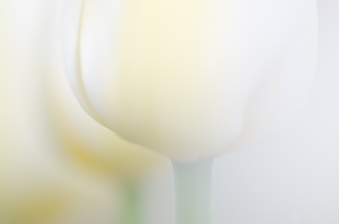
Tulips 2
‹ PreviousFlora GalleryNext ›

Tulips 2

by Nathan Buck

Gallery: FloraPosted April 23, 2014299 views16 comments
Hi all.

Thank you very much for your kind words and thoughts on Tulips 1. I appreciate the suggestions to leave it in full color.

I am wondering on this one too. This one was created by sliding just to the right a bit and shooting past another white tulip. I liked the mist that the other tulip added. There were some that I did by 'strumming' that tulip and letting it swing back and forth like a pendulum and taking several photos in varying degree of mist.

Any and all thoughts appreciated.

Nathan

Nikon D7000, Sigma 180 macro, tripod, ISO 200, f4ish

Comments

16 comments
Comment posted by Thomas Haney on April 24, 2014 at 7:05 AM
Both are beautiful Nathan, but personally I prefer this post to the previous. The composition works better for me and I prefer the mostly white presentation.
Registered on April 7, 2013, 138 Posts, 537 Comments
Comment posted by Philip Hodgkins on April 24, 2014 at 9:39 AM
I prefer the first. It has a more orderly composition, and I like the color better.
Registered on July 24, 2006, 2741 Posts, 12349 Comments
Comment posted by Sanjay Sundaram on April 24, 2014 at 7:25 PM
Nathan: Both are awesome shots. I like this one better, because I think the muted colors add to the calmness of the composition. However, my personal preference would be to shoot this with a little more dof. But, even without any changes it is a very nice image. Well seen and taken.

Sanjay
Registered on April 9, 2013, 107 Posts, 725 Comments
Comment posted by Mark Seaver on April 25, 2014 at 11:41 AM
I like what I see in the three flowers, but am finding the oof brightness on the right distracting, has me wondering about cropping about half of the blurred area on the right.
Registered on January 23, 2011, 1103 Posts, 17270 Comments
Comment posted by Bob/Charly Nelson on April 25, 2014 at 12:02 PM
My vote is for the first Nathan, probable because of more color, but, both are well done and presented.
Bob :wavey:
Registered on January 29, 2014, 35 Posts, 398 Comments
Comment posted by Ant on April 25, 2014 at 12:52 PM
Both are excellent images. I have a preference for this one, for its more evanescent feeling...
Registered on April 13, 2009, 27 Posts, 474 Comments
Comment posted by Lorna Taylor on April 26, 2014 at 11:19 PM
Dreamy !
Registered on November 12, 2010, 254 Posts, 3083 Comments
Comment posted by Albert Darmo on April 27, 2014 at 9:19 PM
Hi Nathan :wavey: Again beautiful work.!!..... love the wonderful light, and the dellicate lines and soft colors :toast:


Albert Darmo
Canada
Registered on November 25, 2008, 1386 Posts, 11978 Comments
Comment posted by Bill Fach on April 28, 2014 at 9:09 AM
Nathan: This is really good. At first glance I prefer Tulip 1 because I'm a color junkie and I like the vertical comp but this one is growing on me because it forces me to look more carefully and when I do I appreciate it more and more. 2+ thumbs up on both. >=))>
Registered on November 1, 2003, 1805 Posts, 26981 Comments
Comment posted by Giuseppe Guadagno on April 28, 2014 at 6:10 PM
Nathan, among your last photos I love better this very delicate, elegant image. Beside the splendid whites I like very much the yellow spots coming down a stair. Splendid work!
Cheers.
Registered on February 3, 2007, 827 Posts, 5052 Comments
Comment posted by Ian Wolfenden on May 1, 2014 at 8:19 PM
I missed this, Nathan - a most beautiful image. Many congratulations on the WP !!!!!
Registered on May 18, 2007, 1108 Posts, 7647 Comments
Comment posted by Michael Lowe on May 1, 2014 at 9:09 PM
Congrats on the WP, Nathan. I didn't get a chance to comment on this. SWEET. Very soft and ephemeral. :toast: :toast:
Registered on February 11, 2004, 777 Posts, 5252 Comments
Comment posted by Giuseppe Guadagno on May 2, 2014 at 4:55 AM
Nathan I am glad that this splendid image has the award that it deserves for its beauty and your creative idea..
Cheers.
Registered on February 3, 2007, 827 Posts, 5052 Comments
Comment posted by John Williams on May 3, 2014 at 2:23 AM
So soft and lovely Nathan.
Registered on September 6, 2007, 221 Posts, 5985 Comments
Comment posted by Albert Darmo on May 8, 2014 at 1:53 AM
Hi Nathan :wavey: Congrats on a well deserved WP :toast: :toast: :toast:


Albert Darmo
Canada
Registered on November 25, 2008, 1386 Posts, 11978 Comments
Comment posted by Lucy Aron on May 10, 2014 at 3:47 PM
Amazing subtle power of this image. Nicely done.
Registered on February 25, 2011, 189 Posts, 1160 Comments