Nature Photographers Network
This is the preserved archive of the original Nature Photographers Network. The community continues at naturephotographers.network.
WC632 Quarry NEW VERSION
‹ PreviousWeekly Challenge GalleryNext ›

WC632 Quarry NEW VERSION

by Nancy de Flon

Gallery: Weekly ChallengePosted May 2, 2014362 views5 comments
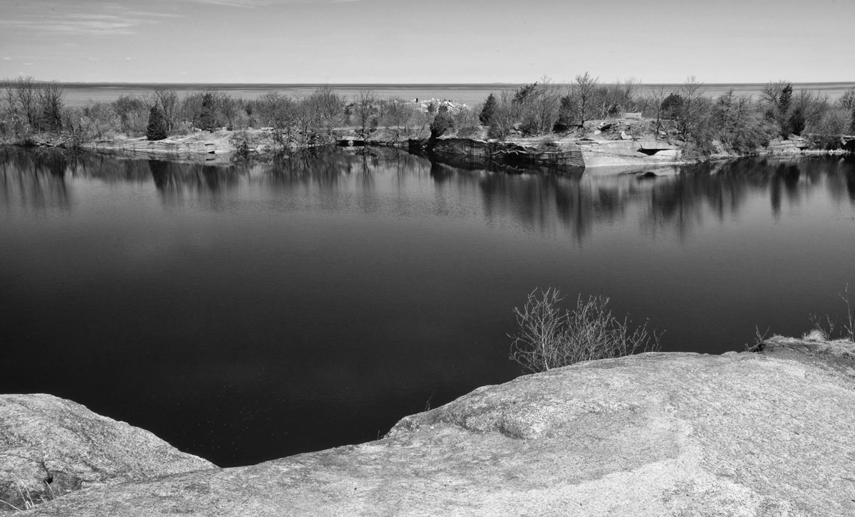
Thanks to the great feedback from several NPN members I've reprocessed this photo, both cropping it and also converting to B&W (my son's suggestion). In the latter process I used Nik Silver Efex Pro, which allowed me to intensify the structure; this, I think, also answers Carolyn's suggestion to tone down the brightness of the rock. Again, thanks so much for the suggestions!

Comments

5 comments
Comment posted by Carolyn Derstine on May 2, 2014 at 12:52 AM
Nicely done B&W conversion. . . but I think I still prefer the colors! :rolleyes: The shadings of blue worked so well to highlight the neutral shades of the land elements. But that is a personal choice. . .I just tend to prefer color for nature images. The crop of the foreground rock works a bit better compared to your other image, but I could see even more being cropped. As it is, the foreground rock still demands a lot of the viewers' attention. . .but I guess it depends on where you want the viewer to focus. Looks like the potential for lots of varying photos to be found at this quarry. :smile:
Registered on February 16, 2011, 610 Posts, 3684 Comments
Comment posted by Nancy de Flon on May 2, 2014 at 1:05 AM
Thank you, Carolyn! I did make several images of this scene but like this one best and so I'm going to continue working on it -- see if I can get a color version that I really like.Maybe I will try cropping out the foreground altogether, see what happens.
Registered on June 28, 2010, 61 Posts, 284 Comments
Comment posted by Mark Seaver on May 2, 2014 at 2:09 PM
I like this crop and the b&w conversion, Nancy. I've spent some time going back and forth with your earlier post about which one I like better. The washes of blue in the color version are very nice, but this version feels more peaceful. After shrinking my window, so I could apply this crop to the color version, I like the color version a bit better, but it's close. Both are gently peaceful with a inviting touch of minimalism.
Registered on January 23, 2011, 1103 Posts, 17270 Comments
Comment posted by Gary Minish on May 2, 2014 at 10:24 PM
I think the cropped helped quite a bit but I like the colors better, Nancy. I think a little more bottom crop to just below the broad "V" on the left side of the rock edge would decrease the "weight" of the foreground and balance better with the thin line of land in the background. The result would be more equal layers and put more focus on the more interesting background. You would end up with more of a panorama but I think that would be a good thing.
Registered on February 4, 2006, 625 Posts, 3583 Comments
Comment posted by Jim Lockhart on May 3, 2014 at 11:56 PM
I like this composition and how you divided up the scene between the rocks, water, land strip, water, and sky. Works well in B&W and you showed just enough horizon to provide balance to the whole scene. The little plant growing out of the rock adds foreground interest too. Nice!
Registered on February 19, 2013, 91 Posts, 500 Comments