Nature Photographers Network
This is the preserved archive of the original Nature Photographers Network. The community continues at naturephotographers.network.
Future Giant w/Repost
‹ PreviousLandscape GalleryNext ›

Future Giant w/Repost

by Scott Fricke

Gallery: LandscapePosted May 3, 20141,072 views14 comments
Redwood National and State Parks, California

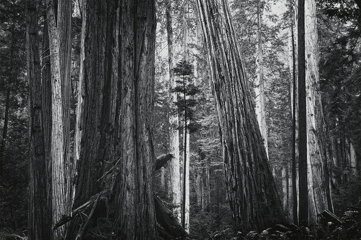
I shot this image in the rain during an all day hike through the redwood forest. One of my best hiking days in along time despite the rain, I made it through about 90% of the hike before I saw any other people so it was a very peaceful journey through the forest. I was attracted to this composition by the varying widths of the trees all around this young redwood "sapling", which was probably 30-40 feet tall. It may one day tower to as high as 360 feet tall. The overcast skies really help sometimes by providing a nice even light. The varying degrees of light on the trunks are due to the density of the forest.

Please see the larger version for better detail. Any critiques would be greatly appreciated!

Canon 5DII, 24-105L @ 70mm, f16, 8 sec, ISO100

Comments

14 comments
Comment posted by Nick Bristol on May 3, 2014 at 12:56 PM
Scott, I would love seeing this as a print. The large version is the way to look at this one for sure. I might be tempted to take the brightest of tree trunks down just a tad but I'm not even sure about that as I'm enjoying this very much just as is. Sounds like you had a very enjoyable hike along the way too. Very nice! :smile:

Nick Bristol
Lone Rock, WI
Registered on February 1, 2004, 752 Posts, 14140 Comments
Comment posted by Stan Rose on May 3, 2014 at 6:26 PM
Cool scene, very familiar to me since I lived there for a couple yrs. I love the idea and the layout and subject are good here. Im not totally sure about the b&w--I have trouble focusing on the subject here because there is so much going on, so many transitions from light to dark--as Nick hinted at it almost seems like you 'forced' the tonality to compensate for lack of light--in this case some filtered light might have been useful to add depth to the scene. But it's definitely a keeper! :wavey:
Registered on September 15, 2005, 836 Posts, 17099 Comments
Comment posted by Kane Engelbert on May 4, 2014 at 12:07 AM
Man I love the composition on this one Scott. The tilted big one right of center adds just as much to this comp as the cool little tree surrounded by the giants. Love the title too.
Registered on June 14, 2009, 63 Posts, 291 Comments
Comment posted by Kah Kit Yoong on May 4, 2014 at 2:14 AM
Nice find. The lighting really helps to give focus to the complex scene.
Registered on September 27, 2006, 636 Posts, 10682 Comments
Comment posted by Brian Schrayer on May 4, 2014 at 5:15 AM
I like the composition and I like the juxtaposition of the young tree among the giants. However, I'd really be interested in seeing a color version of this image. Even with the larger image it seems as if there is not enough separation between the elements and the little tree seems to get buried in the business of the scene. Perhaps the added dimension of color would help to bring greater separation. I haven't read any other comments yet. I'm curious to see what others think.
Registered on May 28, 2004, 114 Posts, 2890 Comments
Comment posted by Scott Fricke on May 4, 2014 at 4:39 PM
Thank you everyone for your comments! I'm posting a color version since a number of the comments brought that up. I normally like simper compositions but for some reason really liked everything going on in this scene with all the variation in light and texture on the trees, etc. The color version definitely does a better job at separating the elements. I'd love to know which version you prefer.
Registered on January 19, 2007, 133 Posts, 1448 Comments
Comment posted by Brian Schrayer on May 4, 2014 at 6:25 PM
I think the color version works better. I wonder if you had the opportunity to return if it would work to use shallow DOF to make the small tree stand out. You would still have the impression of the larger trees, but it would call more attention to the subject. Perhaps different lighting could also help. Anyway, I'm just thinking out loud and hopefully it's somewhat helpful.
Registered on May 28, 2004, 114 Posts, 2890 Comments
Comment posted by Jared Warren on May 4, 2014 at 7:12 PM
Great image, Scott. The comp is great, in spite of the "busyness" of other details in the scene. Definitely would make a great print. Both versions work for me, but I don't think the color adds to it considerably. I think the trick is doing more to isolate the small tree. Brian mentioned possibly a shallower dof (probably can't revisit scene now), but you could also try some selective de-sharpening of peripheral elements, or turning down highlights in areas that aren't right around that middle tree.
Registered on May 11, 2012, 84 Posts, 931 Comments
Comment posted by gary phillips on May 5, 2014 at 3:09 AM
It's hard for me to say I like the color version better here, Scott. I'm usually a sucker for b/w, the color does add to the separation of elements. I also agree if you could find a way to isolate the little tree it would make this sing. Very nice as is.
Registered on October 24, 2013, 185 Posts, 4136 Comments
Comment posted by Nancy Lea Sandy on May 5, 2014 at 3:09 PM
Charming image: well composed nicely captured and the b&w adds some nice mood. Along with the title it tells it's story well. Nice wrok
Registered on January 24, 2011, 576 Posts, 6942 Comments
Comment posted by Bill Reid on May 5, 2014 at 3:22 PM
Both versions look very nice Scott but I lean towards the color by a touch. It seems to put more focus on the little tree. But both look great and a nice job on them.
Registered on January 27, 2013, 65 Posts, 2460 Comments
Comment posted by Floris van Breugel on May 5, 2014 at 6:30 PM
Some really beautiful tones in this Scott, and it definitely feels "big". Well done with the composition and processing!
Registered on December 19, 2008, 306 Posts, 4840 Comments
Comment posted by John Williams on May 6, 2014 at 3:55 AM
This is an image it's easy for the eye to get confused in. I think the details count; the larger version is better, and I'll bet a print would be better yet. I prefer the BW.
Registered on September 6, 2007, 221 Posts, 5985 Comments
Comment posted by Scott Fricke on May 6, 2014 at 6:13 PM
Thank you everyone for your comments, I'm still on the fence about the color or B&W, but I do think Floris hit on a significant point I forgot to include in my description - making the trees look "big". Without a person or something else for scale it is hard to get a sense of the scale of these trees and one of my primary goals in the compositions I was taking was to project that sense of size. In this image I tried to do that by including some ferns at the base of the big slanting tree so you could get a relative size and by including the "sapling" and other trees in the background you could easily see were very tall trees yet much smaller in trunk diameter than the the really big ones.
Registered on January 19, 2007, 133 Posts, 1448 Comments