Nature Photographers Network
This is the preserved archive of the original Nature Photographers Network. The community continues at naturephotographers.network.
Zion morning
‹ PreviousLandscape GalleryNext ›

Zion morning

by Kathy Barnhart

Gallery: LandscapePosted May 10, 2014231 views6 comments
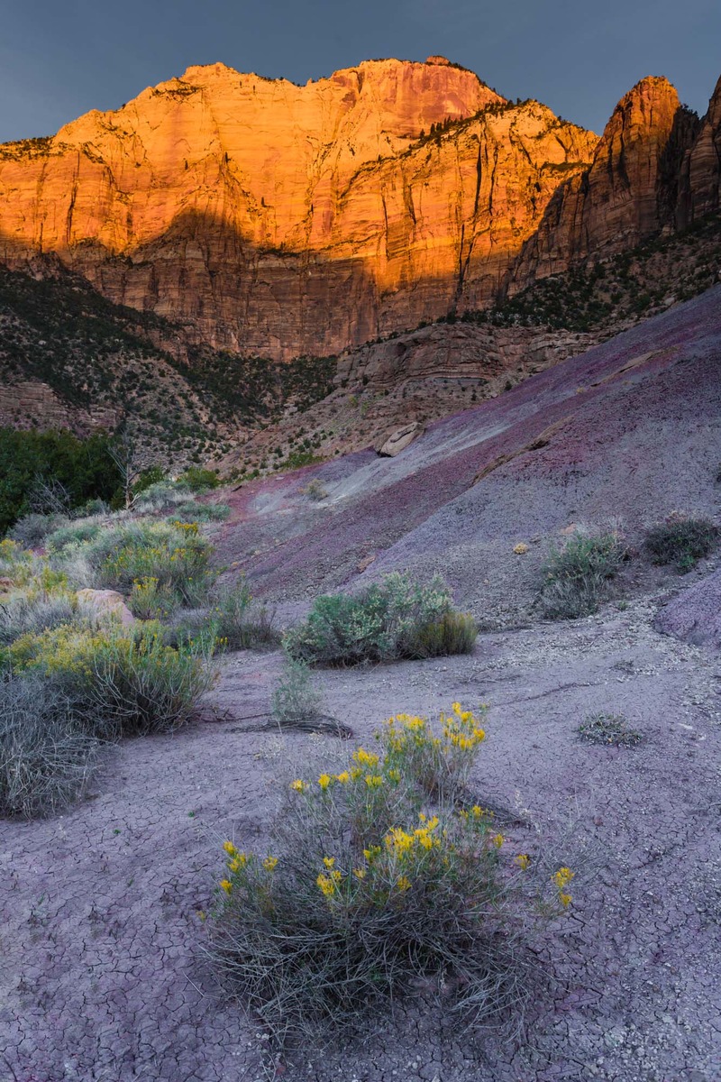
I've been working with this photo awhile, trying to see how I can make it all hang together. Would really appreciate any feedback. The orange top of the mountain at sunrise was so colorful that I think it may dominate the rest of the photo, with its more subtle colors.

Canon 5d,M3, ISO500, 28mm, f/10, 1/60 sec.

Thanks in advance for any comments or critiques

Comments

6 comments
Comment posted by Ken Smith on May 10, 2014 at 7:52 PM
Hi Kathy, my quick impressions of this photo is it has individually strong elements …but they are not unified….”hang together”. The bottom third with the flowering shrub (tho a tad soft), then the band of pine shrubs in center and finally, the blazing sun-drenched mtn. The biggest disruption is the gap in the center between the lower blooming bush with the mtn. Were the flowering shrubs continuous and forming a nice Z- or S curve flowing up the drainage in the center of the photo to the mtn…that might help.
Registered on September 5, 2008, 449 Posts, 2444 Comments
Comment posted by Michael Cothran on May 10, 2014 at 9:30 PM
You're correct about the mountain top. Try this as a "creative" technique to bring the bottom portion into better relativity with the top - Darken the side edges a bit at the bottom up towards the mountain, then lighten a "trail" from the bottom flowering bush towards the top. That "trail" of light will, or should, help lead the eyes.
Registered on December 5, 2012, 31 Posts, 730 Comments
Comment posted by Kah Kit Yoong on May 11, 2014 at 5:02 AM
I think this hangs together OK although as others have noted there are some compositional weaknesses. I would add some contrast to the fore and mid ground for more pop to match the alpen glow.
Registered on September 27, 2006, 636 Posts, 10682 Comments
Comment posted by Bill Reid on May 12, 2014 at 3:48 PM
very nice scene Kathy and I agree with Kah Kit about adding some contrast to fore and mid ground. Also Michael's idea of dodging some spots to leave a trail of light to follow through the scene. A very nice scene though.
Registered on January 27, 2013, 65 Posts, 2460 Comments
Comment posted by John Williams on May 13, 2014 at 3:08 AM
I'd like to compare a comp where you got lower and closer to the foreground flowers. Closer would have reduced the empty spaces on the sides, and lower would have shrunk that mid-zone some. You don't happen to have one of those hanging around, do you? :smile: The color is beautiful on the cliff face too, but I'd back the saturation down just a tad; it looks like some detail has been lost there.

This is actually a very nice shot, we're just picky around here and a few changes could really add zip.
Registered on September 6, 2007, 221 Posts, 5985 Comments
Comment posted by Brian Schrayer on May 14, 2014 at 2:19 AM
Kathy, I've come back to this image a number of times. I actually think the contrast between the bold color of the mountain and the more subtle color in the foreground works well. I think you have a really nice composition.
Registered on May 28, 2004, 114 Posts, 2890 Comments