Gallery: AvianPosted May 24, 2014121 views13 comments
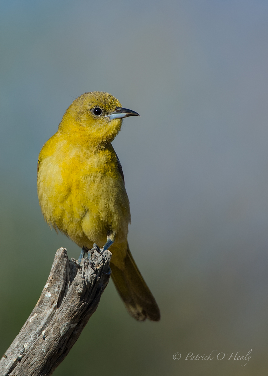
May 18, 2014 at Charlie Van Tassel's yard in Poway, California
Nikon D4 600mm 1.4TC 850mm 1/4000 f/6.3 ISO 640 White Balance Auto Processed in Lightroom, PSCC, NIK and TK slight crop
Comments welcome
Comments
13 comments
Comment posted by Charlie VanTassel on May 24, 2014 at 12:08 PM
Nice Patrick! Was this some kind of setup???
Registered on October 18, 2006, 644 Posts, 4801 Comments
Comment posted by Patrick O'Healy on May 24, 2014 at 12:28 PM
Charlie,
The set up is a series of branches placed where the light is right. The owner of the home has a keen understanding of bird behavior, and has a yard that attracts birds. It is a wonderful location for a variety of birds. The only downside is that the owner has a tommy gun filled with zingers.
Registered on March 13, 2011, 326 Posts, 1679 Comments
Comment posted by Keith Bauer on May 24, 2014 at 12:57 PM
Great pose,perch, and background for the bird. I like all of that. Feels a bit on the dark side to me and just a bit flat. Here's a version applying a TK Light Lights Mask on a levels adjustment layer and moving the white point in significantly (171). See what you think.
Registered on November 20, 2003, 458 Posts, 4836 Comments
Comment posted by Patrick O'Healy on May 24, 2014 at 1:01 PM
Keith,
Your version looks much better. I guess you will have to process all my images from now on. The subtleties are daunting. Thanks for showing me the way.
Registered on March 13, 2011, 326 Posts, 1679 Comments
Comment posted by Keith Bauer on May 24, 2014 at 1:07 PM
What Luminance level do you choose when you calibrate your monitor? I use a value of 100 cd/m2. I use that because I find it provides a nice balance between images on the monitor and the prints are always better for me using that as a calibration level on the screen. I ask just because of the brightness level of the image as posted.
Registered on November 20, 2003, 458 Posts, 4836 Comments
Comment posted by Sharon Hallowell on May 24, 2014 at 2:44 PM
I probably shouldn't say this, but Patrick...I like your version better. The areas on the breast of Keith's repost are too bright for my liking, and I see better detail in your yellows. I also prefer the darker bg that your image has. That being said...Keith thinks my images are flat and dark, too. So maybe I'm just not seeing what I'm supposed to be seeing?? Just because an image CAN be brighter, and the whites CAN be moved closer to the limit, does that mean we should make it so? What if the light and conditions are shown by what is posted? Are my eyes not seeing something they should? Keith...in no way do I mean to contradict you...I have the utmost respect for you, your images and your post processing knowledge....I'm just wondering if I'm not seeing something I should, and am hoping to learn something here.
Anyway...back to your image Patrick...it's wonderful! Sharon
Registered on November 1, 2003, 392 Posts, 4810 Comments
Comment posted by Kurt Bowman on May 24, 2014 at 2:45 PM
Nice capture Patrick, I do agree with Keith about the brightness and the repost really makes this image pop a lot more.
Registered on June 19, 2008, 1005 Posts, 8028 Comments
Comment posted by Richard Ditch on May 24, 2014 at 4:53 PM
I prefer Patrick's original version. I find Keith's lightened version has made the yellow too lemony for the species.
Perhaps this discussion should move to the general forum; I agree with Sharon's comments on the darker BG, the overall lightness, and the general concern about keeping the presentation close to the original scene.
Registered on November 1, 2003, 1031 Posts, 12705 Comments
Comment posted by Keith Bauer on May 24, 2014 at 5:16 PM
Great Discussion on what some like and what some don't. I'm not suggesting there is a right answer. For me, the image was dark and I thought it looked better lightened up. I rely heavily on the histogram values. That doesn't mean I'm trying to push things all the way to the right or left, just trying to see the tones fall where it looks like they should. Clearly for others, it is preferable to have the image look/feel different. I do not believe that there is a singular "right" answer!! Great feedback on the image, and my re-post.
Registered on November 20, 2003, 458 Posts, 4836 Comments
Comment posted by Howard Cheek on May 24, 2014 at 6:36 PM
I like the soft light & slightly muted colors of the female.
Very nice
Registered on July 24, 2008, 1201 Posts, 10758 Comments
Comment posted by Sharon Hallowell on May 24, 2014 at 11:17 PM
As much as any of us, I want to make my images better! I still have so very much to learn! I appreciate your response, Keith. I guess sometimes it does come down to personal preferences, and I also like Patrick's comment, "The subtleties are daunting" I think it's good to try different things with your images in regard to processing, and thank you Keith for helping us by taking the time to do posts like this, and the ones you've done on my own images. One of the best things I've learned this year in processing my own images is to do things in VERY small increments, SUBTLY. Large changes to an image can really make it suffer and look worse than the original. I see many posts here from the beginners that are just too saturated, and I did it too! I am learning to TRAIN MY EYES to see things like contrast, temperature, and saturation. For some, I guess that comes naturally. I feel like I have a pretty good idea what I like....Now I'm learning about WHY I like it that way! Thanks, Patrick, Keith, and Richard for the post and input. Sharon
Registered on November 1, 2003, 392 Posts, 4810 Comments
Comment posted by Jim DeWitt on May 25, 2014 at 2:24 AM
A fine shot, Patrick. And an equally fine discussion, one of the reasons I enjoy NPN so much.
Registered on August 28, 2006, 1240 Posts, 8506 Comments
Comment posted by Dennis Plank on May 25, 2014 at 10:05 PM
Excellent perch , pose and bg, Patrick, and really good image quality.
Registered on January 28, 2008, 1767 Posts, 23192 Comments


Comments
13 commentsThe set up is a series of branches placed where the light is right. The owner of the home has a keen understanding of bird behavior, and has a yard that attracts birds. It is a wonderful location for a variety of birds. The only downside is that the owner has a tommy gun filled with zingers.
Your version looks much better. I guess you will have to process all my images from now on. The subtleties are daunting. Thanks for showing me the way.
Anyway...back to your image Patrick...it's wonderful! Sharon
Perhaps this discussion should move to the general forum; I agree with Sharon's comments on the darker BG, the overall lightness, and the general concern about keeping the presentation close to the original scene.
Very nice