Nature Photographers Network
This is the preserved archive of the original Nature Photographers Network. The community continues at naturephotographers.network.
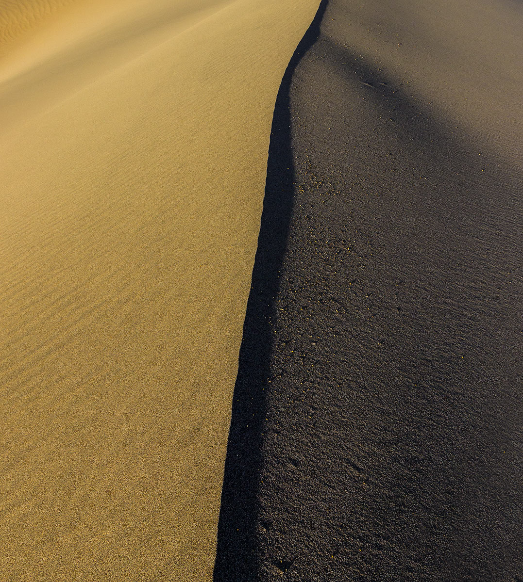
Dune edge abstract
‹ PreviousLandscape GalleryNext ›

Dune edge abstract

by Ronald Murphy

Gallery: LandscapePosted July 8, 2014151 views14 comments
Mesquite Flats Sand Dunes, Death Valley

Raw file processed in LR5, with TK resize/sharpening for web. Canon T3i, 1/80 s, f/10, ISO 200, EFS 10-22 mm @ 15 mm, CPL, cropped

Please view the large image!

Seeking any and all advice and comments. Thanks in advance.

Comments

14 comments
Comment posted by Brian Schrayer on July 8, 2014 at 8:54 PM
I like the contrast between the warm light on the left and the shadow darks on the right. The texture and interesting ripples add to the appeal of this image. The one critique that I have is that the composition is a bit static due to the basically straight line that travels along basically the center of the image. If you could have found a curved line it would have been a bit more of a dynamic composition which would give it more visual appeal.

On the other hand, I could see if you wanted to convey more of a simple concept showing just the contrast between the warm / shadow areas, but if that was your goal I would recommend cropping out the upper third of the image. This creates some visual tension and ambiguity as it's not as obvious what the viewer is seeing in the image.

Having said all of that there is not a right or wrong way to compose this image so if you like it as presented that's the most important thing. I just wanted to pass along some suggestions that are hopefully constructive. :wavey:
Registered on May 28, 2004, 114 Posts, 2890 Comments
Comment posted by gary phillips on July 8, 2014 at 9:49 PM
I kinda agree with what Brian is saying, Ronald. At first blush, I had the same thought. Too static and centered. Having said that, the longer I spent with the image I realized it is quite graphic. Love the deep shadow line at the apex of the dune and the texture change. What really could have sent this image to another level would have been deep, graphic, ripples on the left side, instead of the more muted ones presented here.
Registered on October 24, 2013, 185 Posts, 4136 Comments
Comment posted by Harry Lichtman on July 9, 2014 at 8:41 AM
Beautiful mix of tones and textures. Fine as is for me.
Registered on September 17, 2010, 304 Posts, 3507 Comments
Comment posted by Catherine Reilly on July 9, 2014 at 2:04 PM
Beautiful, graphic abstract! I like following the line of the shadow and the larger rocks along there that harmonize well with color on the left. Try gently burning in the ripples on the left; I'd be curious to see how it effects the perception of the scene. There are also a couple of other straight vertical lines on the left that parallel the main one. This is good as is, but there may be more to see, or to add interest, on the left side, if you want to.
Registered on August 16, 2006, 603 Posts, 9192 Comments
Comment posted by Bill Chambers on July 9, 2014 at 2:37 PM
Beautiful abstract and really special light.
Registered on April 10, 2005, 753 Posts, 21216 Comments
Comment posted by Michael Lowe on July 9, 2014 at 3:59 PM
The others offer some valid points, but I like it as presented. Great detail in the larger image.
Registered on February 11, 2004, 777 Posts, 5252 Comments
Comment posted by Joel Hazelton on July 9, 2014 at 5:35 PM
"On the other hand, I could see if you wanted to convey more of a simple concept showing just the contrast between the warm / shadow areas, but if that was your goal I would recommend cropping out the upper third of the image. This creates some visual tension and ambiguity as it's not as obvious what the viewer is seeing in the image. "

I think Brian's feedback is spot-on. The composition as presented is fairly straight-forward and does not challenge me much. I think cropping the top 1/3 would create a more interesting image.
Registered on August 6, 2008, 194 Posts, 1315 Comments
Comment posted by Julia Flanagan on July 9, 2014 at 6:35 PM
Well, this is challenging me plenty! My first thought was, "Sand on the left asphalt on the right... how odd...no that can't be right. What is this???" The black line down the middle doesn't make sense to me either. That's not a bad thing. It keeps me looking at it trying to figure it out. IMHO quite an intriguing image.
Registered on November 13, 2003, 59 Posts, 986 Comments
Comment posted by Chet Dowell on July 9, 2014 at 6:53 PM
Nice job of seeing this image, Ronald. Very graphic with starkly contrasting elements. I like it. Chet
Registered on December 3, 2012, 237 Posts, 1171 Comments
Comment posted by Vance Gese on July 9, 2014 at 11:18 PM
Love the stark, graphic, abstract design of your image, Ronald. The different textures to either side of the ridgeline only add to this. Fantastic work.
Registered on November 13, 2008, 298 Posts, 6629 Comments
Comment posted by Thomas Haney on July 10, 2014 at 12:58 PM
Very unique shot Ronald, don't think I've seen a dune abstract quite like it before. The only suggestion I have is that you might consider darkening the upper left corner a little for balance. Well done.
Registered on April 7, 2013, 138 Posts, 537 Comments
Comment posted by Dan Kearl on July 10, 2014 at 6:54 PM
This is really a superb abstract. The texture makes it would very well and the perfect black line also is just really nice.
I would not change a thing.
Registered on September 2, 2013, 209 Posts, 1514 Comments
Comment posted by Preston Birdwell on July 12, 2014 at 10:07 AM
This is a wonderful abstract. I've looked at this a few times, and wouldn't change a thing.

--P
Registered on November 1, 2003, 471 Posts, 5188 Comments
Comment posted by Nick Bristol on July 13, 2014 at 2:11 PM
Excellent!! I like this a lot as is. :smile:

Nick Bristol
Lone Rock, WI
Registered on February 1, 2004, 752 Posts, 14140 Comments