Nature Photographers Network
This is the preserved archive of the original Nature Photographers Network. The community continues at naturephotographers.network.
Shape, lines, color +V2
‹ PreviousFlora GalleryNext ›

Shape, lines, color +V2

by Nathan Buck

Gallery: FloraPosted August 15, 2014140 views8 comments
Hi all.

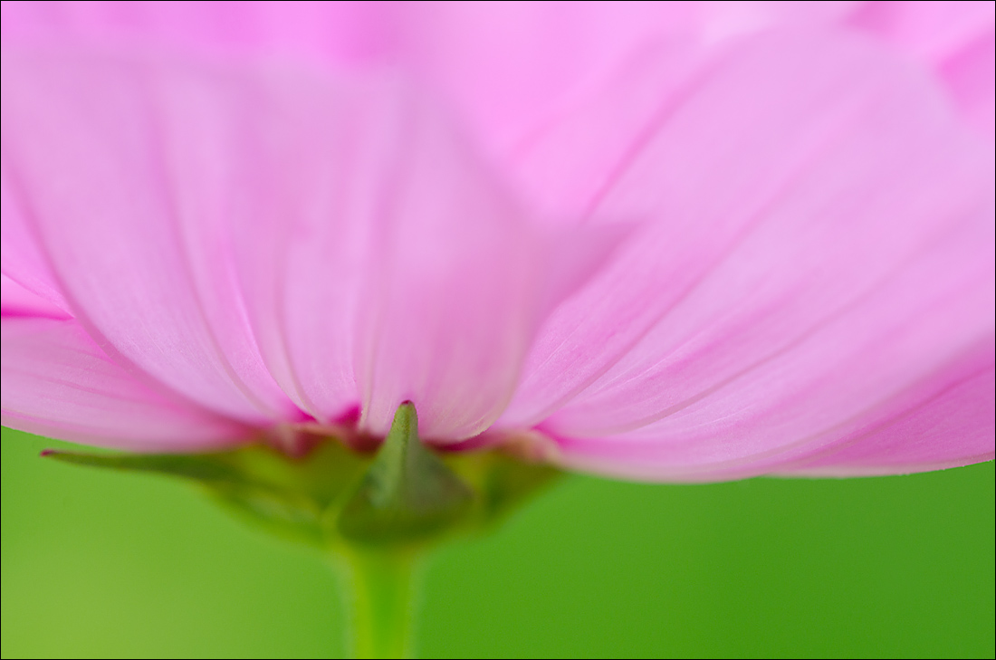
I will post another pink brachycome in the near future, but I wanted your thoughts on this Cosmo. Sort of simple, relying on color, form, lines, shape.

Does it have enough to hold your interest?

Please be honest with me!

Thanks!

Nathan

Nikon D7000, Sigma 180 macro, tripod, ISO 400, f8

Comments

8 comments
Comment posted by Nathan Buck on August 15, 2014 at 2:13 AM
Here is another version - shot more open... This one is around f4.

Nathan
Registered on November 1, 2003, 1101 Posts, 13589 Comments
Comment posted by Ronald Murphy on August 15, 2014 at 7:59 AM
I prefer the f/8. I would like to see this very large on a wall. Would be eye-catching.
Registered on March 13, 2012, 279 Posts, 975 Comments
Comment posted by Bill Fach on August 15, 2014 at 3:21 PM
Nathan: Hmmm. . . I'll take one of each. I think for this presentation I will vote 51-49 for the f8 version. I do like the slightly greater structure. Good vision, good photography. >=))>
Registered on November 1, 2003, 1805 Posts, 26981 Comments
Comment posted by Philip Hodgkins on August 15, 2014 at 4:22 PM
I like the first. It holds my interest. First thing I thought of was a big lady sitting on a small stool! :biggrin:
Registered on July 24, 2006, 2741 Posts, 12349 Comments
Comment posted by Ramamohan Pai on August 15, 2014 at 7:49 PM
Nathan - I like the F/8 version as well for the slightly more definition and content for my eyes to rest on. Sometimes I also take a few shots "looking up" in addition to straight on and then compare which perspectives look better.
Registered on November 1, 2003, 550 Posts, 9037 Comments
Comment posted by scott lanz on August 15, 2014 at 10:28 PM
Another vote for the f8 version, Nathan. I like the comp a lot and the contrasting colors are fabulous. The cosmos works really well for this comp with the lines and color.


:toast:

So, did you take any stopped down even more? With a clean bg like this, you could try for more dof.
Registered on November 14, 2003, 840 Posts, 12902 Comments
Comment posted by Albert Darmo on August 15, 2014 at 10:37 PM
Hi Nathan :wavey: Bill echoed my thoughts perfectly :eek: :jump: :eek: Amazing light & color :toast:


Albert Darmo
Canada
Registered on November 25, 2008, 1386 Posts, 11978 Comments
Comment posted by Ian Wolfenden on August 17, 2014 at 1:43 PM
I like the first for depth of field and focus, Nathan, the second for the more muted colour. The upward fading of the petals in the first is a real delight.
Registered on May 18, 2007, 1108 Posts, 7647 Comments