Nature Photographers Network
This is the preserved archive of the original Nature Photographers Network. The community continues at naturephotographers.network.
Layers of the Desert
‹ PreviousLandscape GalleryNext ›

Layers of the Desert

by Bill Leggett

Gallery: LandscapePosted September 12, 2014189 views10 comments
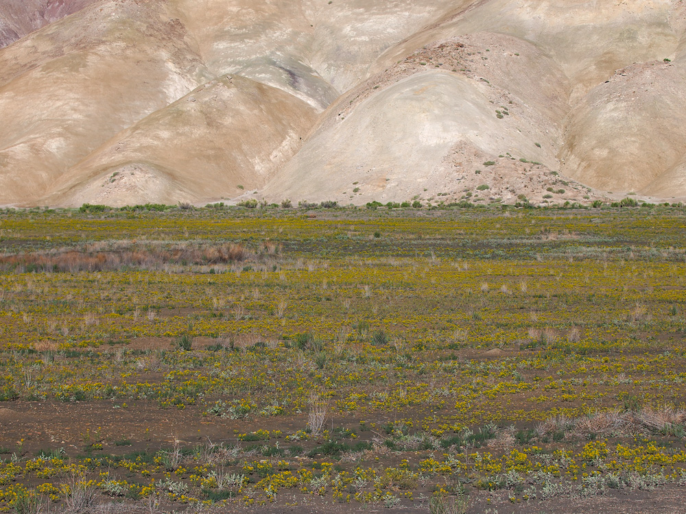
I found this somewhere along UT24 near Capitol Reef. I liked the contrast between the harsh hills and the carpet of lush spring bloom. Full frame, larger image included.

E-5 ZD50-200 @50 Manfrotto 3265 on GT2531, ISO 100 f5.6 -1/3EV 4 sec delay with MLU.

Comments

10 comments
Comment posted by John&Patty Benway on September 12, 2014 at 1:19 PM
Very nice indeed Bill, really like the way you composed this, it's different in a good way, also like the natural color. I think everything came together beautifully.
John
Registered on May 12, 2006, 626 Posts, 8700 Comments
Comment posted by Ed Lowe on September 12, 2014 at 2:33 PM
I really like this, Bill. Sort of like an abstract with all these colors and shapes.

Ed
Registered on February 7, 2004, 414 Posts, 7115 Comments
Comment posted by Preston Birdwell on September 12, 2014 at 2:55 PM
I like this composition a lot, Bill. I do think the foreground leading up to the hills is a tad flat. If you pulled up the mid tones just a bit, it would have more pop. I really like the hills.

--P
Registered on November 1, 2003, 471 Posts, 5188 Comments
Comment posted by Catherine Reilly on September 12, 2014 at 5:01 PM
This is good, Bill. The large mounds kind of overwhelm all the delicate details in the foreground. I favor the adjustment suggested by Preston. If you have NIK plug-ins, I'd sure give ColorEfex a chance at the foreground. It's too lovely not to stand out a little more.
Registered on August 16, 2006, 603 Posts, 9192 Comments
Comment posted by Tony Kuyper on September 12, 2014 at 11:38 PM
I really like the contrast between the foreground and background. Just maybe thinking less foreground would maybe work well too.
Registered on November 1, 2003, 364 Posts, 22328 Comments
Comment posted by Peter Richter on September 13, 2014 at 9:47 AM
An exceptional image for me, I almost perceive it as an abstract. The delicate foreground details complement the shapes in the depth most interestingly to me.

Peter
Registered on November 10, 2010, 218 Posts, 2723 Comments
Comment posted by Mark Seaver on September 13, 2014 at 4:11 PM
This is a very interesting and challenging view, Bill. The color and shape contrast top to bottom is dramatic. After spending a long time looking, I think that Preston's suggestion of more "pop" in the flowers is likely to work because as presented there is good drama in the shapes and colors of the hills while the flowers are much more subtle, with no strong places to catch my eyes.
Registered on January 23, 2011, 1103 Posts, 17270 Comments
Comment posted by gary phillips on September 13, 2014 at 4:15 PM
This is pretty nice, Bill. I'm probably in the add more pop camp here. The blanket of yellow is just too understated for me. Obviously, it comes down to personal taste. It's such a beautiful drive along Hwy 24, I'm glad you shared this one.
Registered on October 24, 2013, 185 Posts, 4136 Comments
Comment posted by Mark Metternich on September 15, 2014 at 3:18 AM
Works nicely! :toast:
Registered on June 19, 2009, 276 Posts, 6240 Comments
Comment posted by Pat Sampson on September 15, 2014 at 6:52 PM
I like this too Bill. Very nice. No suggestions.

pat
Registered on May 19, 2007, 953 Posts, 15989 Comments