Nature Photographers Network
This is the preserved archive of the original Nature Photographers Network. The community continues at naturephotographers.network.
Aspens and Tall Grass + rp
‹ PreviousLandscape GalleryNext ›

Aspens and Tall Grass + rp

by Preston Birdwell

Gallery: LandscapePosted September 12, 2014259 views15 comments
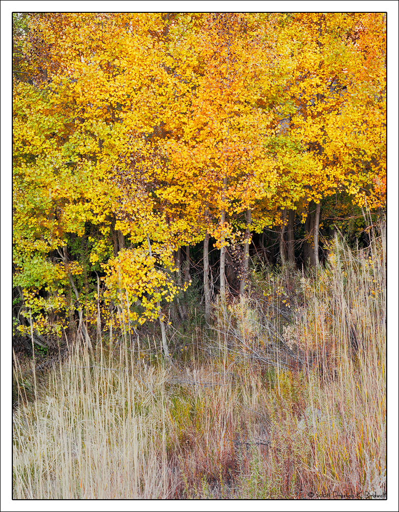
Here's another from my negative archive. I liked the 'wall' of aspens contrasted with the tall grass near McGee Creek, in the Sierra.

Tachihara 4x5
Nikkor-M 300mm
Fuji 160 Pro-S Color Negative.
TK's Masks, including Saturation and Vibrance Masks
October 2008

Please see the large version. Compression isn't doing this one any favors. Thanks!

Your thoughts are always appreciated. :smile:

--P

Comments

15 comments
Comment posted by Gary Reed on September 12, 2014 at 2:55 PM
Preston, I like where this is trying to go. Just wish the light was not so strong and even on the aspens. Nice contrast between texture in grass and leaf though.
Registered on September 19, 2009, 198 Posts, 1074 Comments
Comment posted by John&Patty Benway on September 12, 2014 at 4:11 PM
Very inspiring Preston, I never get tired of viewing scenes of this nature, I really like the warm pleasant feeling it evokes. Beautiful color, love all the fine detail in the grasses, and the composition works beautifully.
John
Registered on May 12, 2006, 626 Posts, 8700 Comments
Comment posted by Catherine Reilly on September 12, 2014 at 4:57 PM
I like the "forest edge" look to this, Preston. Great comp. The aspen are really taking a lot of light but there is an enjoyable array of color there.
Registered on August 16, 2006, 603 Posts, 9192 Comments
Comment posted by Paul Breitkreuz on September 12, 2014 at 8:04 PM
Compression isn't doing this one any favors.


Never easy with aspen tree images or anything with so much small detail. I like the composition but as already mentioned is on the bright side with regard to lighting. Maybe some adjustments there to see how things appear might be an idea. The negative film has provided some nice color and a very natural look to the scene. It also provided some excellent all around exposure between the brightness here and the shadow area deep inside the lower tree areas. Very nice work with the film here, Preston.
Registered on February 25, 2006, 525 Posts, 8448 Comments
Comment posted by Joseph Campisi on September 12, 2014 at 9:51 PM
Nicely seen Preston. This strongly reminds me of an image I took a couple of years ago on the east side of Snoqualmie Pass. I guess great minds think alike... :biggrin:
Registered on November 24, 2008, 304 Posts, 3211 Comments
Comment posted by Tony Kuyper on September 12, 2014 at 11:40 PM
I like the softness of the grass and it's vertical quality. Leaves feel a bit contrasty. Could maybe see creating a vignette to focus that contrast more in the center of the frame.
Registered on November 1, 2003, 364 Posts, 22328 Comments
Comment posted by Kah Kit Yoong on September 13, 2014 at 2:22 AM
I like this a lot. The two parts complement and contrast well. I feel that a slight crop off the top for symmetry works better for me.
Registered on September 27, 2006, 636 Posts, 10682 Comments
Comment posted by gary phillips on September 13, 2014 at 2:30 AM
Really nice, Preston. I agree with Tony that the aspens could be tamed somewhat, but otherwise very well presented. :wavey:
Registered on October 24, 2013, 185 Posts, 4136 Comments
Comment posted by Preston Birdwell on September 13, 2014 at 2:44 PM
Thanks for your suggestions, everyone!

I cropped a bit from the top, burned the top and left and right edges in the trees, and also tweaked the contrast to soften it up a bit.

I'd appreciate your thoughts on the repost. Thanks!

--P
Registered on November 1, 2003, 471 Posts, 5188 Comments
Comment posted by Mark Seaver on September 13, 2014 at 3:41 PM
This makes for an interesting contrast/comparison with John B's green version of a similar scene, Preston, and I like them both. You've got a fine warmth from the leaves and the grasses, plus I like how the clear area through the grass in the middle helps leads my eyes to the glowing trees. I also like that the tree line isn't level, which adds a gentle sense of movement.

I like the crop from the top, but I think the extra muting of the trees and grass on the left in the repost reduces the overall balance.
Registered on January 23, 2011, 1103 Posts, 17270 Comments
Comment posted by Nick Bristol on September 13, 2014 at 5:32 PM
Preston, I like this a lot! This comp works great and I love that foreground grass! What a nice feel.
The repost looks very good but I think I like the grass best in the original.

Nick Bristol
Lone Rock, WI
Registered on February 1, 2004, 752 Posts, 14140 Comments
Comment posted by Paul Breitkreuz on September 14, 2014 at 11:25 AM
I like the repost as is, Preston. I think it is easier viewing with the light tamed a bit there. I'm sure it will be a really nice print, something that is hard at times to see at these sizes and "compression" factors.......nice work. :cool:
Registered on February 25, 2006, 525 Posts, 8448 Comments
Comment posted by Harley Goldman on September 14, 2014 at 12:16 PM
I suspect that compression is the main culprit with the contrast on the leaves. I often have issues with that on scanned film of fall colors. No idea why that particular subject manifests the issue, but I have seen it a lot with my work.

The repost looks a little flat to me.
Registered on November 19, 2003, 586 Posts, 11271 Comments
Comment posted by Preston Birdwell on September 14, 2014 at 2:16 PM
Thanks all,

Compression is really killing the original and the repost. In the 1800 ppi 16-bit image in Adobe RGB, the grass and the leaves are much more lively. Comparing the two, it appears that the compression is throwing out some high values across the entire image, leaving the jpg flat looking.

Even though I really like the dynamic range of color negative film, scanning it and processing the files is much more of a challenge than with color transparency film.

Thanks again for your help and suggestions!

--P
Registered on November 1, 2003, 471 Posts, 5188 Comments
Comment posted by Pat Sampson on September 15, 2014 at 1:20 PM
Strong comp Preston and I particularly like the grasses in it. I actually prefer the original but I'd enjoy either on my wall.

pat
Registered on May 19, 2007, 953 Posts, 15989 Comments