Nature Photographers Network
This is the preserved archive of the original Nature Photographers Network. The community continues at naturephotographers.network.
Granitic Abstraction
‹ PreviousLandscape GalleryNext ›

Granitic Abstraction

by Preston Birdwell

Gallery: LandscapePosted September 15, 2014229 views12 comments
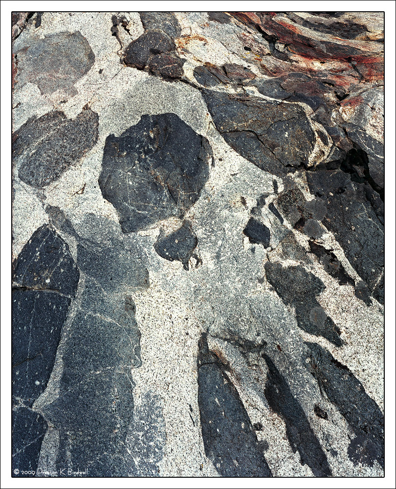
This amazing intrusion is located in Lee Vining Canyon on the East Side of the Sierra.

Bonus points if you can tell us what the dark rocks embedded in the lighter granite are called.

Tachihara 4x5
Fujinon 180mm
Fuji 160 Pro-S color negative
October 2009. Recently re-scanned and post processed.

Please see the large version. Thanks!

Your thoughts are always appreciated. :smile:

--P

Comments

12 comments
Comment posted by Pat Sampson on September 15, 2014 at 6:47 PM
Preston,

I like the comp in this but I'm not sure about the red stains? at the top. The details and textures are very fine. How would this be as a black and white conversion I wonder?

I'm going to guess that the inclusions are gabbroic xenoliths but just a guess. They're almost certainly xenoliths. (xenos -foreign, lithos - rock)
Registered on May 19, 2007, 953 Posts, 15989 Comments
Comment posted by Preston Birdwell on September 15, 2014 at 7:26 PM
Thanks Pat. You win the bonus points! I am not sure they are gabbro, though. Anyone have an idea?

I did a quick B&W, but the dark rocks lost a lot of detail, and I like the bluish hue. I may look at dropping the saturation in the red stains.

Thanks again!

--P
Registered on November 1, 2003, 471 Posts, 5188 Comments
Comment posted by Nick Bristol on September 15, 2014 at 7:39 PM
Preston, Great composition with this and I really like the detail and textures that come through in the large version. I might think about dropping the saturation of those red stains as well, as you mentioned. Not sure what the dark rocks would be... :smile:

Nick Bristol
Lone Rock, WI
Registered on February 1, 2004, 752 Posts, 14140 Comments
Comment posted by Tony Kuyper on September 16, 2014 at 12:17 AM
Interesting abstract. I'm really not sure of its scale, but I'm guessing bigger rather than smaller. The top maybe feels a bit too light compared the bottom. Could see trying to balance this out more.
Registered on November 1, 2003, 364 Posts, 22328 Comments
Comment posted by Stan Rose on September 16, 2014 at 12:25 AM
It's a pretty cool abstract, but like TK I feel it is a bit unbalanced; the red section pulls the eye to the urhc and there's not enough in the vast expanse of gray below it to pull the eye back.
Registered on September 15, 2005, 836 Posts, 17099 Comments
Comment posted by John&Patty Benway on September 16, 2014 at 6:54 AM
Preston, really like the composition, beautiful detail and patterns, but the iron deposits do tug at my eye a bit, but that is an easy fix. Like it alot, beautiful work.
John
Registered on May 12, 2006, 626 Posts, 8700 Comments
Comment posted by Harley Goldman on September 16, 2014 at 9:23 AM
Real nice pattern abstract. I agree that the red pulls my attention. It works nicely for me with the reds (and even yellows) desaturated.
Registered on November 19, 2003, 586 Posts, 11271 Comments
Comment posted by Balakumar Kaushik on September 16, 2014 at 3:08 PM
Lovely texture in the rock. Not sure if I like the red region on top right...
Registered on January 4, 2008, 98 Posts, 1403 Comments
Comment posted by Eva McDermott on September 16, 2014 at 7:50 PM
The shapes and lines work very well Preston. I might have been tempted in to go B&W with this image but understand that does not always work. Maybe desaturating the reds may better than B&W.
Registered on January 4, 2009, 1015 Posts, 13229 Comments
Comment posted by Paul Breitkreuz on September 16, 2014 at 11:15 PM
Very interesting geological study here, Preston. Always a favorite for me in landscape work with the multitude of formations, textures, and materials that comprise that realm. Enough stated on the red with regard to some options, regardless, a very fine image. :cool:
Registered on February 25, 2006, 525 Posts, 8448 Comments
Comment posted by Catherine Reilly on September 17, 2014 at 5:38 PM
Pretty amazing abstract work you're posting, Preston. I like the design in this one, including the red in the urc. No geologist am I, so I'll leave that to rest and look forward to learning the answer.
Registered on August 16, 2006, 603 Posts, 9192 Comments
Comment posted by Bill Fach on September 19, 2014 at 12:12 AM
Preston: Well seen and composed. Reminds me of some of Anil Rao's rock abstracts and I think that is a good thing. Nicely done.>=))>
Registered on November 1, 2003, 1805 Posts, 26981 Comments