Nature Photographers Network
This is the preserved archive of the original Nature Photographers Network. The community continues at naturephotographers.network.
Coyote
‹ PreviousWildlife GalleryNext ›

Coyote

by Max Waugh

Gallery: WildlifePosted October 30, 2014294 views15 comments
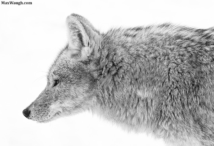
Here's a shot taken in Yellowstone back in January. This coyote walked past my car, using the road as an easier means of travel to avoid deep snow. With my long lens I was only able to fit the front half of it in the frame. I really wanted to emphasize the texture of the fur, so I settled on this slightly high key B/W look.

Incidentally, this was not a healthy animal. The back half of it was very scrawny, and its tail was bare due to mange.

Canon 1DX
Canon 500mm f/4 IS
ISO 400
1/500th
f/9

Max

Comments

15 comments
Comment posted by Ken Watkins on October 30, 2014 at 12:32 PM
Max.
From your description, just as well we cannot see it all :biggrin:
Nice detail in this, but I would prefer a little more space on the left :toast: :toast:
Registered on December 15, 2010, 1537 Posts, 4877 Comments
Comment posted by Ken Archer on October 30, 2014 at 6:18 PM
I really like the fur texture visible here too. The look of concentration fits perfectly with this close-up capture.

Sweet One Max!
Registered on October 28, 2004, 222 Posts, 6683 Comments
Comment posted by Richard Sandor on October 30, 2014 at 7:44 PM
Max: high key was an excellent choice. Now there are nothing to distract from just pure coyote. Richard
Registered on January 12, 2014, 453 Posts, 1625 Comments
Comment posted by Philip Hodgkins on October 30, 2014 at 9:15 PM
Good choice. I agree with Ken, but I would also consider adding to the top as well to maintain the crop shape. :smile:
Registered on July 24, 2006, 2741 Posts, 12349 Comments
Comment posted by Gary Reed on October 30, 2014 at 10:12 PM
Max, love the detail and high key. Because this is on a pure white background...I think you could add the space back everyone else is mentioning... :toast:
Registered on September 19, 2009, 198 Posts, 1074 Comments
Comment posted by Nate Chappell on October 30, 2014 at 10:13 PM
The texture and fur stand out beautifully against that background Max, a bit more room in front and on top for me also. Sweet shot. :toast:
Registered on February 1, 2006, 1158 Posts, 19528 Comments
Comment posted by John Launstein on October 31, 2014 at 2:01 AM
Hi Max! Oh man I like this one. I'm a sucker for a well-handled B&W image and this qualifies in spades. Stunning detail and wonderful, intense pose from your subject that adds a lot of drama and tension. The eye looks PHENOMENAL. And way to go in showing the best "side" of this coyote...no hint that he's not extremely healthy. I can't disagree with the suggestions for more room above and "in front," but on the other hand for me this is an extreme close-up image that has a lot of impact as presented, so...I'm a bit torn on whether there is room for actual improvement here. I like it--a lot.
Registered on April 5, 2011, 223 Posts, 1193 Comments
Comment posted by William Bickle on October 31, 2014 at 8:24 AM
Hello Max

Great job to bring out the Best in this guy! Sharp with excellent details!

My personal preference would enjoy some additional room on three sides , if you had it ?

Bill
Registered on June 13, 2011, 183 Posts, 1702 Comments
Comment posted by Max Waugh on October 31, 2014 at 1:36 PM
Thanks for the feedback, and I appreciate the positive response. I admit I was wrestling with how much space to leave in front. I was so focused on the texture and shape of the coyote, that I started thinking of it more in terms of a static graphic element--like an arrow--rather than a normal subject where I'm more worried about breathing room and the direction the eye moves in the frame. I tend to agree with the sentiment to add more room back, but there's not all that much in the original frame. I did update the print version with more added space (all that was left on the left side!), but it may still not be as much as you'd hoped for.

Max
Registered on September 26, 2008, 428 Posts, 2329 Comments
Comment posted by Kurt Bowman on October 31, 2014 at 10:11 PM
Love the texture in the fur...B&W really makes it stand out especially with this HK BG. I like it as posted. :toast:
Registered on June 19, 2008, 1005 Posts, 8028 Comments
Comment posted by Catherine Reilly on November 1, 2014 at 8:18 AM
High key is great for this. The look on its face intrigues me. I get the feeling that its life is hard and causing some suffering, but perhaps I am influenced by your description… The look of concentration is there, but also something like weariness, something else…
Registered on August 16, 2006, 603 Posts, 9192 Comments
Comment posted by Brad Hill on November 1, 2014 at 8:28 AM
Hi Max,

I like this a lot too - for many of the reasons mentioned above. I looked at it more as a graphic element than a representation of a coyote (the minute one goes B&W we're so far away from "reality" anyway...and add in high-key...) so was just fine with the composition and amount of space all-round. Personally I wouldn't change it at all...

Nicely seen - both in the field and behind the computer...

Cheers...

Brad
Registered on May 29, 2007, 431 Posts, 6061 Comments
Comment posted by Ashleigh Scully on November 1, 2014 at 4:46 PM
I think this is beautiful Max. I really like the stare and the use of black and white shows a lot of fur detail. Awesome!
Registered on November 4, 2013, 36 Posts, 210 Comments
Comment posted by Mario Moreno on November 10, 2014 at 3:09 PM
Congrats Max on a well deserved "Weekly Pick" . . . . . Great composition, detail and conversion :toast:
Registered on January 24, 2012, 163 Posts, 369 Comments
Comment posted by Jenaya Launstein on January 20, 2015 at 3:10 AM
Nice, crisp detail in this image, Max! I absolutely LOVE the B&W conversion. Congrats on a well deserved WP!
Registered on February 8, 2011, 254 Posts, 1302 Comments