Nature Photographers Network
This is the preserved archive of the original Nature Photographers Network. The community continues at naturephotographers.network.
Pillar of Light (+)
‹ PreviousLandscape GalleryNext ›

Pillar of Light (+)

by Jared Warren

Gallery: LandscapePosted November 9, 2014294 views14 comments
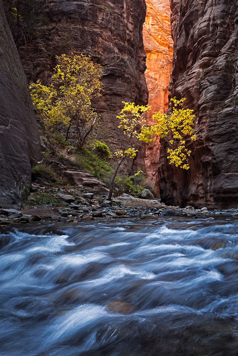
I made my third visit to the Zion narrows a couple weeks ago. It's always been a challenge for me to photograph. Just haven't often come away with something that communicates the feeling of the place for me. I think this was the best image I came away with this time, but look forward to your comments and critiques.

This is a 3-image focus blend. The main exposure was at 35mm, f/8.0, 0.8 sec, ISO 100. Quite a bit of selective burning to communicate the darker feel of the place, and other contrast and minor color adjustments using channel masking/luminosity masks.

* repost below *

Comments

14 comments
Comment posted by Bill Reid on November 9, 2014 at 1:58 PM
Another great shot Jared and the colors in this are wonderful. Beautiful tones in the rocks also and a great job on the processing. Tiny nit is the plant upper left but very minor. Super job. :toast:
Registered on January 27, 2013, 65 Posts, 2460 Comments
Comment posted by Pat Sampson on November 9, 2014 at 2:12 PM
I love this one Jared. The processing looks great to me and I like the comp and water treatment a lot. Beautiful work. No suggestions on my part.

pat
Registered on May 19, 2007, 953 Posts, 15989 Comments
Comment posted by Ryan Shain on November 9, 2014 at 2:40 PM
This is really sweet Jared,

I love the play between the cool water in fg and the warm "pillar of light" in the bg. The colors are so nice, and there is so much depth to this image. Those Canyon walls are so enchanting.

Excellent capture :toast:
Registered on February 20, 2007, 226 Posts, 4571 Comments
Comment posted by scott lanz on November 9, 2014 at 4:00 PM
Beautiful, Jared. I especially like the look of the water in this shot which looks a bit "rougher" than most fall narrows images. Adds some drama to the scene as well as contrasting blue color. Well done. :toast:
Registered on November 14, 2003, 840 Posts, 12902 Comments
Comment posted by Dan Kearl on November 9, 2014 at 7:23 PM
Just perfect lighting and the vert comp is also very nice.
I like the water as is, but could see another with a bit softer flow.
Registered on September 2, 2013, 209 Posts, 1514 Comments
Comment posted by Jared Warren on November 10, 2014 at 12:50 AM
Thanks for the comments so far. Here's a version I played with today with a bump in saturation and a slight Orton glow. What's your preference? My wife likes the original - often that matters. :wink:
Registered on May 11, 2012, 84 Posts, 931 Comments
Comment posted by gary phillips on November 10, 2014 at 1:57 AM
This is pretty cool, Jared. Love the cool/warm vibe and the pillar of light. The vertical comp and fall colors are beautiful. I have yet to do the narrows, perhaps when the majority of tourist leave, I'll give it a go. Nice work as always. :wavey:
Registered on October 24, 2013, 185 Posts, 4136 Comments
Comment posted by Mark Metternich on November 10, 2014 at 3:59 AM
Nice job on a classic Jared! :toast:
Registered on June 19, 2009, 276 Posts, 6240 Comments
Comment posted by Ronald Murphy on November 10, 2014 at 8:21 AM
Excellent. I prefer the original; seems to have more detail in the bright background wall.
Registered on March 13, 2012, 279 Posts, 975 Comments
Comment posted by Pat Sampson on November 10, 2014 at 9:29 AM
I know I'm out voted - same situation at home but I prefer the repost slightly. They're both gorgeous.

pat
Registered on May 19, 2007, 953 Posts, 15989 Comments
Comment posted by Harley Goldman on November 10, 2014 at 8:47 PM
Real nice take on the Narrows. Third time is a charm. I prefer the repost. Very well done.
Registered on November 19, 2003, 586 Posts, 11271 Comments
Comment posted by Daniel Rappaport on November 10, 2014 at 9:02 PM
Beautiful composition, striking light and colors. Well done.
Registered on September 9, 2009, 294 Posts, 2006 Comments
Comment posted by Jim Greenwood on November 11, 2014 at 9:15 AM
There's not a big difference between the two, but I like the original better. There's a little too much blue saturation in the water for my taste, but of course that's always a personal preference.
Registered on November 9, 2003, 229 Posts, 1523 Comments
Comment posted by Nick Bristol on November 13, 2014 at 5:59 PM
Jared, This looks fantastic to me! I really like your comp here with that foreground flowing water and the texture it has. The light and color through out the rest of the image look wonderful. Both version are very nice and i slightly prefer the repost. Nice work on this! :smile:

Nick Bristol
Lone Rock, WI
Registered on February 1, 2004, 752 Posts, 14140 Comments