Gallery: LandscapePosted November 9, 20143,362 views9 comments
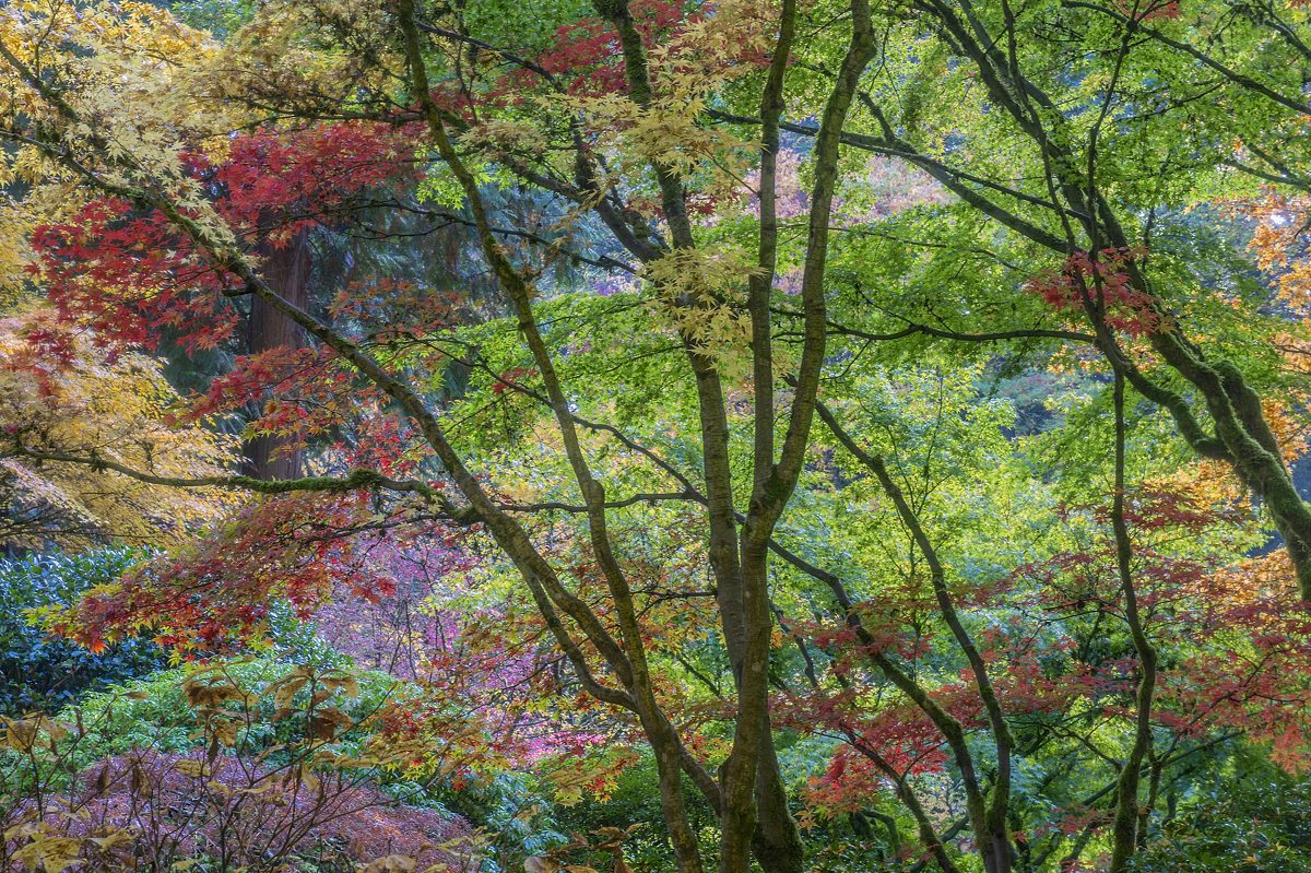
Portland Japanese Garden.
2 sec.,iso100, f16, 66mm (24-70 f2.8 lens), D800
Comments
9 comments
Comment posted by Stan Rose on November 10, 2014 at 1:08 AM
Interesting comp--confusing but coherent! Im wondering if a slight warming might improve this--since warm colors seem important here (the reds in particular) which seem to clash with the blues in the bg.
Registered on September 15, 2005, 836 Posts, 17099 Comments
Comment posted by Mark Metternich on November 10, 2014 at 4:04 AM
Very nice shot and colors!!!
I do feel it is slightly muted and could maybe benefit from a slight contrast boost in the lights and maybe a touch more saturation.
Registered on June 19, 2009, 276 Posts, 6240 Comments
Comment posted by scott lanz on November 10, 2014 at 8:03 AM
Wow, that's is an incredible array of fall colors, Dan. I'll second Mark's suggestions.
Registered on November 14, 2003, 840 Posts, 12902 Comments
Comment posted by Pat Sampson on November 10, 2014 at 9:25 AM
I'd love to see a huge print of this Dan. I like the image a lot as posted. Warming might make it pop a bit more but I'd need to see it to know. Great detail and mood.
pat
Registered on May 19, 2007, 953 Posts, 15989 Comments
Comment posted by gary phillips on November 10, 2014 at 12:23 PM
NIce profusion of color, Dan. I'll echo what has been said about a slight boost in contrast and or saturation. Wonderfully chaotic.
Registered on October 24, 2013, 185 Posts, 4136 Comments
Comment posted by Mark Seaver on November 10, 2014 at 12:49 PM
That's an amazing collection of colored leaves, Dan. You did a fine job of positioning the trees in the frame. I like this very much as posted, it's wonderfully subtle and inviting.
Registered on January 23, 2011, 1103 Posts, 17270 Comments
Comment posted by Bill Reid on November 10, 2014 at 1:24 PM
Great job putting this scene together Dan and nice positioning of the trees. I agree with Mark's comments about contrast and sat. To me some of the purples look off and a lot of cyan in the greens in the backround. But should look great with some slight adjustments.
Registered on January 27, 2013, 65 Posts, 2460 Comments
Comment posted by R.Bill Moser on November 10, 2014 at 4:11 PM
This is an interesting composition. I agree with Stan that warm colors are important here so I would suggest a slight warming and also as Mark said a slight contrast boot and a bit more saturation. Beautiful scene
Registered on January 29, 2010, 285 Posts, 4281 Comments
Comment posted by Vance Gese on November 13, 2014 at 2:38 PM
What an amazing palette of color. The lines of those trees set against that color work so very well.
Registered on November 13, 2008, 298 Posts, 6629 Comments

Comments
9 commentsI do feel it is slightly muted and could maybe benefit from a slight contrast boost in the lights and maybe a touch more saturation.
pat