Gallery: LandscapePosted November 13, 201485 views9 comments
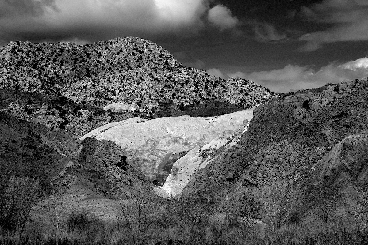
This image is from The Grand Staircase Escalante. Thought the subject lent itself to BW. Comments appreciated. Chet
Comments
9 comments
Comment posted by Joel Hazelton on November 13, 2014 at 3:42 PM
Interesting study in textures and tonal relationships. I have a hard time figuring out exactly what's going on here, which isn't a bad thing in this situation. I would like to see the foreground trees stand out more (localized increase in contrast?), but otherwise I think this is great. Well done.
Registered on August 6, 2008, 194 Posts, 1315 Comments
Comment posted by Pat Sampson on November 13, 2014 at 5:00 PM
Chet,
The composition works for me as does your processing and conversion. I don't really have any suggestions here other than possibly darkening the fg around the rock to make it pop a bit more but I'm not sure about that without seeing it.
pat
Registered on May 19, 2007, 953 Posts, 15989 Comments
Comment posted by Brian Schrayer on November 13, 2014 at 8:17 PM
This works very well in B&W. I like the strong contrasts and tonal range. I do find myself wishing for more of the sky and less of the foreground. I like the contrasting tones in the sky.
Registered on May 28, 2004, 114 Posts, 2890 Comments
Comment posted by gary phillips on November 13, 2014 at 9:58 PM
I like this, Chet. I think you did a nice job on the conversion. I think if it were mine, I might play with foreground to either lighten or selectively darken it in order to gain some separation from the next level in the image. I also might try to push to whites in the clouds.
Registered on October 24, 2013, 185 Posts, 4136 Comments
Comment posted by Richard Teller on November 13, 2014 at 11:39 PM
The sky works to make this a good b&w and nice composition. Having been though Grand Staircase Escalante I find myself wondering what the color in the image looks like.
Registered on August 23, 2010, 1162 Posts, 6692 Comments
Comment posted by Harley Goldman on November 14, 2014 at 6:00 PM
I would echo Gary's suggestions. A little more separation would work well and agree with the cloud idea, too. There is nice depth to this with its different layers and lines.
Registered on November 19, 2003, 586 Posts, 11271 Comments
Comment posted by Ryan Shain on November 14, 2014 at 7:45 PM
I like the depth to this image Chet, and I agree with Gary's ideas, as well as others on the fg separation, on how to bring this one to the next level.
Registered on February 20, 2007, 226 Posts, 4571 Comments
Comment posted by Chet Dowell on November 14, 2014 at 9:33 PM
Thanks everyone for your comments and your helpful suggestions. Chet
Registered on December 3, 2012, 237 Posts, 1171 Comments
Comment posted by Vance Gese on November 14, 2014 at 11:00 PM
Really like the luminosity of the centered rock and how the diagonals throughout the composition interact with that area. Lots of ways to interpret and process the tonal ranges of course. Nicely done as presented.
Registered on November 13, 2008, 298 Posts, 6629 Comments

Comments
9 commentsThe composition works for me as does your processing and conversion. I don't really have any suggestions here other than possibly darkening the fg around the rock to make it pop a bit more but I'm not sure about that without seeing it.
pat