Gallery: LandscapePosted November 26, 2014188 views8 comments
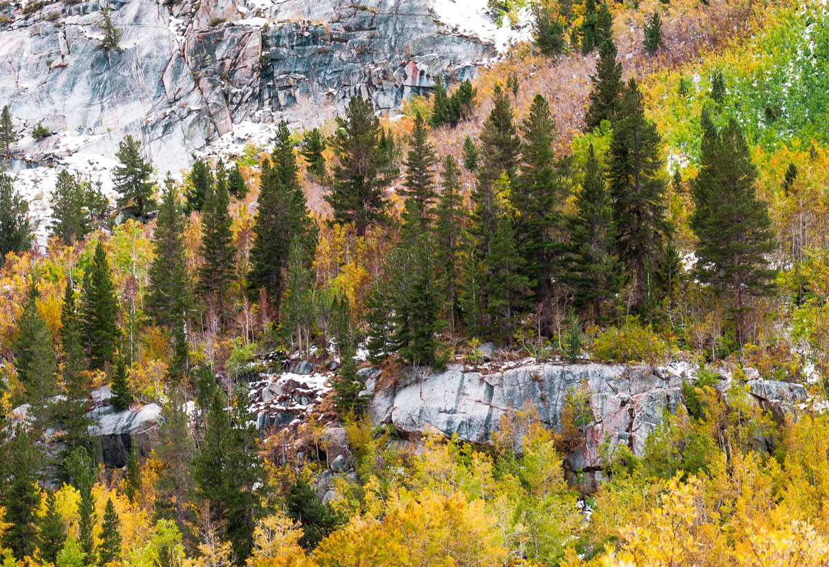
This is near Bishop Creek, taken in October 2011.
D300, 80-200 @ 105, 1/13, f11, ISO 100. C&C welcome and appreciated.
Comments
8 comments
Comment posted by Preston Birdwell on November 27, 2014 at 10:47 AM
Jim, I like the composition, but I do have some suggestions. First, the greens and the blues look somewhat over-saturated; especially in the granite and the trees on the top right. Second, the background rock and snow is too bright, and the snow has lost detail. You may be able to select that area and use a curves layer to bring it down. Third, it could be my old eyes, but both versions look a bit soft.
I do like the bands of color and the varied textures.
--P
Registered on November 1, 2003, 471 Posts, 5188 Comments
Comment posted by Nick Bristol on November 27, 2014 at 11:28 AM
Jim, I too like this scene and your comp. I think Preston made some very good suggestions that would help this image very much. It is a nice shot and worth a little more fine tuning. Both versions look a little soft to me as well.
Nick Bristol
Lone Rock, WI
Registered on February 1, 2004, 752 Posts, 14140 Comments
Comment posted by Nancy Lea Sandy on November 27, 2014 at 5:28 PM
Great layers in this image with the bands of trees and stone and Preston's suggestions would probably work wonders for the fine tuning.
Registered on January 24, 2011, 576 Posts, 6942 Comments
Comment posted by Mark Seaver on November 28, 2014 at 9:37 AM
The wash of color flowing down the mountain works very well. I agree with Preston about the green saturation urc and burning in the rocks in the ulc so they don't pull as much attention.
Registered on January 23, 2011, 1103 Posts, 17270 Comments
Comment posted by Brian Schrayer on November 29, 2014 at 12:40 PM
I like your composition here - you have used the repeating diagonal lines well. I also like the contrasting colors. It may be due to compression, but the texture in the rocks seems to be lacking. It also looks like you have lost detail due to overexposure in what I assume is snow. A little bit more work to bring back highlight detail and increase mid-tone contrast especially in the rocks would really improve the processing on what is a nice image.
Registered on May 28, 2004, 114 Posts, 2890 Comments
Comment posted by Jim Hansen on November 29, 2014 at 3:45 PM
Thanks everyone for your helpful feedback. I have included a new version taking your suggestions into account. I desaturated the green in the urc, desaturated the blue (even though I didn't see any), darkened the rocks and snow, and (I hope), did a better sharpening job. Is this better?
Registered on May 5, 2011, 161 Posts, 908 Comments
Comment posted by Ryan Shain on November 30, 2014 at 9:01 PM
Jim,
The repost looks much better, and I like what you have seen and captured in this view. It takes a good eye to see and frame up a scene like this one, and you did a good job with that.
Nice work on the repost.
Registered on February 20, 2007, 226 Posts, 4571 Comments
Comment posted by Jim Hansen on December 1, 2014 at 1:45 PM
Thanks Ryan. The feedback is greatly appreciated.
Registered on May 5, 2011, 161 Posts, 908 Comments

Comments
8 commentsI do like the bands of color and the varied textures.
--P
Nick Bristol
Lone Rock, WI
The repost looks much better, and I like what you have seen and captured in this view. It takes a good eye to see and frame up a scene like this one, and you did a good job with that.
Nice work on the repost.