Gallery: LandscapePosted December 6, 2014173 views8 comments
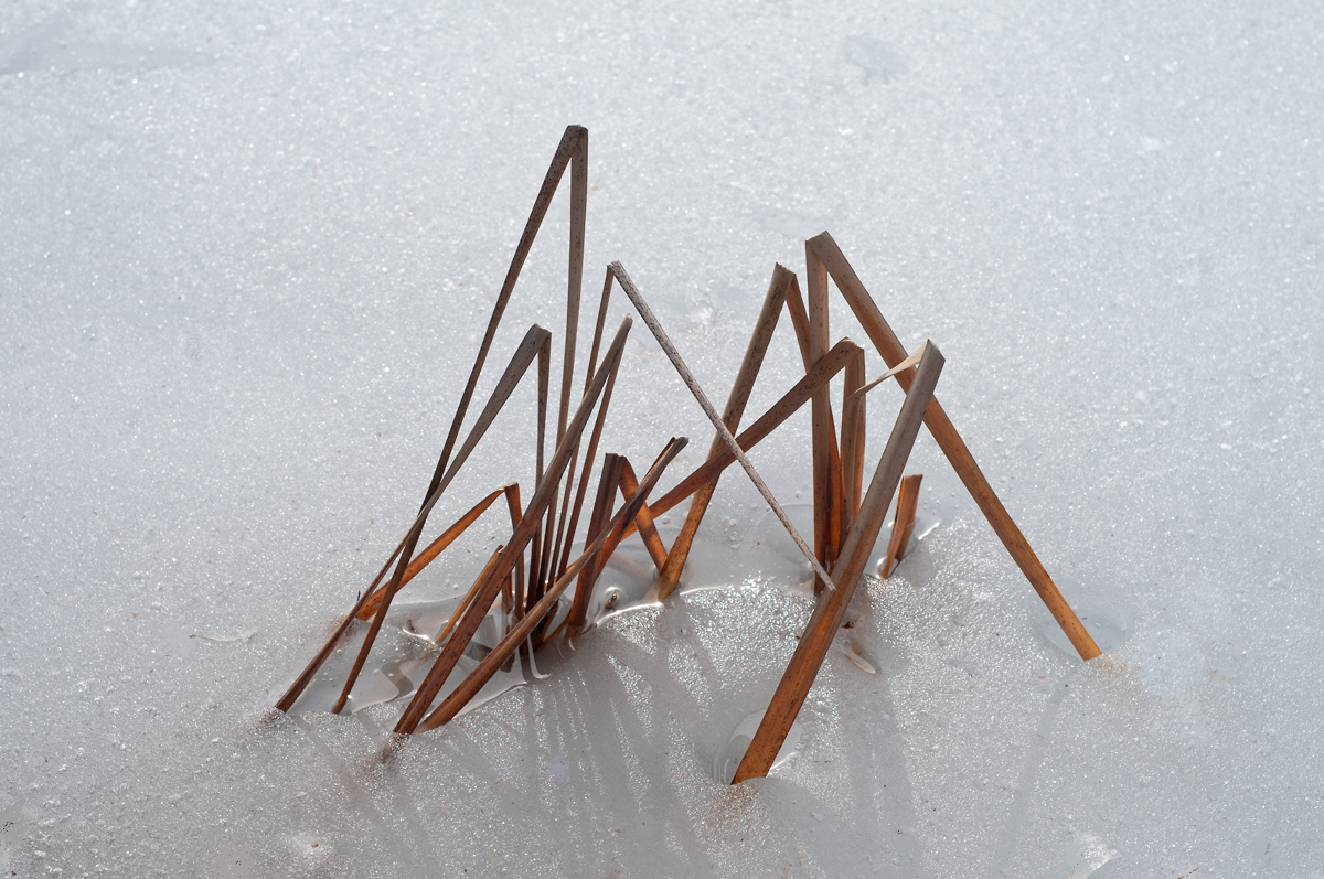
I think these bent stems convey a zen mood , or perhaps a minimalist mood. what do you think? comments appreciated. please see large version..
D300. 50mmf1.8.. f/8. 1/500 sec. iso250. tripod..
Comments
8 comments
Comment posted by Pat Sampson on December 6, 2014 at 1:15 PM
Nice comp Albert and I really like the textures and processing in this. The faint shadows in particular add a lot of interest to the image for me. I guess I might bring the white point up a little in this but not sure. Well seen and presented.
pat
Registered on May 19, 2007, 953 Posts, 15989 Comments
Comment posted by gary phillips on December 6, 2014 at 3:52 PM
This is pretty cool, Albert I like the simple presentation. If it were mine, I might stretch out the histogram and convert it to mono. Of course, that's always my agenda. Very nice.
Registered on October 24, 2013, 185 Posts, 4136 Comments
Comment posted by Preston Birdwell on December 6, 2014 at 4:04 PM
I like the idea, here, Albert. The composition is nice, and I like the detail in the reed. Personally, I would have stopped down for a bit more depth of field in order for the ice crystals in the background to be a little sharper. At least on my monitor, the white point looks fine, and I like the soft shadows of the reeds.
--P
Registered on November 1, 2003, 471 Posts, 5188 Comments
Comment posted by scott lanz on December 6, 2014 at 10:43 PM
Well seen and imaged, Albert. I like Gary's idea of converting this to mono and emphasizing form over color.
Registered on November 14, 2003, 840 Posts, 12902 Comments
Comment posted by Mark Seaver on December 7, 2014 at 9:37 AM
This is a neat look at these cattail leaves, Albert, with them nicely isolated against the ice and well positioned in the frame. I can see why folks are thinking b&w as that would put more emphasis on the shapes, but I like the subtle warmth that the leaves provide so I'm not convinced that b&w would be better.
Registered on January 23, 2011, 1103 Posts, 17270 Comments
Comment posted by Nick Bristol on December 7, 2014 at 5:46 PM
Albert, This is very nice! I like your comp and especially enjoy the feel this has. I too can see the thoughts for b&w but I do like the color in this.
Nick Bristol
Lone Rock, WI
Registered on February 1, 2004, 752 Posts, 14140 Comments
Comment posted by D.A. Edwards on December 8, 2014 at 5:50 PM
I think I'll like this better as presented than as a monochrome. The red reeds look right against the snow and their shadows. Agree about the softness on the top edge; maybe it would look better even blurrier?
Registered on October 8, 2014, 226 Posts, 1187 Comments
Comment posted by Lucy Aron on December 13, 2014 at 11:23 PM
Strong minimalist image. I like the way the "triangles" seem to echo one another.
Registered on February 25, 2011, 189 Posts, 1160 Comments

Comments
8 commentspat
--P
Nick Bristol
Lone Rock, WI