Nature Photographers Network
This is the preserved archive of the original Nature Photographers Network. The community continues at naturephotographers.network.
Coyote Cove (+)
‹ PreviousLandscape GalleryNext ›

Coyote Cove (+)

by Jared Warren

Gallery: LandscapePosted January 3, 2015372 views19 comments
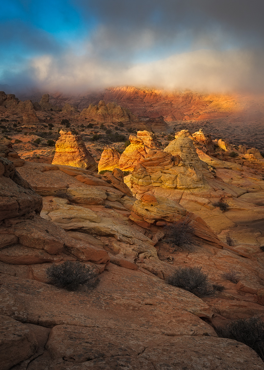
This is from a short visit to Coyote Buttes South last month (view toward Cottonwood Cove). The skies were mostly overcast/low clouds on this morning, but for a few brief moments the sun shone through a break in the clouds and lit up parts of the landscape.

I'd been working on this color version of the image, but then started to wonder if it might make for a nice B&W (I'll post a BW version below). I've been going back and forth as to which one works better. Your thoughts? Any other suggestions/refinements are also appreciated.

Comments

19 comments
Comment posted by Jared Warren on January 3, 2015 at 6:21 PM
B&W version, with slightly less foreground. Your preference?
Registered on May 11, 2012, 84 Posts, 931 Comments
Comment posted by Ed Lowe on January 3, 2015 at 6:46 PM
This probably will not be any help to you Jared, but I do not think you can go wrong with either version. The light and mood is spectacular in both and the range of tones really shine in the B&W. FWIW I do like the crop in the B&W better.

Ed
Registered on February 7, 2004, 414 Posts, 7115 Comments
Comment posted by Carey Closs on January 3, 2015 at 6:55 PM
I prefer the color version Jared, blue and gold is a pretty strong combination but the crop in the B&W suits this better to my eye. The empty space at the bottom of the color image doesn't really add to the scene, the fun begins above the two little plants. Its a lovely image with lots of color and drama but I think some selective dodging and burning would make it pop out more. in particular, I would lighten the buttes at the back left side somewhat and the dark clouds at the top a little as well. :toast:
Registered on April 15, 2012, 107 Posts, 326 Comments
Comment posted by Daniel Rappaport on January 3, 2015 at 7:21 PM
The colors are beautiful and work together well, and the isolated lighting is great in both, but I like the B&W better.
Registered on September 9, 2009, 294 Posts, 2006 Comments
Comment posted by Alberto Patiño on January 3, 2015 at 8:31 PM
The B&W version is nice, but I much prefer the colored version. I find that it transmits a much better feeling for the place, the B&W feels more "detached". :toast:
Registered on December 2, 2014, 278 Posts, 1736 Comments
Comment posted by Doug Koepsel on January 3, 2015 at 9:18 PM
Jared, i like the color version as the clouds and blue/gold combo look better in the color version. Preference is for the bottom crop (and maybe a tiny off the left too), and maybe a little less cyan saturation in the sky.
Registered on April 1, 2010, 196 Posts, 1592 Comments
Comment posted by Nancy Lea Sandy on January 3, 2015 at 10:17 PM
Put me down for a b&w vote. The tonal range is excellent and the lighting very dramatic. both are nice, though
Registered on January 24, 2011, 576 Posts, 6942 Comments
Comment posted by Kah Kit Yoong on January 3, 2015 at 11:35 PM
Prefer the colour by a large margin. First thing I would consider is cropping the bottom from the bush on the right edge down. Wonderful light and conditions.
Registered on September 27, 2006, 636 Posts, 10682 Comments
Comment posted by Catherine Reilly on January 4, 2015 at 1:28 AM
Color version by far! Most excellent atmospheric conditions make for good drama. What a wonderful shot. I 2nd Kah Kit's suggestion for a crop.
Registered on August 16, 2006, 603 Posts, 9192 Comments
Comment posted by Mark Pelton on January 4, 2015 at 10:49 AM
I also much prefer the color version. Contrasts and even tonal range are more evident in color version, but I prefer the B&W crop.
Registered on November 25, 2003, 380 Posts, 4647 Comments
Comment posted by Mark Seaver on January 4, 2015 at 12:49 PM
I think the colors here are a major part of the image, with the warmth of the rocks against the coolness of the sky. As others have said, the blue/gold combo works very well, but he blues in the sky do seem too strong.
Registered on January 23, 2011, 1103 Posts, 17270 Comments
Comment posted by gary phillips on January 4, 2015 at 12:54 PM
I'll join the color version crowd here, Jared. Like most of the other folks I prefer the crop on the b/w. It isn't that I don't like the b/w, I just think it could use a little more work to bring out the drama you have captured in the scene. Selective dodging and burning to bring out the striping in the sandstone and foreground rock. Beautiful image and a clear winner in the color version and with some devotion to b/w version a dual winner. :wavey:
Registered on October 24, 2013, 185 Posts, 4136 Comments
Comment posted by Nick Bristol on January 4, 2015 at 1:05 PM
Jared, Beautiful light and color in this ! I think the b&w crop works much better but love the color. You really captured some wonderful conditions in this image. Very nice!

Nick Bristol
Lone Rock, WI
Registered on February 1, 2004, 752 Posts, 14140 Comments
Comment posted by Brian Schrayer on January 4, 2015 at 3:40 PM
The B&W image has a lot going for it with the dramatic skies and dynamic tonal range. It stands well on its own. However, the warm glow in the sandstone tips the balance in favor of the color version for me. The B&W feels more ominous while the color version feels more warm and inviting. It's all in the mood that you want to convey. :toast:
Registered on May 28, 2004, 114 Posts, 2890 Comments
Comment posted by Bill Dark on January 4, 2015 at 7:01 PM
I much prefer the color version, but can understand why some might like the B/W. Either way, you had some great light and framed this nicely. However, as others have already suggested, a crop from the bottom would improve the color frame, IMO.
Registered on May 27, 2005, 148 Posts, 1121 Comments
Comment posted by Ryan Shain on January 4, 2015 at 8:43 PM
HI Jared,

The combination you have given us with the natural colors of this area, and of the light on this day work very well. I say use the crop from the black and white, and you have yourself some beautiful and strong photography. Also, I prefer the color version as presented, but the B&W works for me.

:toast:
Registered on February 20, 2007, 226 Posts, 4571 Comments
Comment posted by Jared Warren on January 4, 2015 at 11:30 PM
Thanks for the helpful comments and feedback. I'll go with the color version for now. Here's a refresh with new crop, selective dodging/burning, and minor color adjustments. :wavey:
Registered on May 11, 2012, 84 Posts, 931 Comments
Comment posted by Harley Goldman on January 5, 2015 at 9:52 PM
Sweet light and great conditions. The fog really gives it a nice mood. I like the color version and the reposted one.
Registered on November 19, 2003, 586 Posts, 11271 Comments
Comment posted by Lucy Aron on February 5, 2015 at 3:54 PM
Gorgeous. Captures the magic of light.
Registered on February 25, 2011, 189 Posts, 1160 Comments