Nature Photographers Network
This is the preserved archive of the original Nature Photographers Network. The community continues at naturephotographers.network.
Red Ribbon Badlands
‹ PreviousLandscape GalleryNext ›

Red Ribbon Badlands

by Tony Kuyper

Gallery: LandscapePosted January 30, 20153,129 views18 comments
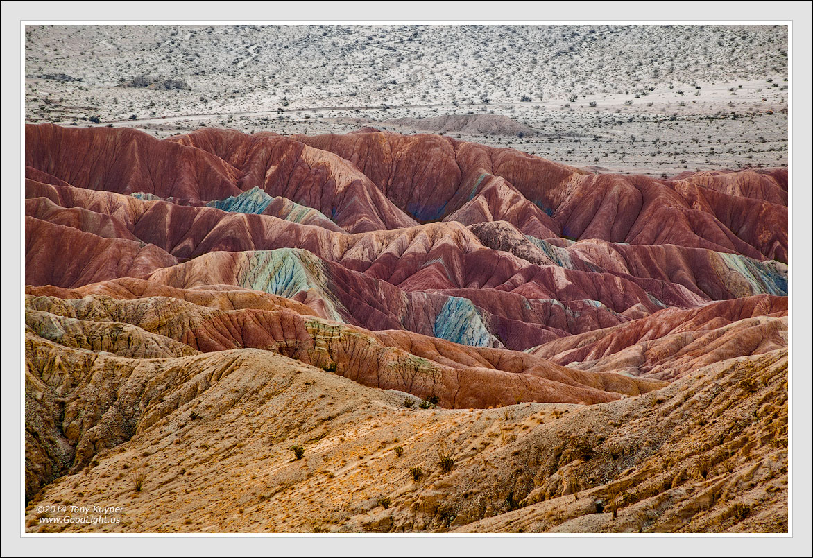
While HDR blending remains popular, I still like working with LDR images−those that have very low-dynamic-range. Opening up the contrast in this sort of image often reveals unexpected colors and textures, and within an abstract composition, there is some leeway as to what is considered acceptable.

The image shown here was taken shortly after sunrise (but while the elements were still in shadow) with a telephoto lens. The color and textures were there, but because of the soft light and density of the atmosphere between the camera and the landscape, the contrast was very low (unadjusted RAW file below).

There was no preconceived idea of how this should look when finished. To some degree, these types of images dictate their own course, and each is different. For me, the process is finished when there are no more veils of haze to remove. The contrast and color in the final image creates vibrancy and detail that seems real, but also maybe also a little beyond belief as to what our eyes could actually see.

Your thoughts on this image or its processing would, as always, be both appreciated and earnestly considered.

Canon 5D2, 28-300@300, f/16, 0.8 sec, ISO 100

Comments

18 comments
Comment posted by Tony Kuyper on January 30, 2015 at 10:14 PM
Registered on November 1, 2003, 364 Posts, 22328 Comments
Comment posted by Preston Birdwell on January 30, 2015 at 11:09 PM
Very interesting color palette, Tony. The reds and oranges against that neutral background make for an interesting dichotomy. I like the textures and the nice lines in the strata.

--P
Registered on November 1, 2003, 471 Posts, 5188 Comments
Comment posted by Zack Clothier on January 30, 2015 at 11:59 PM
Wow, it's amazing what kind of detail you managed to pull from a single RAW file. Very well seen, and processed, Tony. The larger version is a must see. :toast:
Registered on January 28, 2010, 343 Posts, 2257 Comments
Comment posted by gary phillips on January 31, 2015 at 3:45 AM
Tony, I can't tell you how many times I have looked at a raw file and thought to myself " that's not what I saw or felt in the field." I think you have, in fact, pushed the bubble beyond where must of us have thought we could go. Bravo! What you have pioneered in this age of post processing is truly remarkable. I am certainly not there yet, but I will be soon, and I want to personally thank you for your foresight and effort. Lovely development of this image. :toast:
Registered on October 24, 2013, 185 Posts, 4136 Comments
Comment posted by Prashant Khapane on January 31, 2015 at 5:20 AM
you really are a magician. :wavey:
Registered on November 1, 2003, 492 Posts, 4580 Comments
Comment posted by Tony Prower on January 31, 2015 at 5:39 AM
Amazing colours and strong lines. Superb composition with excellent proportions.
Registered on February 5, 2012, 24 Posts, 167 Comments
Comment posted by Nancy Lea Sandy on January 31, 2015 at 11:09 AM
Your processing is what elevates this image from a landscape photo to a fine art landscape. The colors and textures are wonderful, especially the textures in the fg hills. Excellent work
Registered on January 24, 2011, 576 Posts, 6942 Comments
Comment posted by Roel Wijtmans on January 31, 2015 at 12:04 PM
The contrast between the almost monochrome background and the colorful hills in the foreground is fascinating Tony. These colored hills are really something special. I remember back in '05 when I visited the Painted Hills that I was really amazed. Good job on capturing and evoking such a awe-inspiring landscape on a 2-dimensional photo.
Registered on September 30, 2012, 116 Posts, 2257 Comments
Comment posted by Philip Hodgkins on January 31, 2015 at 12:24 PM
Tony, you ended up with a beautiful image, not too overdone. An artistic interpretation like this should always plan for a willing suspension of belief. I think you have succeeded. :toast:
Registered on July 24, 2006, 2741 Posts, 12349 Comments
Comment posted by Harley Goldman on January 31, 2015 at 4:55 PM
I really like the colors against the monochrome-ish background. I think this rendition keeps the colors within the general realm of believable for me. It could be desaturated a bit, but too much and the image seems to die on the vine.
Registered on November 19, 2003, 586 Posts, 11271 Comments
Comment posted by Mark Seaver on January 31, 2015 at 5:45 PM
The colored hills in the lower 2/3rds are amazingly sharp, Tony, as well as very colorful. They contrast so nicely with the distant background. This is a wonderful view. I've seen this same effect in some of my icescapes where they start out very low contrast and as the contrast increases, the colors really start to pop.
Registered on January 23, 2011, 1103 Posts, 17270 Comments
Comment posted by R.Bill Moser on February 1, 2015 at 4:02 AM
I love the colors palette in this one. As always very well seen and also well processed.
Registered on January 29, 2010, 285 Posts, 4281 Comments
Comment posted by Stuart Williams on February 2, 2015 at 6:27 AM
your work here has led to some interesting and varied layers. i might consider cropping just a little from the bottom - mainly as a ploy to reduce the amount of that ochre-coloured stuff in the lower left. nice exploration - always fascinated to see your work!
Registered on December 7, 2007, 247 Posts, 4792 Comments
Comment posted by Ryan Shain on February 2, 2015 at 4:07 PM
Hi Tony,

I like the final image very much, and your vision and work is inspiring. The inclusion of the raw image is great to see where you have started from.

The image has a very nice balance to it, and the progression of tones of color are sweet. The layers and lines really stimulate the eye, and this is just beautiful vision on your part.

Excellent stuff :toast:
Registered on February 20, 2007, 226 Posts, 4571 Comments
Comment posted by Harry Lichtman on February 2, 2015 at 7:39 PM
Love what you have done with the processing. I think a tighter view of the center section might be more eye catching. Maybe some additional contrast/clarity adjustment for the center forms. I have tried to pull some of the colors out of some recent low contrast skies with some success, looks like you have it down! :toast:
Registered on September 17, 2010, 304 Posts, 3507 Comments
Comment posted by Nick Bristol on February 3, 2015 at 4:36 PM
Tony, This looks wonderful to me and I love the colors you brought out in this. The patterns, shapes and textures are all very nice. I also think this comp works great just as it is. Nothing I could see doing to make this any better. The large version is quite impressive to see. :smile:

Nick Bristol
Lone Rock, WI
Registered on February 1, 2004, 752 Posts, 14140 Comments
Comment posted by D.A. Edwards on February 3, 2015 at 7:40 PM
Thanks Tony for including the raw file so that we can start to understand where your art originates. I agree that this image is truly finished by the inclusion of the more monochrome slope in the background. This really is a continuation of your close-up work that have intrigued me on NPN for years.
:toast:
Registered on October 8, 2014, 226 Posts, 1187 Comments
Comment posted by Vance Gese on February 5, 2015 at 6:43 PM
Stunning work of art, Tony. The colors and contrasts, details and delicate textures are, as always, so beautifully brought out by your incredible vision. I am always humbled and inspired by your work.
Registered on November 13, 2008, 298 Posts, 6629 Comments