Nature Photographers Network
This is the preserved archive of the original Nature Photographers Network. The community continues at naturephotographers.network.
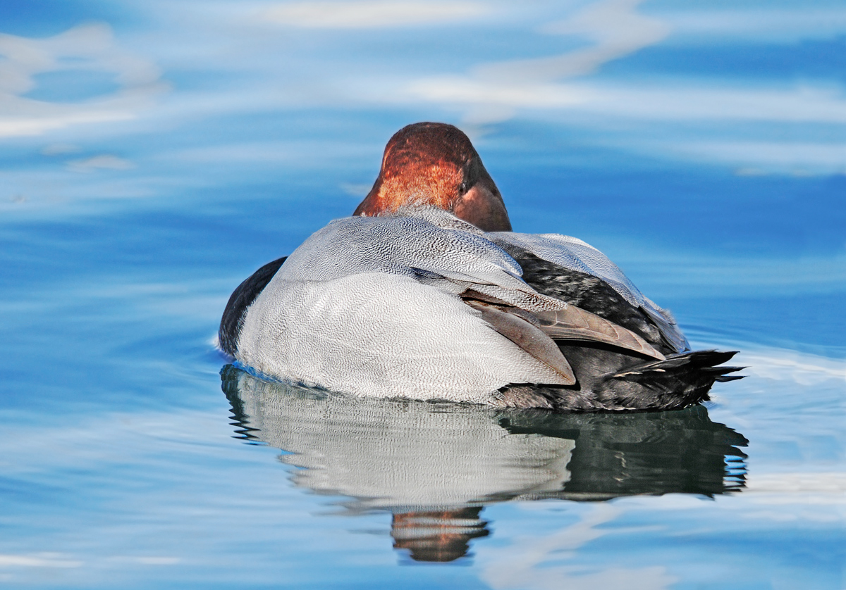
René Magritte Pochard
‹ PreviousAvian GalleryNext ›

René Magritte Pochard

by David Rowe

Gallery: AvianPosted February 3, 201596 views5 comments
Geneva, Switzerland
D300S VR 150 - 500 mm/max f5/6.3 G @ 500mm
f/8.0 ISO 320 1/800 EV 0.00 WB manual Hand held
Tiff image Bit depth 8 72% of full frame Photoshop PS6

When processing this shot I was fascinated by the black and white vermicelli effect on parts of the plumage. I wish I had shot RAW for it was difficult to recuperate sufficient detail in the lights and darks. The bird is floating serenely on the limpid waters of lac Léman and the eye contact imparts a feeling of subdued awareness. It looks to me as if the bird and reflection are floating in mid air, superimposed surreally against a lightly clouded sky!

Your crits. and nits are most welcome

Comments

5 comments
Comment posted by Jerry Austin on February 3, 2015 at 7:28 AM
I have always been a fan of this particular pose that ducks sometimes exhibit. For it to work, I believe you have to have a good look at one eye. The eyes in this one are not very visible, and that detracts some for me. It also looks a bit oversaturated. Beautiful duck and beautiful water though.
Registered on January 6, 2012, 651 Posts, 3448 Comments
Comment posted by David Rowe on February 3, 2015 at 10:59 AM
Hi Jerry
Many thanks for your constructive comment - seeing both eyes at once would have been really tricky in this straight ahead glance.
I was in two minds about posting the following shot since the surreal effect is less marked.
David
Registered on December 20, 2013, 133 Posts, 286 Comments
Comment posted by Jerry Austin on February 3, 2015 at 1:23 PM
I personally like the repost much better. However, I think it is a bit too bright. The saturation does look more natural in this shot.
Registered on January 6, 2012, 651 Posts, 3448 Comments
Comment posted by Hans Overduin on February 3, 2015 at 1:52 PM
The repost is my favorite as well: brighter, better overall techs and a nice eye.. Cheers, Hans
Registered on August 31, 2011, 491 Posts, 3807 Comments
Comment posted by Steve Thompson on February 3, 2015 at 5:20 PM
I'm definitely liking the second image better and I agree with Jerry that it's still a little too bright. The main post seems way over saturated to me David and the eyes are an issue.
Registered on August 7, 2014, 125 Posts, 2319 Comments