Nature Photographers Network
This is the preserved archive of the original Nature Photographers Network. The community continues at naturephotographers.network.
Mellow Yellows
‹ PreviousLandscape GalleryNext ›

Mellow Yellows

by Preston Birdwell

Gallery: LandscapePosted February 21, 2015234 views10 comments
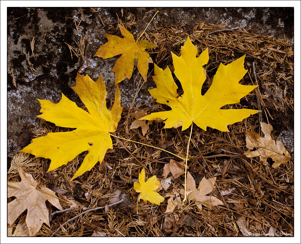
Maple leaf detail, Yosemite Valley.

Nikon D-7100
Nikkor DX 18-140
TK's masks
Cropped to 4x5 ratio
November 2014

Edit: For some reason, the image looks more red in IE 11 than it does in FireFox. The rendering in FireFox is closer to the way it appears in my master file, so please view in FireFox if you have it. Thanks.

Please see the large version. Thank you!

Your thoughts are always appreciated. :smile:

--P

Comments

10 comments
Comment posted by Harley Goldman on February 21, 2015 at 5:26 PM
Very nice leafscape. The yellows really pop against the browns.
Registered on November 19, 2003, 586 Posts, 11271 Comments
Comment posted by Alberto Patiño on February 22, 2015 at 12:14 AM
I really like the colors and the composition. I use Chrome and the colors look very natural to me - the yellow in the leaves is fine, and I see no reddish tint.
Registered on December 2, 2014, 278 Posts, 1736 Comments
Comment posted by Roel Wijtmans on February 22, 2015 at 8:02 AM
That's weird, they look exactly the same in my IE 11 and FF. No idea what could be the cause.... Anyway, love how the yellows stand out against the brown background!
Registered on September 30, 2012, 116 Posts, 2257 Comments
Comment posted by Mark Seaver on February 22, 2015 at 9:53 AM
Lovely warm colors here, Preston. I like the emphasis on the two darn near perfect leaves and their setting on the older leaves and pine needles. It's a fine depiction of fall. Folks have been talking about IE and it's lack of color fidelity for years. It's a classic case of Microsoft trying to dictate to the users rather than listening to the users if it's software.
Registered on January 23, 2011, 1103 Posts, 17270 Comments
Comment posted by Richard Teller on February 22, 2015 at 10:35 AM
I like the simple composition, very pleasing. I also the way the yellow leaves pop from the brown background.
Registered on August 23, 2010, 1162 Posts, 6692 Comments
Comment posted by Nick Bristol on February 22, 2015 at 6:08 PM
This is very nice, Harley! I'm viewing with firefox and it looks good to me. Like the others I like how the yellow leaves contrast so nice against the background of brown. I might prefer the whole back ground being all the brown needles and leaves instead of the darker band across the top, but still it works fine just as it is. :smile:

Nick Bristol
Lone Rock, WI
Registered on February 1, 2004, 752 Posts, 14140 Comments
Comment posted by Brian Schrayer on February 22, 2015 at 10:57 PM
Maple leaves are just so photogenic. I like the small, medium, and large variations. I always look for these kind of comps, but struggle to find order out of chaos so I can certainly appreciate seeing these kind of comps done so well.
Registered on May 28, 2004, 114 Posts, 2890 Comments
Comment posted by Navin Sarma on February 24, 2015 at 2:52 PM
Pretty, perfect arrangement of colors on the forest floor. Lovely exposure but I might brighten the top leaf just a bit as it has sort of a grad look to it. Colors are spot on for me in either browser.
Registered on July 17, 2011, 233 Posts, 1373 Comments
Comment posted by gary phillips on February 24, 2015 at 3:43 PM
Really sweet little leaf arrangement, Preston. Love the different sizes and states of degradation. Nicely presented..
Registered on October 24, 2013, 185 Posts, 4136 Comments
Comment posted by Bill Chambers on February 25, 2015 at 3:00 PM
Beautiful capture and composition. I might dodge the top somewhat to lighten the darker area.
Registered on April 10, 2005, 753 Posts, 21216 Comments