Gallery: LandscapePosted March 12, 2015218 views8 comments
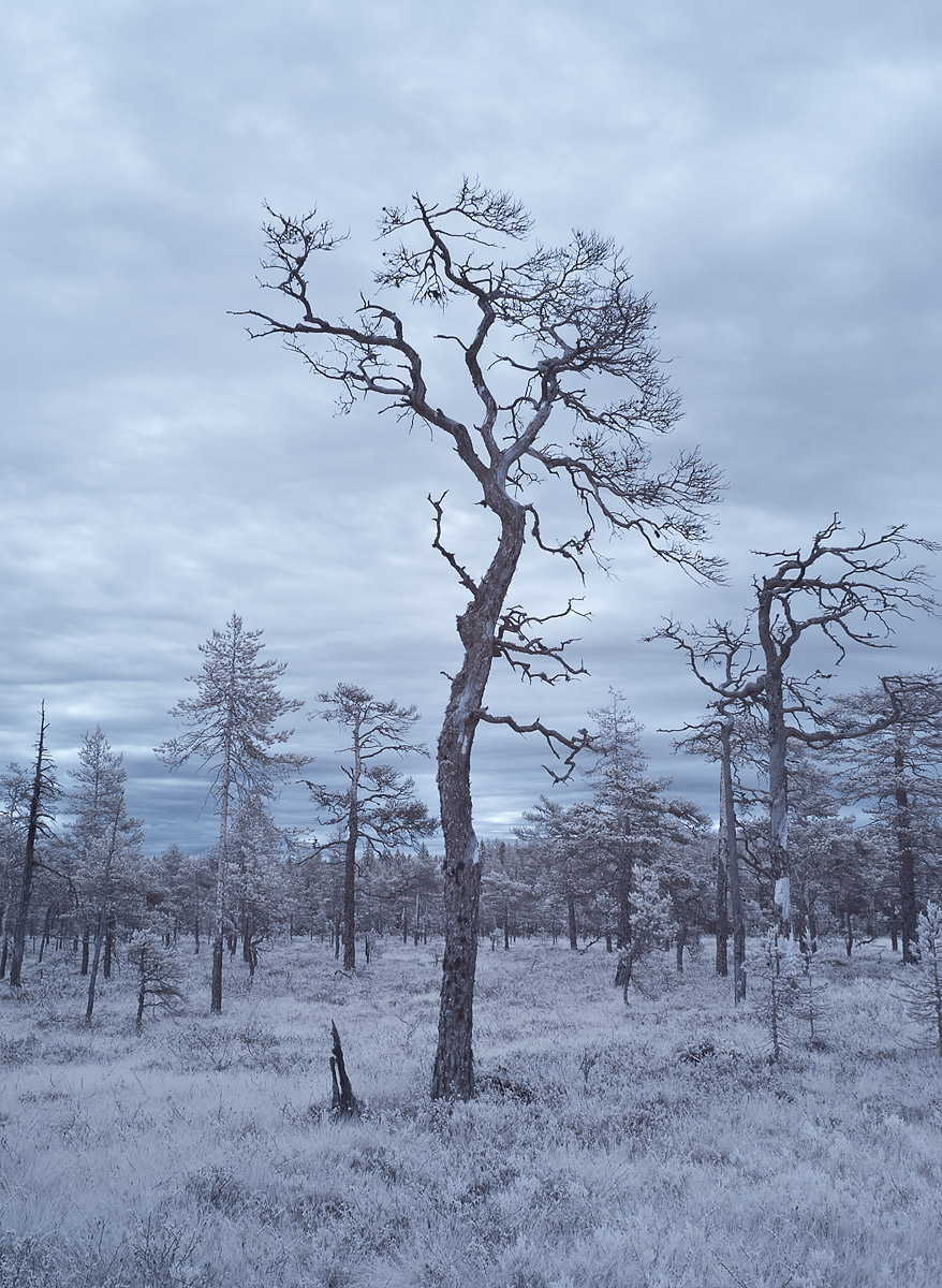
A picture with my IR camera, taken a while back. I liked the shape of the trees.
f/18, ISO 100, 1/15 s, 36 mm.
C&C welcome! Large version is included.
Roel
Comments
8 comments
Comment posted by Harley Goldman on March 12, 2015 at 4:22 PM
I like the starkness of the scene and like you, the tree shapes. I think this would work very well in B&W, too.
Registered on November 19, 2003, 586 Posts, 11271 Comments
Comment posted by Eva McDermott on March 12, 2015 at 8:10 PM
I love the synergy of this image Roel. The starkness and visual contrasts work well here.
Registered on January 4, 2009, 1015 Posts, 13229 Comments
Comment posted by Stephen Stanton on March 13, 2015 at 1:20 AM
Nice image, Roel, the tree shapes and forms certainly hold my interest. Would like to see the tree on the right have a more breathing space to provide a stronger counter balance to the composition. I wonder what the image would be like in less of a gray monotone.
Registered on March 1, 2015, 54 Posts, 453 Comments
Comment posted by Patricia Brundage on March 13, 2015 at 7:09 AM
I like the feel of a frosty morning combined with this tree with such character. The blue monotone enhances that feature nicely. Well done.
Registered on March 23, 2006, 1111 Posts, 6531 Comments
Comment posted by Igor Doncov on March 13, 2015 at 7:49 AM
Beautifully shot Roel. It has a graphic quality to it, almost like a woodblock print. The interplay between the center tree and the tree to the right is interesting. If the tree on the right was not right up against the edge you could have cropped off some of the left side of the image and emphasized the relationship between the two trees. Like in music - a dominant sound and a faint sound echoing the dominant one.
Registered on November 22, 2014, 189 Posts, 2733 Comments
Comment posted by gary phillips on March 13, 2015 at 4:38 PM
Very nice, Roel. I love your use of the infared camera for this shot. I agree with Harley, that this would make a super b/w. I really like this.
Registered on October 24, 2013, 185 Posts, 4136 Comments
Comment posted by Alberto Patiño on March 15, 2015 at 5:42 PM
I love the composition - it has great depth! I agree that B&W would work too, but the bluish cast adds an eerie feeling that increases the impact of the image. For some reason it makes me think of World War I....
Registered on December 2, 2014, 278 Posts, 1736 Comments
Comment posted by Monica Orchard on March 20, 2015 at 9:20 PM
I like the post apocalyptic effect resulting from IR. It is a refreshingly different take on scene that would otherwise be just "nice".
Registered on March 4, 2015, 11 Posts, 73 Comments

Comments
8 comments