
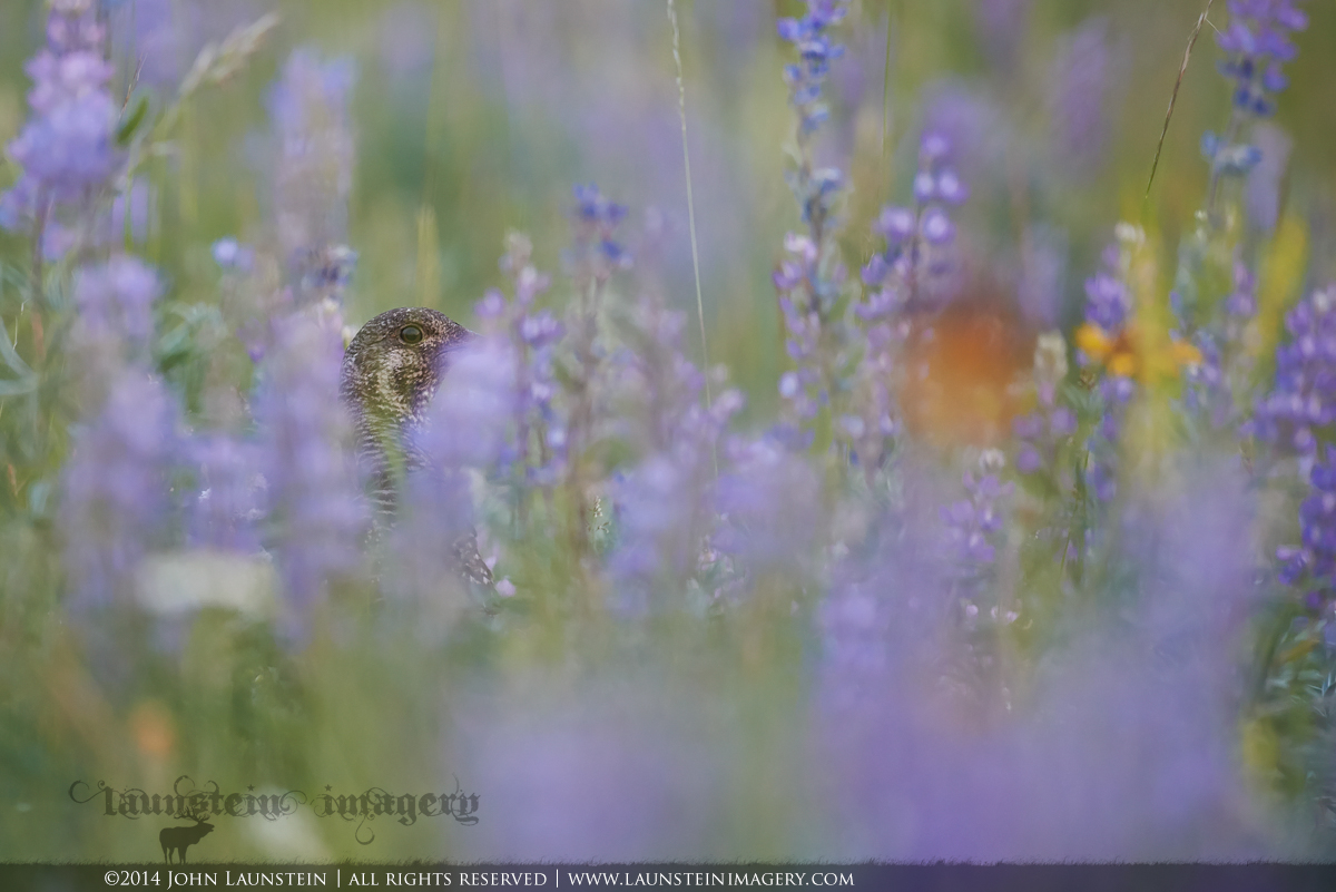
I know many of you can relate to how much suddenly comes into play when attempting shots like this: Camera angle left-to-right, camera angle up and down, wind, lighting, sounds and movements that pull the subject's attention, the seemingly fickle whims of a wild spruce grouse... 
At least that's what I tell myself as an explanation to the rather poor shot-to-keeper ratio in my files whenever I feel like taking on the challenge, and why the beak on this grouse is SLIGHTLY more obscured than I would like. I do have several nice floral images sans bird anyway! 
I suspect this one won't work for all (or many?), but it does work for me, and I'm sure part of that, like so often for me, is tied to the memory of my son and I quietly working for compositions and angles of this grouse in the dusky light of a Rocky Mountain meadow, and the occasional stifled celebrations when we thought we might have pulled one off.
I would love to know which of these two versions you prefer: the slightly cropped comp here where it becomes more of a complete frame of OOF flowers, or the slightly wider more "meadow" feel below (same frame, below is uncropped).
Don't forget to click on the image above for a larger view with better colour and detail (forgot to prepare a 720 version on this cropped version).
Nikon D600
Nikkor AF-S 500mm f/4D IF-ED
ISO 1800
1/250sec @ f/4.5
VERY light adjustments to colour temperature, brightness and contrast, dodging.
Comments
12 commentsHere's the full-frame version that has a touch more breathing room and more of an overall meadow feel to me. I'm personally pretty torn on this one, originally preferring the full-frame comp but then going back and forth a bit! Thanks in advance for your feedback!
The orange flower on the right is bigger and brighter than the bird so its a distraction -- hard to recognize the bird so this does not work for me
I like your original crop as a "birdscape", with the grouse's eye and head being the only things in focus. I do think you could further crop to square without changing the "story" that the picture tells while emphasizing the bird a bit more.
Less cropped, Claude Monet
This definitely works for me John. I really love it! Sometimes I prefer this type "suggestion of bird" image to the more blatant norm of an "OBVIOUS BIRD IN A MEADOW" type of presentation, and this is a great example of it. The grouse really stands out because it is (almost) the only thing in focus in the image. To me the flowers are not a distraction, but the two individual grass shoots (upper middle and upper right) are a small distraction for me. The two images are not significantly different to me, so I have no favorite. On second thought, maybe I slightly prefer the first one, for reasons unknown to me. Great work!
Beautiful image with awesome colors and just enough of the bird. I'd consider making this a square crop (using the original image) and ditching the whole right 1/3 of the image as the oranges and yellows are distracting.
Another cool one, John. I think I prefer the composition on the first one. The grouse just seems to fall in a better location. I do wish the beaik were a little clearer, but the eye is what really counts in this kind of shot for me.

The original crop works for me. The orange blob competes with the bird. I think a vertical crop would work well.
Always interesting to see how everybody has his or her own ideas about what works for them or not. Since I am a huge fan of hidden birds, I already have a positive feeling towards this image. After considering both options, I go for the cropped version, since the position of the bird appeals more to me. Nice one John ! Cheers, Hans
I like this John and like out of the box thinking, so nice work. I am between the two personally. I like the larger canvas of the orginal, but I like the position of the bird in the cropped version. I keep going back and forth...sorry I know that sin't any help, but it is all I can say because I can't make up my mind and I am normally very decisive.
I like the un cropped version, the grass in focus has a better feel and seems to be in harmony and part of the overall image as such. Great image.
Really cool! I'm not sure which version I prefer. It would've been nice to see his beak, but what can you do. I love all the purples in the image. The orange flower doesn't really bother me.