Gallery: FloraPosted April 28, 20151,537 views5 comments
Hi all.
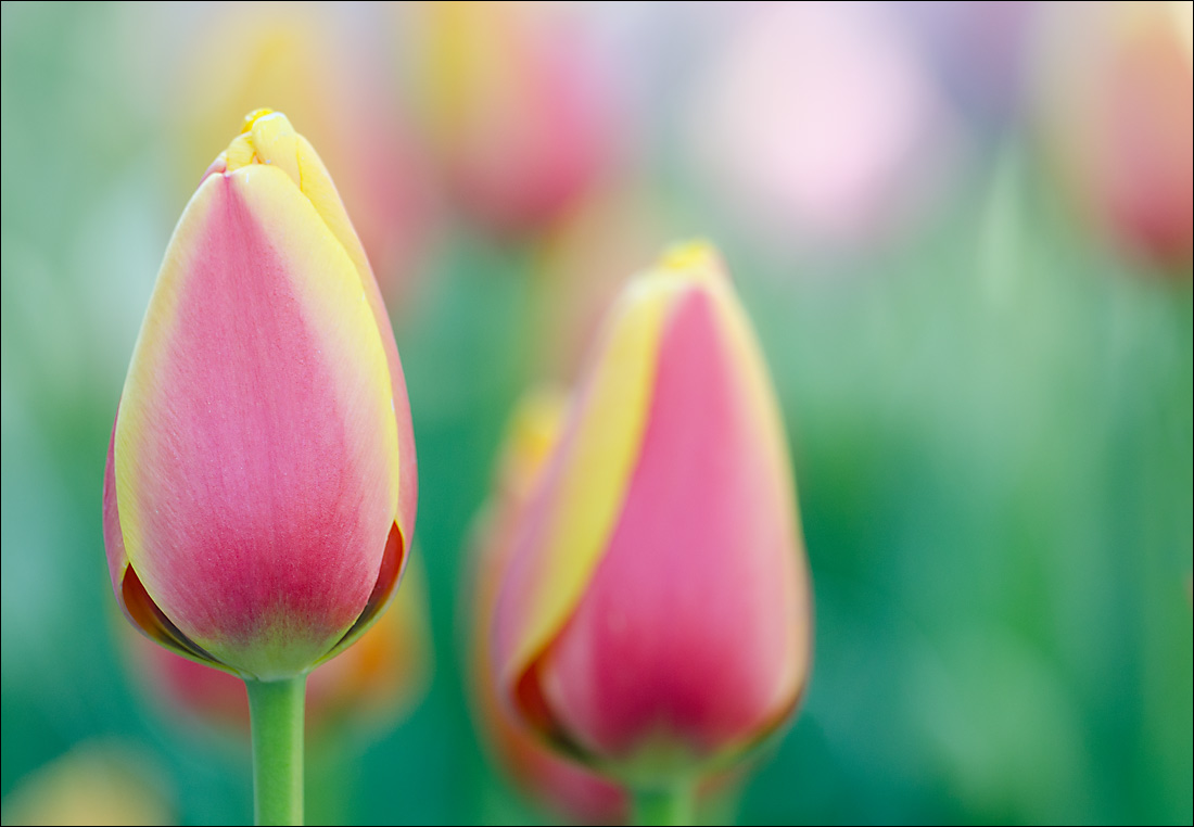
Another shot taken at the same time as my other one. Any and all thoughts appreciated.
Nathan
Nikon D7000, Sigma 180 macro, tripod, ISO 400, f4
Comments
5 comments
Comment posted by Ian Wolfenden on April 28, 2015 at 5:18 AM
Very nicely done, Nathan ! I like how the main flower in not on the third but well balanced by the secondary flower in the centre.
Registered on May 18, 2007, 1108 Posts, 7647 Comments
Comment posted by Philip Hodgkins on April 28, 2015 at 8:23 AM
I like the complementing colors in this. A crop from the right to about a 4:5 would balance this up even better, but good as is.
Registered on July 24, 2006, 2741 Posts, 12349 Comments
Comment posted by Bill Fach on April 28, 2015 at 10:18 AM
Nathan: Superb. I especially like the comp and the DOF choice with the color and focus fading to the right. top notch! >=))>
Registered on November 1, 2003, 1805 Posts, 26981 Comments
Comment posted by Sanjay Sundaram on April 28, 2015 at 7:35 PM
The colors combination is wonderful and the dof is just right. I think the light spot at One 'OClock could be toned down a bit.
Well done Nathan!
Sanjay
Registered on April 9, 2013, 107 Posts, 725 Comments
Comment posted by scott lanz on April 28, 2015 at 9:42 PM
I like the dof managment and spumoni colors, Nathan. My iniital im pressive was consistent with Phil's about the balance, but, unless you go nearly square, I prefer it as is without any crop.
Registered on November 14, 2003, 840 Posts, 12902 Comments

Comments
5 commentsVery nicely done, Nathan ! I like how the main flower in not on the third but well balanced by the secondary flower in the centre.
I like the complementing colors in this. A crop from the right to about a 4:5 would balance this up even better, but good as is.
Nathan: Superb. I especially like the comp and the DOF choice with the color and focus fading to the right. top notch! >=))>
The colors combination is wonderful and the dof is just right. I think the light spot at One 'OClock could be toned down a bit.
Well done Nathan!
Sanjay
I like the dof managment and spumoni colors, Nathan. My iniital im pressive was consistent with Phil's about the balance, but, unless you go nearly square, I prefer it as is without any crop.