
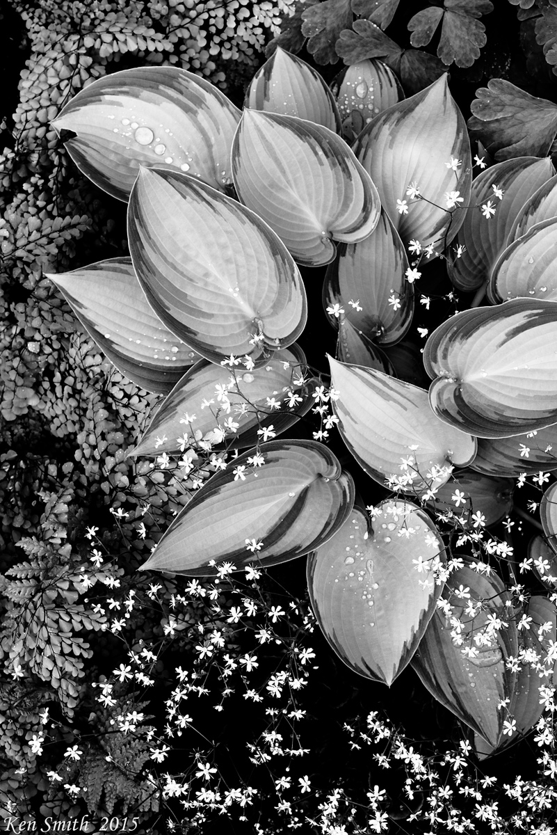
by Ken Smith
Something different seeing the garden in b/w. The little flowers, blue bells, popped more in bold white against the black. I kinda like the look...prolly cause it is not too common. My wife...'meh, blah.... '. And so it goes. But, always the magic of cameras and an excuse to stand and fuss in the outdoors. Even if only in the backyard.
Comments
9 commentsI like this very much. The small flowers almost seem to be floating in the image. Great choice of B&W.
Nicely done.
I like the photo a lot, Ken. The range of shapes, textures, etc are great. I knew that it was yours the second that it opened (without seeing your name). I sort of wonder about rotating it 90 degrees CW.
For me, one reason that I love flora photography is that it fits with my busy life (with 4 young kids and a self-employed wife). I can go out in the back yard and shoot and I do not have to fit it in to my day (or week) - I can take a few minutes here and a few minutes there.
Nice work!
Nathan
Ken - Just beautiful. Awesome presentation. Great tones and harmonious assortment of various kinds of plants and flowers in the frame.
This is very striking Ken! I love it. You don't see B&W flora often and the comp really has to work to pull it off, and have it in spades here.
The spades shaped leaves look as though they've been polished, and the blue bells do look like they float in the scene. Good comp and excellent PP. It would be interesting to see rotated CW as Nathan suggests.
Charming graphic quality about this, Ken - I imagine it as a book illustration with its variety of forms and textures and superb composition.
This is a striking image, Ken. It makes one remember that B&W can sometimes have so much more expressive power than color. I am sure that the original color image is beautiful too, but it is unlikely that it will be as evocative as this version. Now you put ideas in my head ... thank you, and congratulations on a marvelous image!!!
This looks very cool in B&W! I love the assortment of shapes and textures. Very nicely done, Ken.
Ken: Exceptional conversion IMO. Marvelous contrasts and tones and an intriguing subject. Many thumbs up! >=))>
I ever liked thse "Hosta" leaves, and this your rendering is so well done.
Great by technical and creative (but they works together IMHO) point of view. Tones are perfect, and the framing works very well without being boring.
All the best,
Sandro